Devin marketing design research
A study of 13 captured public pages on devin.ai (out of 377 public URLs, all listed in public-pages.md), built to answer one question: how do you make a landing page for a serious AI developer product with this level of craft?
- Captured: 2026-11-21, Chromium (agent-browser 0.27), 1440 × 900 viewport, plus 390 × 844 mobile and 768 × 1024 tablet full-page shots of Home and Pricing.
- Pages: Home, Pricing, Customers, Bots, Cloud, Security, Blog index; added 2026-11-21: two blog posts, two customer stories, Brand, Enterprise.
- Every number comes from the live DOM:
getComputedStyle, CSS custom properties, document.fonts, @font-face and @keyframes rules. Raw measurements are in data/*.json (<page>.json = headings, text styles, buttons, colors, media; <page>.probe.json = fonts, tokens, transitions, animations, radii).
- Values estimated from pixels are marked "≈". Everything else is measured.
- Local research only. Not committed.

The site in one paragraph
Devin's site is a light, paper-white editorial page (#fcfcfc) set in one grotesk, Skandia, at weight 400 for almost everything. Hierarchy comes from size and from a single ink color (#191919) used at three opacities (100 %, 56 %, 40 %), not from bold weights. Headlines are two-tone: the first clause in grey, the second in ink ("From problem to merged PR, / Devin gets hard engineering work done."). The product is shown, not described: every feature block contains a high-fidelity, re-built product UI (set in Inter, not Skandia) floating on a soft photographic "vellum" backdrop. Color is rationed to status (green +/red −), one link blue (#317cff), and a set of saturated 3D bot mascots and an illustrated otter in the footer that give the brand warmth. The Bots page flips the whole system to dark (#141414) with a full-bleed video hero, which signals "new product line" without inventing a new design language.
Read in this order
| # |
File |
What it answers |
| 01 |
Design principles |
The 10 principles behind every decision and why Devin chose them |
| 02 |
Color system |
Paper, ink at 3 opacities, hairlines, one accent, status colors, dark theme, contrast ratios |
| 03 |
Typography |
Skandia + Inter + Geist Mono, every measured size/weight/line-height/tracking, two-tone headings, mobile scale |
| 04 |
Layout, grid and spacing |
1400px grid, 80/96px margins, 10px gutter, the zig-zag module, vertical rhythm, radii |
| 05 |
Heroes |
All 7 hero types, measured and compared |
| 06 |
Section types |
Catalog of every section pattern: bento, zig-zag steps, bot grid, changelog list, stats wall, comparison table, FAQ… |
| 07 |
Copywriting and voice |
Headline formulas, two-clause headlines, CTA verbs, proof copy |
| 08 |
Components |
Nav, buttons, links, chips, cards, tables, accordions, footer |
| 09 |
Art direction and imagery |
Vellum backdrops, rebuilt product UI, 3D bot mascots, otter illustration, customer color cards |
| 10 |
Motion and interaction |
Measured transitions, keyframes, marquees, collage pan, gravity bots, hover rules |
| 11 |
Glossary |
The terms you need to brief or build a page like this |
| 12 |
Build recipe |
CSS tokens, type classes, component snippets, a section-by-section build order |
| 13 |
Brand assets |
Inventory of every graphic type (logos, otter, vellum UI, photo stats, customer tiles) with crops and how to rebuild it |
| — |
Public pages |
All 377 public URLs from the sitemap (English), grouped: 38 core, 291 blog, 42 customers |
Page reviews (section by section)
| Page |
What is special |
| Home |
Product-window hero over a drifting photo collage, zig-zag 4-step workflow, changelog list |
| Pricing |
Segmented toggle, 2 plan cards, 5-column comparison table with a tinted "Teams" column, black FAQ panel |
| Customers |
Video testimonial hero, 40+ brand-colored story cards, staggered stats wall |
| Bots |
The only dark page: video hero, 3D mascot reveal, gradient feature cards, testimonial carousel |
| Cloud |
Product page: big product window, logo wall, sticky use-case tabs with stat cards, bento |
| Security |
Credits pill, announcement banner, 3-up feature row, quote card, FAQ |
| Blog |
Featured post + monospace tag filter + 3-column card grid |
| Blog post template |
Mono meta row, 680px body at 18/27, sticky TOC, HTML charts (2 posts) |
| Customer story template |
Outcome headline, customer-colour cover, stat grid, findings as H2s (2 stories) |
| Brand + Enterprise |
Download-first brand page; enterprise photo stats, zig-zag modules, guarantee band |
| Shared header and footer |
52px fixed nav, otter footer |
Images
images/full/ — full-page 1440px screenshots, one per page.images/<page>/ — the same pages cut into sections (images/sections.json lists every crop with its y offset).images/patterns/ — 29 close-up crops of single components.images/responsive/ — 390px and 768px full-page shots of Home and Pricing.
Public pages · every public URL on devin.ai
377 public pages, taken from robots.txt → sitemap.xml (and every nested sitemap) on 2026-11-21. Localized copies of the same page (for example /ja/…, /de/…) are left out; English only. Titles are each page's <title> tag, fetched live.
Machine-readable copy: data/public-pages.json. Research site: https://devin-design-research.sutharjay3635.workers.dev
| Group |
Pages |
| Core marketing |
38 |
| Blog |
291 |
| Customers |
42 |
| Security |
3 |
| Windsurf |
3 |
Core marketing
38 pages.
Blog
291 pages.
- Blog: Product Updates, News & Research ·
/blog
- Agentic MapReduce ·
/blog/agentic-map-reduce
- Windsurf and AHEAD Form Strategic AI DevOps Partnership ·
/blog/ahead-partnership
- Amazon CodeWhisperer is out of beta. We tried it. Spoiler: it isn’t good. ·
/blog/amazon-codewhisperer-review
- Anduril on Windsurf ·
/blog/anduril-case-study
- Statement on Anthropic Model Availability ·
/blog/anthropic-models
- athenahealth Advances Healthcare Innovation with Windsurf ·
/blog/athena-health-case-study
- Atlassian x Codeium ·
/blog/atlassian-codeium-announcement
- Code Suggestion Attribution ·
/blog/attribution-announcement
- Cognition and AWS team up to help ambitious teams ship more, faster ·
/blog/aws-sca
- Best AI Product Lists ·
/blog/best-ai-product-lists
- Codeium Beta Launch ·
/blog/beta-launch-announcement
- We compete with Github. Bing does not show our website. ·
/blog/bing-does-not-index-codeium
- Blog – Case Studies ·
/blog/category/case-studies
- Blog – Changelist ·
/blog/category/changelist
- Blog – Changelist – Page 2 ·
/blog/category/changelist/page/2
- Blog – Changelist – Page 3 ·
/blog/category/changelist/page/3
- Blog – Company ·
/blog/category/company
- Blog – Company – Page 2 ·
/blog/category/company/page/2
- Blog – Company – Page 3 ·
/blog/category/company/page/3
- Blog – Company – Page 4 ·
/blog/category/company/page/4
- Blog – Company – Page 5 ·
/blog/category/company/page/5
- Blog – Enterprise ·
/blog/category/enterprise
- Blog – Enterprise – Page 2 ·
/blog/category/enterprise/page/2
- Blog – Enterprise – Page 3 ·
/blog/category/enterprise/page/3
- Blog – Enterprise – Page 4 ·
/blog/category/enterprise/page/4
- Blog – Enterprise – Page 5 ·
/blog/category/enterprise/page/5
- Blog – Industry ·
/blog/category/industry
- Blog – Industry – Page 2 ·
/blog/category/industry/page/2
- Blog – Industry – Page 3 ·
/blog/category/industry/page/3
- Blog – Industry – Page 4 ·
/blog/category/industry/page/4
- Blog – Partners ·
/blog/category/partners
- Blog – Product ·
/blog/category/product
- Blog – Product – Page 10 ·
/blog/category/product/page/10
- Blog – Product – Page 11 ·
/blog/category/product/page/11
- Blog – Product – Page 12 ·
/blog/category/product/page/12
- Blog – Product – Page 13 ·
/blog/category/product/page/13
- Blog – Product – Page 14 ·
/blog/category/product/page/14
- Blog – Product – Page 15 ·
/blog/category/product/page/15
- Blog – Product – Page 2 ·
/blog/category/product/page/2
- Blog – Product – Page 3 ·
/blog/category/product/page/3
- Blog – Product – Page 4 ·
/blog/category/product/page/4
- Blog – Product – Page 5 ·
/blog/category/product/page/5
- Blog – Product – Page 6 ·
/blog/category/product/page/6
- Blog – Product – Page 7 ·
/blog/category/product/page/7
- Blog – Product – Page 8 ·
/blog/category/product/page/8
- Blog – Product – Page 9 ·
/blog/category/product/page/9
- Changelist: April 2023 ·
/blog/changelist-apr23
- Changelist: April 2024 ·
/blog/changelist-apr24
- Changelist: April 2025 ·
/blog/changelist-apr25
- Changelist: August & September 2023 ·
/blog/changelist-aug23-sep23
- Changelist: August 2024 ·
/blog/changelist-aug24
- Changelist: December 2022 ·
/blog/changelist-dec22
- Changelist: December 2023 ·
/blog/changelist-dec23
- Changelist: December 2024 ·
/blog/changelist-dec24
- Changelist: February 2023 ·
/blog/changelist-feb23
- Changelist: February 2024 ·
/blog/changelist-feb24
- Changelist: February 2025 ·
/blog/changelist-feb25
- Changelist: January 2023 ·
/blog/changelist-jan23
- Changelist: January 2024 ·
/blog/changelist-jan24
- Changelist: January 2025 ·
/blog/changelist-jan25
- Changelist: July 2023 ·
/blog/changelist-jul23
- Changelist: July 2024 ·
/blog/changelist-jul24
- Changelist: June 2023 ·
/blog/changelist-jun23
- Changelist: June 2024 ·
/blog/changelist-jun24
- Changelist: June 2025 ·
/blog/changelist-jun25
- Changelist: March 2023 ·
/blog/changelist-mar23
- Changelist: March 2024 ·
/blog/changelist-mar24
- Changelist: March 2025 ·
/blog/changelist-mar25
- Changelist: May 2023 ·
/blog/changelist-may23
- Changelist: May 2024 ·
/blog/changelist-may24
- Changelist: May 2025 ·
/blog/changelist-may25
- Changelist: November 2022 ·
/blog/changelist-nov22
- Changelist: November 2023 ·
/blog/changelist-nov23
- Changelist: November 2024 ·
/blog/changelist-nov24
- Changelist: October 2023 ·
/blog/changelist-oct23
- Changelist: October 2024 ·
/blog/changelist-oct24
- Changelist: September 2024 ·
/blog/changelist-sep24
- Why ChatGPT Highlights Copilot's Fundamental Flaw ·
/blog/chatgpt-and-copilots-fundamental-flaw
- Claude Fable 5.2 is now available in Devin ·
/blog/claude-fable-5-2
- Update on Claude Fable 5 in Devin ·
/blog/claude-fable-5-available-in-devin
- Claude Haiku 5.5 is now available in Devin ·
/blog/claude-haiku-5-5
- Claude Mythos 5.2 is now available in Devin Security ·
/blog/claude-mythos-5-2-security
- Claude Opus 5 is now available in Devin ·
/blog/claude-opus-5
- Claude Opus 5.5 is now available in Devin ·
/blog/claude-opus-5-5
- Claude Sonnet 5 is now available in Devin ·
/blog/claude-sonnet-5
- Claude Sonnet 5.5 is now available in Devin ·
/blog/claude-sonnet-5-5
- Clearwater Analytics on Codeium ·
/blog/clearwater-analytics-case-study
- AI Code Assistants: Head to Head ·
/blog/code-assistant-comparison-copilot-tabnine-ghostwriter-codeium
- Why You Should Not Trust All the Numbers You See ·
/blog/code-llm-eval-why-you-should-not-trust-all-the-numbers-you-see
- Better Chat than ChatGPT ·
/blog/codeium-better-chat
- Codeium Chrome Extension ·
/blog/codeium-chrome-extension-launch
- Command: A Case Study in Product Development ·
/blog/codeium-command-improvement-case-study
- Codeium Command ·
/blog/codeium-command-launch-announcement
- Context Pinning ·
/blog/codeium-context-pinning-launch
- Codeium in Databricks Notebooks ·
/blog/codeium-copilot-alternative-in-databricks-notebooks
- Codeium in Emacs ·
/blog/codeium-copilot-alternative-in-emacs
- Codeium in Vim and Neovim ·
/blog/codeium-copilot-alternative-in-vim
- Codeium in Visual Studio, and Eclipse ·
/blog/codeium-copilot-alternative-in-visual-studio-sublime-eclipse
- Our Cultural Principles ·
/blog/codeium-cultural-principles
- Culture: Be Valuable, Not Right ·
/blog/codeium-culture-be-valuable-not-right
- Dream Bigger ·
/blog/codeium-dream-bigger
- Codeium for Enterprises ·
/blog/codeium-for-enterprises
- Codeium: Forbes AI 50 Recipient ·
/blog/codeium-forbes-ai-50
- How Codeium Helps Onboarding ·
/blog/codeium-helps-onboarding
- Codeium in Jupyter Notebooks ·
/blog/codeium-in-jupyter-notebooks
- Codeium is SOC2 Compliant ·
/blog/codeium-is-soc2-compliant
- Codeium is SOC 2 Type 2 Compliant ·
/blog/codeium-is-soc2-type2-compliant
- Introducing Codeium Live: Free, Forever Up-to-Date In-Browser Chat ·
/blog/codeium-live
- Prototype Capabilities ·
/blog/codeium-prototype-features
- Smart Paste: Effortless Code Translation ·
/blog/codeium-smart-paste
- Codeium: Rising the Ranks on Stack Overflow ·
/blog/codeium-stack-overflow-developer-survey-2024
- Codeium: Leader According to Stack Overflow Survey ·
/blog/codeium-stack-overflow-pulse-survey
- Codeium Teams ·
/blog/codeium-teams-launch
- Codeium: Truly Enterprise-Ready Code Assistant ·
/blog/codeium-truly-enterprise-ready
- Codeium Brings VS Codium AI Powers ·
/blog/codeium-vs-codium-ai
- CodeSandbox x Codeium ·
/blog/codesandbox-codeium-partnership-announcement
- Cognition and McKinsey form an alliance to help enterprises prove the value of AI in software engineering ·
/blog/cognition-mckinsey-alliance
- Cognition and Windsurf's Commitment to United States Government (USG) and Impact Level 6 (IL6) Deployments ·
/blog/cognition-windsurf-il6
- Context Aware Everything: More Advanced Realtime Context than GitHub Copilot ·
/blog/context-aware-everything-more-advanced-realtime-context-than-github-copilot
- What "Copilot for X" Really Takes ·
/blog/copilot-for-x-learnings
- GitHub Copilot Emits GPL. Codeium Does Not. ·
/blog/copilot-trains-on-gpl-codeium-does-not
- DeepSeek R1 and OpenAI o3-mini now available in Windsurf ·
/blog/deepseek-r1-and-o3-mini-available-in-windsurf
- Introducing Devin Apps ·
/blog/devin-apps
- Bringing Devin Cloud to your terminal ·
/blog/devin-cloud-in-your-terminal
- Devin for Databricks Migrations: Less time migrating, more time building ·
/blog/devin-for-databricks-migrations
- Cognition and MongoDB partner to modernize enterprise infrastructure in months, not years ·
/blog/devin-for-mongodb-modernizations
- Bringing macOS to Devin ·
/blog/devin-gets-a-mac
- Devin in Pylon: Driving faster Median Time To Fix ·
/blog/devin-in-pylon
- Devin Review 2.0 ·
/blog/devin-review-2
- Fast and Comprehensive Code Review, Now in Windsurf ·
/blog/devin-review-windsurf
- Devin Security 2.0: Built for the new threat landscape ·
/blog/devin-security-2
- Devin's new Teams plan ·
/blog/devin-teams-plan
- Devin's Slack Etiquette ·
/blog/devins-slack-etiquette
- DRW on Codeium ·
/blog/drw-case-study
- Codeium Chat in Eclipse! ·
/blog/eclipse-codeium-chat-announcement
- A smarter approach to AI cost controls: allocating spend by efficiency ·
/blog/efficiency-based-cost-controls
- Fable 5.1 in Devin and Why It’s Cheaper than Opus 5 ·
/blog/fable-5-1
- Windsurf Extensions are now FedRAMP High Authorized and compliant with DoD IL5 and ITAR: A Milestone for Secure AI-Driven Development in the Federal Space ·
/blog/fedramp-certification
- Forge Deprecation ·
/blog/forge-deprecation
- Codeium: Gartner AI Challenger ·
/blog/gartner-codeium-magic-quadrant-critical-capabilities
- Cognition (Windsurf) Named a Leader in the 2025 Gartner® Magic Quadrant™ for AI Code Assistants ·
/blog/gartner-windsurf-cognition-magic-quadrant-ai-coding-assistants
- Gemini 3.1 Pro is now available in Windsurf ·
/blog/gemini-31-pro
- Gemini 3.7 Flash is now available in Devin ·
/blog/gemini-37-flash
- Gemini 4 Argon is now available in Devin ·
/blog/gemini-4-argon
- Gemini 4 Carbon is now available in Devin ·
/blog/gemini-4-carbon
- Gemini 4 Hydrogen is now available in Devin ·
/blog/gemini-4-hydrogen
- Gemini 4 Neon is now available in Devin ·
/blog/gemini-4-neon
- What do you actually get with GitHub Copilot for Enterprises? ·
/blog/github-copilot-enterprise-review
- GitHub Copilot’s Security Filters Don’t Work ·
/blog/github-copilot-security-scanning-does-not-work
- GitLab Code Suggestions: Why You Should Not Build Your Own Generative AI Product for Code ·
/blog/gitlab-ai-review
- GLM-5 and Minimax M2.5 are now available in Windsurf ·
/blog/glm-5-minimax-m25
- The Golden Metrics: Characters per Opportunity and Percentage Code Written ·
/blog/golden-metrics-characters-per-opportunity-percentage-code-written
- Google Gemini CodeAssist: A Review ·
/blog/google-gemini-codeassist-review
- Governing AI agents at scale with BlackRock ·
/blog/governing-ai-agents-at-scale-with-blackrock
- GPT 5.1, GPT 5.1-Codex, and GPT-5.1-Codex Mini are now available in Windsurf ·
/blog/gpt-5-1
- GPT 5.2 is now available in Windsurf! ·
/blog/gpt-5-2
- GPT-5.2-Codex is now available in Windsurf! ·
/blog/gpt-5-2-codex
- GPT-5.6 models are now available in Devin ·
/blog/gpt-5-6
- GPT-5.6 Sol: Now even cheaper in Devin ·
/blog/gpt-5-6-sol-price-drop
- GPT-5.6 Sol: 70% off in Devin ·
/blog/gpt-5-6-sol-promo
- GPT-5.3-Codex-Spark is now available in Windsurf ·
/blog/gpt-53-codex-spark
- GPT-5.4 is now available in Windsurf ·
/blog/gpt-54
- GPT-6.1 Sol is now available in Devin ·
/blog/gpt-6-1-sol
- GPT-6 Astra is now available in Devin ·
/blog/gpt-6-astra
- GPT-6 Sol and GPT-6 Luna are now available in Devin ·
/blog/gpt-6-sol-luna
- Grok 4.6 is now available in Devin ·
/blog/grok-4-6
- Grok 4.7 is now available in Devin ·
/blog/grok-4-7
- Hierarchical budgets: manage AI spend the way your company is organized ·
/blog/hierarchical-budgets
- How is Codeium Free? ·
/blog/how-is-codeium-free
- How to Make AI UX Your Moat ·
/blog/how-to-make-ai-ux-your-moat
- How We Think of AI Product Development ·
/blog/how-we-think-of-ai-product-development
- The Effect of Generative AI on the Human-Tool Interface ·
/blog/human-tool-interface
- Hybrid Deployment: Perfect mix of security and performance ·
/blog/hybrid-deployment
- Code Suggestions You Don’t Get from Copilot: In-line FIM ·
/blog/inline-fim-code-suggestions
- Streamlining AI Code Chat with @ Mentions ·
/blog/introducing-at-mentions
- Introducing Code Scans ·
/blog/introducing-code-scans
- Introducing Devin Bots: from tasks to outcomes ·
/blog/introducing-devin-bots
- Introducing Devin Oncall ·
/blog/introducing-devin-oncall
- Introducing Devin Outposts ·
/blog/introducing-devin-outposts
- Introducing Stacked PRs in Devin ·
/blog/introducing-pr-stacks
- Should your Company ban Generative AI? ·
/blog/is-your-company-banning-gen-ai
- Codeium Chat in JetBrains! ·
/blog/jetbrains-codeium-chat-announcement
- Codeium Command in JetBrains ·
/blog/jetbrains-codeium-command-launch
- Codeium: JPMorgan Chase's Hall of Innovation ·
/blog/jpmc-codeium-hall-of-innovation
- Kimi K2.7 and GLM 5.2 Now Available in Devin Desktop and CLI ·
/blog/kimi-k27-glm-52-devin-desktop
- Kimi K3 is now available in Devin ·
/blog/kimi-k3
- Latency, the Ultimate Gen AI Constraint ·
/blog/latency-the-ultimate-constraint
- LTM Partners with Cognition To Reduce Cyber Risk in Financial Services ·
/blog/ltm-cognition-partnership
- Memory and dreaming: how Devin learns from working with you ·
/blog/memory-and-dreaming
- Windsurf Fuels Mercado Libre’s Growth Strategy ·
/blog/mercado-libre-case-study
- Devin now works across Microsoft Teams and Microsoft 365 ·
/blog/microsoft-teams-and-microsoft-365
- MongoDB x Codeium ·
/blog/mongodb-codeium-partnership-announcement
- Devin is now up to 40% more cost-efficient ·
/blog/more-efficient-devin
- Checking for NGINX2Root and Java4Shell with Threats in Devin Security ·
/blog/nginx2root-java4shell-threats
- Codeium Passes One Million Downloads ·
/blog/one-million-codeium-downloads
- Opus 4.5 is now available in Windsurf ·
/blog/opus-45
- Opus 4.6 is now available in Windsurf ·
/blog/opus-46
- Opus 4.6 (fast mode) is now available in Windsurf ·
/blog/opus-46-fast
- Opus 4.7 (fast mode) is now available in Windsurf ·
/blog/opus-47-fast
- Our Brand ·
/blog/our-brand
- Our Commitment to Windsurf ·
/blog/our-commitment-cognition-partnership
- Our Model Strategy ·
/blog/our-model-strategy
- Blog – Page 10 ·
/blog/page/10
- Blog – Page 11 ·
/blog/page/11
- Blog – Page 12 ·
/blog/page/12
- Blog – Page 13 ·
/blog/page/13
- Blog – Page 14 ·
/blog/page/14
- Blog – Page 15 ·
/blog/page/15
- Blog – Page 16 ·
/blog/page/16
- Blog – Page 17 ·
/blog/page/17
- Blog – Page 18 ·
/blog/page/18
- Blog – Page 19 ·
/blog/page/19
- Blog – Page 2 ·
/blog/page/2
- Blog – Page 20 ·
/blog/page/20
- Blog – Page 3 ·
/blog/page/3
- Blog – Page 4 ·
/blog/page/4
- Blog – Page 5 ·
/blog/page/5
- Blog – Page 6 ·
/blog/page/6
- Blog – Page 7 ·
/blog/page/7
- Blog – Page 8 ·
/blog/page/8
- Blog – Page 9 ·
/blog/page/9
- Percentage of Code Written ·
/blog/percentage-code-written
- Personalization: Context Awareness vs Customer-Specific Finetuning ·
/blog/personalization-context-awareness-vs-customer-specific-finetuning
- An Update to Our Pricing ·
/blog/pricing-v2
- Plans and Pricing Updates ·
/blog/pricing-windsurf
- Pro Tier ·
/blog/pro-tier-launch
- Productionizing Context Aware Everything ·
/blog/productionizing-context-aware-everything
- Windsurf Queued Messages Release ·
/blog/queued-messages
- How Devin rebuilt its renderer ·
/blog/rebuilding-devins-chat-renderer
- Remote Indexing and Multi-repository Context Awareness ·
/blog/remote-indexing-multirepo-announcement
- Introducing Security in Devin Review ·
/blog/security-in-devin-review
- Evaluating Security Swarm ·
/blog/security-swarm-eval
- Self-Hosted Deployment Maintenance Mode ·
/blog/self-hosted-deployment-maintenance-mode
- Series B Announcement ·
/blog/series-b-annoucement
- Series C Announcement ·
/blog/series-c-annoucement
- Sign in with ChatGPT ·
/blog/sign-in-with-chatgpt
- Claude Sonnet 4.6 is now available in Windsurf ·
/blog/sonnet-46
- Supercomplete ·
/blog/supercomplete-launch
- Introducing SWE-1.5: Our Fast Agent Model ·
/blog/swe-1-5
- Termium: Codeium in the Terminal ·
/blog/termium-codeium-in-terminal-launch
- The Art of Analytics ·
/blog/the-art-of-analytics
- An Update to Our Free Plan ·
/blog/update-to-free-plan
- User Analytics ·
/blog/user-analytics-launch
- User Personalization, the Next Frontier in LLMs ·
/blog/user-personalization-for-llms
- Using Code Syntax Parsing for Generative AI ·
/blog/using-code-syntax-parsing-for-generative-ai
- Codeium Chat in Visual Studio! ·
/blog/visual-studio-codeium-chat-announcement
- Broadcom x Codeium ·
/blog/vmware-codeium-announcement
- Fixing Critical Node & PHP Flaws ·
/blog/vulnerability-fixes-plugin
- What GitHub Copilot Lacks: Fine-tuning on Your Private Code ·
/blog/what-github-copilot-lacks-finetuning-on-your-private-code
- What is an Agent? ·
/blog/what-is-an-agent
- What to Know About the Context Going into your Code LLM ·
/blog/what-to-know-about-the-context-going-into-your-llm
- What We Think of 2023 Q4 AI News ·
/blog/what-we-think-of-2023q4-ai-announcements
- What Will Harvard Business School Write? ·
/blog/what-will-hbs-write
- What you Actually Get (and Don’t Get) with GitHub Copilot for Business ·
/blog/what-you-actually-get-and-dont-get-with-github-copilot-for-business
- Why your AI Code Completion tool needs to Fill in the Middle ·
/blog/why-code-completion-needs-fill-in-the-middle
- Innovation, not Productivity: Why we Built Windsurf ·
/blog/why-we-built-windsurf
- Windsurf 2.0: Introducing the Agent Command Center and Devin in Windsurf ·
/blog/windsurf-2-0
- Introducing Adaptive: a smarter way to use Windsurf ·
/blog/windsurf-adaptive
- Windsurf Arena Mode Leaderboard: The People Want Speed ·
/blog/windsurf-arena-mode-leaderboard
- Windsurf Named 2025’s Forbes AI 50 Recipient ·
/blog/windsurf-codeium-forbes-ai50
- An Inflection Point for U.S. Government ·
/blog/windsurf-inflection-government
- Windsurf is now Devin Desktop ·
/blog/windsurf-is-now-devin-desktop
- Windsurf Launch ·
/blog/windsurf-launch
- Windsurf Next Launch ·
/blog/windsurf-next
- Introducing our new Windsurf pricing plans ·
/blog/windsurf-pricing-plans
- The Next Chapter: Renaming to Windsurf ·
/blog/windsurf-rebrand-announcement
- Windsurf Tab v2: 25-75% more accepted code with Variable Aggression ·
/blog/windsurf-tab-2
- Windsurf Wave 1 ·
/blog/windsurf-wave-1
- Wave 10: The Windsurf Browser ·
/blog/windsurf-wave-10-browser
- Wave 10: Planning Mode ·
/blog/windsurf-wave-10-planning-mode
- Wave 10: Other Announcements ·
/blog/windsurf-wave-10-ux-enterprise
- Wave 11: Just Keep Shipping ·
/blog/windsurf-wave-11
- Windsurf Wave 12: Devin features in Windsurf ·
/blog/windsurf-wave-12
- Windsurf Wave 13: Merry Shipmas ·
/blog/windsurf-wave-13
- Wave 14: Arena Mode - May the Best Model Win ·
/blog/windsurf-wave-14
- Windsurf Wave 2 ·
/blog/windsurf-wave-2
- Windsurf Wave 3 ·
/blog/windsurf-wave-3
- Windsurf Wave 4 ·
/blog/windsurf-wave-4
- Windsurf Wave 5 ·
/blog/windsurf-wave-5
- Windsurf Wave 6 ·
/blog/windsurf-wave-6
- Windsurf Wave 7 ·
/blog/windsurf-wave-7
- Wave 8: Cascade Customization Features ·
/blog/windsurf-wave-8-cascade-customization-features
- Windsurf Wave 8: Teams & Enterprise Features ·
/blog/windsurf-wave-8-teams-and-enterprise
- Wave 8: UX Features + Plugins Update ·
/blog/windsurf-wave-8-ux-features-and-plugins
- SWE-1: Our First Frontier Models ·
/blog/windsurf-wave-9-swe-1
- The Next Chapter ·
/blog/windsurfs-next-chapter
- The Next Stage of Windsurf ·
/blog/windsurfs-next-stage
- Work at Little Tech ·
/blog/work-at-little-tech-codeium
- World Wide Technology on Codeium ·
/blog/wwt-case-study
- Zillow on Codeium ·
/blog/zillow-codeium-case-study
Customers
42 pages.
Security
3 pages.
Windsurf
3 pages.
01 · Design principles
Ten principles explain almost every decision on devin.ai. Each one lists the evidence (measured) and the reason Devin chose it.
1. Show the work, not the claim
Evidence. Every feature block on Home, Cloud, Security and Bots contains a re-built product interface: chat threads with timestamps ("8:05 PM"), PR cards with diff counts (+13 −1 in #00a558 / #f53b3a), a model picker, a scheduler, a code review with syntax-highlighted code. Home alone renders 400+ text nodes inside these mockups (data/home.json → texts).
Why. Devin sells an autonomous engineer. The buyer's doubt is "does it actually finish the job?". A screenshot of a PR that says "5 tests passed" answers that faster than any adjective. The mockups are HTML, not images, so they stay sharp at every size and can animate.
2. One typeface, one weight
Evidence. Marketing copy uses Skandia at weight 400 for H1 (36px and 64px), H2 (36px), H3 (20px and 32px), body (16px) and buttons. Weight 500 appears only on the Customers page and on plan-table column names (data/*.json → heads).
Why. A single regular weight reads calm and confident, like an engineering document. The product does the shouting. It also keeps the page visually distinct from competitors that use heavy display type.
3. Hierarchy from grey, not from bold
Evidence. Ink is rgb(25 25 25). Secondary text is the same ink at 56 % opacity; tertiary at 40 % (--text-secondary: 25 25 25 / .56, --text-disabled: 25 25 25 / .4). Section headlines put the first clause at 40–56 % and the second at 100 %.
Why. Opacity-based greys stay in the same hue family on any background, including the photo backdrops. They give three clear levels with one token.
4. Two-tone headlines
Evidence. "From problem to merged PR, Devin gets hard engineering work done." The first span measures #191919/0.56; the rest #191919. The closing CTA inverts this: "Stop deprioritizing" (40 %) over "Do it all with Devin" (100 %).
Why. The grey half states the problem or context; the ink half states the outcome. The eye lands on the outcome first. It turns every headline into a before/after without extra words.
5. Paper, not chrome
Evidence. Page #fcfcfc, cards #ffffff, hairlines rgba(0,0,0,.08) and .06. Shadows are tiny: 0 1px 2px rgba(0,0,0,.05). No gradients on UI chrome.
Why. The light paper look says "documentation" and "trust". It lets the colorful bot mascots and photographic backdrops carry the emotion.
6. Product UI sits on photography
Evidence. Every mockup floats on a blurred photo (graphic-backgrounds/vellum-blur-2.webp, bg-1.jpg … bg-6.jpg, frontier-models/background-*.jpg). The hero is a slow-panning collage with mix-blend-mode: multiply.
Why. Pure UI on white looks like a spec sheet. Soft photographic texture adds depth and a "real world" feel without competing with the UI, because the photos are low-contrast and desaturated.
7. Personality lives at the edges
Evidence. 3D bot mascots (Bots page, home bot grid), an illustrated otter stacking bots in the footer with otter-hop, wiggle, jelly, flip keyframes, a "built by → the team at Cognition" mark.
Why. The core page stays serious for enterprise buyers. The charm is placed where it cannot hurt comprehension: mascots for a new product line, an Easter egg in the footer.
8. Enterprise proof on every page
Evidence. Logo marquee (Home, Security), a 25-logo wall (Cloud), SOC 2 / ISO 27001 / FedRAMP High badges with 6 security bullets (Home, Bots, Security), named-customer stats (Customers, Cloud).
Why. The buyer is an engineering leader who must justify spend to security and finance. Each page answers "who else uses it" and "is it safe" before the final CTA.
9. Same two CTAs everywhere
Evidence. Black pill "Get started" + outlined pill "Book a demo" (or "Get a demo") on Home hero, Home close, Security hero and close, Customers close, Cloud close. Nav mirrors it: "Get a demo", "Log in", "Get started".
Why. Two audiences: self-serve developers (Get started) and enterprise buyers (Book a demo). Repeating the pair makes the path obvious from any scroll position.
10. Restraint in motion
Evidence. Buttons have transition: none and change opacity to 0.8 on hover. Section headings do not fade in on scroll (measured opacity 1 before scroll). Motion lives inside the product mockups and the decorative layers: hero collage pan (55–242 s loops), logo marquee (60–114 s), bot "gravity" drift (22–26 s).
Why. Instant UI feedback feels like a tool, not a toy. Slow ambient loops add life without asking for attention.
02 · Color system
All values read from CSS custom properties on body in light theme (data/home.probe.json, a live getComputedStyle(document.body).getPropertyValue() read) and from computed background-color / border-color counts on all 7 pages (data/*.json → bg, bd). The site stores tokens as space-separated RGB triplets (--text-primary: 25 25 25) and wraps them with rgb(var(--token)), so opacity can be added per use.
Light theme tokens (6 of 7 pages)
| Token |
Value |
Hex / blend on #fcfcfc |
Used for |
--bg-page |
252 252 252 |
#fcfcfc |
Page and nav background |
--bg-elevated |
255 255 255 |
#ffffff |
Cards, plan cards, mockup windows |
--bg-wash |
248 248 248 |
#f8f8f8 |
Product-window stage on Cloud |
--text-primary |
25 25 25 |
#191919 |
Headings, body, nav |
--text-primary-strong |
0 0 0 |
#000000 |
Primary button fill, nav links |
--text-secondary |
25 25 25 / .56 |
≈ #7d7d7d |
Sub-copy, grey half of headings, footer links |
--text-disabled |
25 25 25 / .4 |
≈ #a1a1a1 |
Step numbers "01", grey CTA line, mono meta |
--tint-secondary |
0 0 0 / .06 |
— |
Hover fill of outline buttons and nav items, blog tags |
--tint-tertiary |
0 0 0 / .04 |
— |
Security credits pill |
--tint-faint |
0 0 0 / .02 |
— |
Very light panels |
--border-primary |
0 0 0 / .08 |
— |
Outline button border, card borders (most common border: 16× on Home) |
--border-secondary |
0 0 0 / .06 |
— |
Row dividers in lists and tables |
--text-accent-primary |
49 124 255 |
#317cff |
Text links ("Explore Wiki >"), "RECOMMENDED", active filter |
--bg-accent-primary |
49 124 255 |
#317cff |
Pricing "Teams" card border |
--text-green |
0 165 88 |
#00a558 |
+13, "PR is ready", "5 tests passed" |
--text-red |
245 59 58 |
#f53b3a |
−14 |
--text-orange |
245 142 58 |
#f58e3a |
"Review PR" |
--text-purple |
149 108 222 |
#956cde |
Chips in Security mockups |
--bg-accent-neutral |
54 54 54 |
#363636 |
Nav "Get a demo" border |
Shadows (light): --shadow-L1: 0 1px 2px rgb(0 0 0/.05), --shadow-L2: 0 1px 3px rgb(0 0 0/.06), 0 1px 2px #0000000f, --shadow-L3: 0 10px 15px -3px #0000000f.
Dark theme (Bots page)
The Bots page sets the same tokens to dark values (read from the stylesheet's dark block):
| Token |
Value |
Hex |
--bg-page |
20 20 20 |
#141414 |
--bg-elevated |
31 31 31 |
#1f1f1f |
--bg-wash |
40 40 40 |
#282828 |
--text-primary |
255 255 255 |
used at 90 % (#ffffff/0.9) for headings |
| secondary copy |
white at 52 % |
≈ #8e8e8e |
--text-accent-primary |
120 191 255 |
#78bfff |
--text-green |
127 240 176 |
#7ff0b0 |
--text-red |
255 138 138 |
#ff8a8a |
| Primary button |
#ffffff fill, #000 text (nav), #e7e7e7 fill (hero) |
|
| Bot gallery tiles |
rgb(29 31 32) = #1d1f20 (42 elements) |
|
Why one dark page. Bots is a new product line launched with a cinematic video. Dark lets the video and the glowing bot "eyes" read as light sources. Because the dark page reuses the same token names, every component works unchanged.
Contrast ratios (WCAG 2.x, computed)
| Pair |
Ratio |
Verdict |
#191919 on #fcfcfc |
17.1 : 1 |
AAA |
ink 56 % (#7d7d7d) on #fcfcfc |
4.0 : 1 |
Passes AA for large text (≥ 18.66px regular) only. Devin uses it at 16px body sub-copy, which is below AA (4.5). |
ink 40 % (#a1a1a1) on #fcfcfc |
2.5 : 1 |
Fails. Used for decorative grey heading halves at 36–64px and for step numbers. |
#317cff on #fcfcfc |
3.75 : 1 |
Large text only; links are 16px |
#00a558 on #fff |
3.2 : 1 |
Status only, always paired with a +/− sign |
#f53b3a on #fff |
3.8 : 1 |
Status only |
white 90 % on #141414 |
15.0 : 1 |
AAA |
white 52 % on #141414 |
5.6 : 1 |
AA |
#e7e7e7 on #000 (Pricing FAQ title) |
17.0 : 1 |
AAA |
Reading. Devin trades some contrast for a quiet, low-noise page. The 40 % grey works because it only appears in very large text where the ink half carries the meaning. If you copy the system, keep 56 % for text ≥ 18px or raise it to ≈ 62 % (#6f6f6f, 4.9 : 1) for 16px body.
Where color is allowed
- Status in mockups: green, red, orange, purple, blue mentions. Never in marketing chrome.
- Links:
#317cff, always with a chevron (Explore Devin Cloud >).
- Brand-colored customer cards: each story card is a full-bleed saturated gradient in the customer's brand color (Wayfair purple, Citi blue). See 09.
- 3D mascots: cyan, red, green, lavender, silver, pink, cobalt, yellow.
- One-off loud headline: on Customers the "Stop deprioritizing" line is
rgb(34 0 255) (#2200ff), the only saturated headline on the site.
Everything else is ink on paper.
03 · Typography
Measured with getComputedStyle on every visible heading and text node (data/*.json → heads, texts, hist) and from @font-face rules (data/home.probe.json → faces).
Font stack
| Role |
Family |
Files loaded |
Where |
| Marketing (headings, body, buttons, nav) |
Skandia (SkandiaSN_Regular / Medium / Bold, woff2) → fallback Arial |
400, 500, 700 |
Everything outside mockups |
| Product UI inside mockups |
Inter (latin + latin-ext, variable 300–700) |
300–700 |
Chat, PR cards, sidebars |
| Labels / eyebrows / meta |
Geist Mono 400 |
400 |
"CUSTOMERS", "RECOMMENDED", "PER MONTH", blog tags and dates |
| Code in mockups |
SFMono-Regular, IBM Plex Mono |
400 |
Code review, branch names |
| Platform-faithful mockups |
Lato (as slackFont), "SF Pro" |
500–800 |
Slack thread, model picker |
| Reserved |
STK Bureau Serif 300–400, interArrow |
— |
Declared, not rendered on these pages |
-webkit-font-smoothing: antialiased. Body font-size: 16px. No font-feature-settings (computed normal).
Why Skandia. A neo-grotesk with open apertures and slightly humanist curves. At weight 400 and tight tracking it looks editorial rather than "tech startup". Why Inter inside mockups. It matches the actual Devin app, so the mockups read as real screenshots. The contrast between Skandia (marketing voice) and Inter (product voice) is deliberate: you always know which is which.
Why per-app fonts in mockups. The Slack mockup uses Lato at 800 for names and #088bd7 for the @Devin mention, exactly like Slack. Faithfulness makes the integration claim believable.
Type scale (desktop, 1440px)
| Style |
Size / line-height |
Weight |
Tracking |
Color |
Example |
| Display (page H1, closing CTA) |
64 / 70.4px (1.1) |
400 |
−1.92px (−0.03em) |
ink |
"Plans and pricing", "Devin Cloud", "Stop deprioritizing / Do it all with Devin" |
| Customers display |
60.96 / 60.96px (1.0) |
500 |
−1.83px (−0.03em) |
ink |
"See how the world's best companies build with Devin" |
| Stat numeral |
64 / 74.4px |
500 |
−2.56px (−0.04em) |
ink |
"30%", "8x" |
| Section H2 / home H1 |
36 / 43.2px (1.2) |
400 |
−1.08px (−0.03em) |
ink + grey span |
"Meet Devin, your team's autonomous software engineer" |
| Step / bento H3 |
32 / 38.4px (1.2) |
400 |
−0.64px (−0.02em) |
ink |
"Understand and plan", "Frontier Performance" |
| Step number |
32 / 38.4px |
400 |
−0.64px |
ink 40 % |
"01" |
| Card H3 |
20 / 24px (1.2) |
400 |
−0.2px (−0.01em) |
ink |
"Tests end to end on its own computer" |
| Blog card title |
20 / 26px (1.3) |
400 |
0 |
ink |
|
| Use-case tab |
24 / 28.8px |
500 |
−0.48px |
ink / ink 40 % |
Cloud "Issue Triage and Bug Fixing" |
| Dark feature H3 |
18 / 25.2px |
400 |
−0.18px |
white 90 % |
Bots |
| Body / lead |
16 / 22.4px (1.4) |
400 |
−0.16px (−0.01em) |
ink 56 % |
Hero sub-copy, card copy |
| List item (security) |
16 / 24px |
400 |
0 |
ink 56 % |
"Inputs and outputs are always your IP" |
| Button |
16 / 24px (hero), 14px (nav) |
400 |
0 |
|
|
| Small / card copy |
14 / 19.6px |
400 |
0 |
ink 56 % |
Bot template descriptions |
| Mono label |
12 / 16.8px |
400 |
+0.36px (+0.03em), UPPERCASE |
ink 40–56 % or #317cff |
"CUSTOMERS", "PER MONTH", "USE CASES" |
Rules derived from the scale
- Tracking tightens with size: 16px → −0.01em, 32px → −0.02em, 36–64px → −0.03em, stat numerals −0.04em. Mono labels go the other way: +0.03em.
- Line-height loosens as size drops: 1.1 at 64px, 1.2 at 20–36px, 1.4 at 14–16px.
- Only two heading sizes carry most pages: 36px for sections and 64px for page titles and closers. The jump (×1.78) is big enough that no intermediate size is needed.
- Weight never changes for emphasis in headings. Emphasis = color (grey vs ink).
Heading + subheading pairings
| Pattern |
Heading |
Sub |
Gap |
| Two-tone H2 |
36px, span 1 ink 56 % (or 40 %), span 2 ink |
none, or 16px ink 56 % |
sub starts ≈ 16px below (space-y-4) |
| Hero H1 |
36px ink, 2 lines, max-width 568px |
16 / 22.4 ink 56 %, max-width 425px |
16px; buttons 26px below sub |
| Feature card |
20px ink |
16 / 22.4 ink 56 % |
8px |
| Step block |
"01" 32px ink 40 % → H3 32px ink |
16px ink 56 % → blue link |
9px, 5px, 12px |
| Page title |
64px centered (Pricing) or left (Cloud) |
16px ink 56 % |
13px |
| Closing CTA |
64px two lines: grey then ink (or ink then grey on Security) |
buttons |
31px to buttons |
Mobile (390px)
| Style |
Desktop |
Mobile |
| Home H1 / section H2 |
36 / 43.2 |
32 / 38.4, −0.96px |
| Card H3 |
20 / 24 |
20 / 24 (unchanged) |
| Display 64 (Pricing, Cloud H1, closers) |
64 / 70.4 |
40 / 44px, −1.2px (measured at 390px) |
| Pricing FAQ title (64px desktop) |
64 / 70.4 |
32 / 35.2px |
Only the top two sizes scale. Body stays 16px so mockups and copy remain legible.
Sourcing: foundry, licence, where to get it, free substitutes
Read from each font file's own name table (fontTools, 2026-11-21) and from the font files the pages load (performance.getEntriesByType('resource')).
| Family |
File served |
Foundry / designer |
Licence |
Used for (measured text nodes) |
Free substitute |
| SN Skandia 1.005 (Regular, Medium, Bold) |
SkandiaSN_Regular/Medium/Bold-*.woff2 |
Skriftkompani (Baat AS, Norway) · Arve Båtevik |
commercial, Skriftkompani EULA (skriftkompani.no) |
everything outside mockups: 1,344 nodes across 13 pages |
Inter Display or Geist at 400; for the softer humanist feel, Instrument Sans or Figtree |
| Geist Mono 1.401 |
GeistMono_Regular-*.woff2 |
Vercel + Basement.studio (Andrés Briganti, Mateo Zaragoza, Guido Ferreyra) |
SIL OFL 1.1, free (vercel.com/font) |
uppercase meta: "COGNITION · JULY 1, 2026 · 9 MIN READ", tags; 139 nodes, mostly blog |
it is free |
| Inter (latin + arrow subsets) |
Inter_latin/arrow-*.woff2 |
rsms · Rasmus Andersson |
SIL OFL 1.1 |
product-UI mockups only (home, cloud, security, bots, enterprise: 721 nodes) |
free |
| IBM Plex Mono |
IBMPlexMono_Regular-*.woff2 |
IBM / Bold Monday · Mike Abbink |
SIL OFL 1.1 |
terminal and code inside mockups ($ ./reproduce-exploit.sh) |
free |
| IBM Plex Sans (Regular, Medium, SemiBold) |
IBMPlexSans_*.woff2 |
IBM / Bold Monday |
SIL OFL 1.1 |
loaded on Enterprise; no visible measured node uses it |
free |
| STK Bureau Serif Book 3.000 |
STKBureauSerif_Book-*.woff2 |
Smuss Type Kiosk · William Stormdal, Robert Janes |
commercial, all rights reserved (typekiosk.smuss.studio) |
loaded on Enterprise; no visible measured node uses it (likely reserved for a hidden or rotating element) |
Newsreader, Source Serif 4 |
Why this mix: one paid grotesk (Skandia) carries the brand voice; free families (Inter, Plex, Geist Mono) render the product so mockups look like the real app. The split is a rule: if text is "Devin speaking", it is Skandia; if text is "Devin's UI", it is Inter or Plex.
New templates measured in this pass
| Template |
H1 |
H2 / H3 |
Body |
Meta |
Blog post (/blog/agentic-map-reduce, /blog/our-brand) |
36px / 46.8px · 400 · −1.08px · #191919, x=213 |
H2 32/32 500 −0.32px or H3 24/26.4 500 (posts differ) |
18px / 27px · 400 · #191919 at 56% opacity, 680px column |
Geist Mono 12/16.8 uppercase +0.36px, 56% ink; TOC 16/22.4, active link #337df4 |
Customer story (/customers/ahead, /customers/access-group) |
40px / 46px · 500 · #111111, 640px |
H2 26/31.2 500; H3 21/25.2 500 |
16px / 25.6px · #111111 (full ink, not 56%) |
stats 28/30.8 500; quotes 26/32.6 400 |
Brand (/brand) |
36/43.2 400 −1.08px |
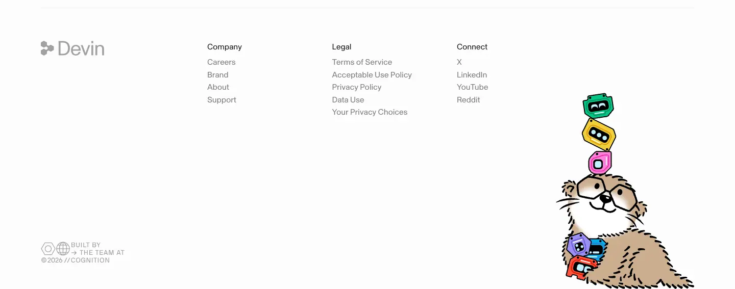
32/38.4 400 −0.64px |
16/22.4 56% ink |
labels 14/19.6 |
Enterprise (/enterprise) |
36/43.2 400 −1.08px, centred 409px |
32/38.4 400; pillar labels 16/22.4 |
16/22.4 −0.16px |
photo stats 40/44 300 white |
Note the deliberate shift: marketing pages stay at weight 400, while customer stories switch to 500 and full-strength ink #111111. Stories are reading documents; the heavier, darker setting raises contrast for long text.
04 · Layout, grid and spacing
Measured from element rectangles (data/*.json, y x w h per text node) and from max-width / padding counts (data/*.probe.json → maxw).
Container
| Token / value |
Measured |
Notes |
--grid-max-width |
1400px |
11 containers on Home have max-width: 1400px; padding-left: 60px |
--container-padding |
20px |
Mobile side gutter (H1 at x = 20 at 390px) |
--gutter |
10px |
Column gap of the CSS grid |
| Content x at 1440px |
80px (Pricing, Cloud, Customers, Bots, Blog) or 96–97px (Home, Security, inside a bordered frame) |
1440 − 1400 = 40 → 20px auto margin + 60px padding = 80px |
| Content width |
1280px (x 80 → 1360) |
Compare-plans H2 measures w = 1280 |
| Mobile |
20px side padding, single column |
|
Framed pages. Home and Security draw thin vertical hairlines at x = 80 and x = 1359 (pixel scan) that run down the whole page, with horizontal hairlines between sections (visible in images/full/home.png). Content sits 16px inside the frame (x = 96). The frame makes the page look like a technical drawing or a document column.
Grid usage
| Layout |
Columns at 1440px |
Measured |
| Two-up feature cards |
2 × 619px, gap 8px |
Home "Tests end to end" (x 97) / "Gets the best…" (x 724) |
| Three-up feature cards |
3 × 410px, gap 8px |
Home x 97 / 515 / 933; Security same |
| Zig-zag step |
text 563px + visual 607px, alternating sides |
Home steps 01–04: text at x 97 then x 736 |
| Bot template grid |
4 virtual columns, 188px text + ≈ 190px square art, staggered rows |
x 309 / 944 then 520 / 1155 |
| Customer story grid |
4 × 309px, gap 15px |
x 80 / 404 / 727 / 1051 |
| Blog grid |
3 × 416px, gap 16px |
x 80 / 512 / 944 |
| Pricing plan cards |
2 × ≈ 470px centered |
Teams x 240, Enterprise x 728 |
| Comparison table |
label col 295px + 5 × 197px |
Plans at x 391 / 588 / 785 / 982 / 1179 |
| Changelog list |
heading col 298px + list 945px |
Home "Recently shipped" |
| Security badges + list |
heading col 361px + 2 × 405px list |
|
Vertical rhythm (Home, measured y of headings)
| Section |
H2 y |
Gap from previous section end |
| Hero H1 |
140 |
nav 52px + 88px |
| Bots |
1296 |
|
| "Your teammate's favorite teammate" |
2172 |
|
| "From problem to merged PR" |
3434 |
|
| Steps 01 → 04 |
3903 / 4479 / 5054 / 5607 |
≈ 575px per step |
| Integrations |
5918 |
|
| Recently shipped |
6394 |
|
| Enterprise security |
6890 |
|
| Closing CTA |
7393 |
|
| Footer |
7845 |
|
Sections are separated by a full-width 1px hairline. Pixel scan of images/full/home.png finds hairlines at y = 582, 1082, 1147, 2103, 3373, 5857, 6333, 6829, 7272, 7780. Measured padding: ≈ 60px above each hairline (last content → line, e.g. bot grid ends 2044, line 2103) and ≈ 61px below it (line 3373 → H2 3434; 5857 → 5918; 6333 → 6394; 6829 → 6890). So a section is padding-block: 60px plus a rule, which totals ≈ 120px between topics. Inside a section the H2 → content gap is 64–96px. Small rhythm: 4 / 8 / 12 / 16 / 20 / 26 / 32px.
Why the rhythm is loose at the top and tight inside. Big gaps separate topics; tight gaps bind the heading to its visual. The reader scans headings, then dives.
Radii (counted on Home)
| Radius |
Count |
Use |
9999px (computed 3.35544e+07px) |
80 |
All buttons, nav items, chips, segmented toggle |
| 6px |
102 |
Inside mockups (rows, inputs, small cards) |
| 12px |
14 |
Mockup windows |
| 10px / 14px / 16px / 20px |
12 / 8 / 9 / 6 |
Larger mockup panels, Bots cards |
| 3.67px |
12 |
Bot template tiles |
| 4px |
9 |
Blog tags, pricing "RECOMMENDED" badge |
| 0 |
— |
Section frames, customer cards use ≈ 8px |
Rule. Marketing chrome is either fully round (pills) or square (frames). Medium radii belong to the product UI. This keeps the two layers visually separate.
Responsive
- Breakpoints in CSS: 360, 768, 940, 1024, 1025 (hover), 1960px.
- At 768px: zig-zag steps stack, 3-up cards become 2-up then 1-up, logo marquee continues.
- At 390px: everything is one column; nav collapses to logo + hamburger (60px tall, measured), bot grid becomes 2 columns, integration grid 2 columns, footer columns 2-up.

05 · Heroes
Devin uses 7 different heroes on 7 pages. They share one rule: the heading is small and the proof is big. No hero H1 is larger than 64px, and the Home H1 is only 36px.
Type A · Product-window hero (Home)
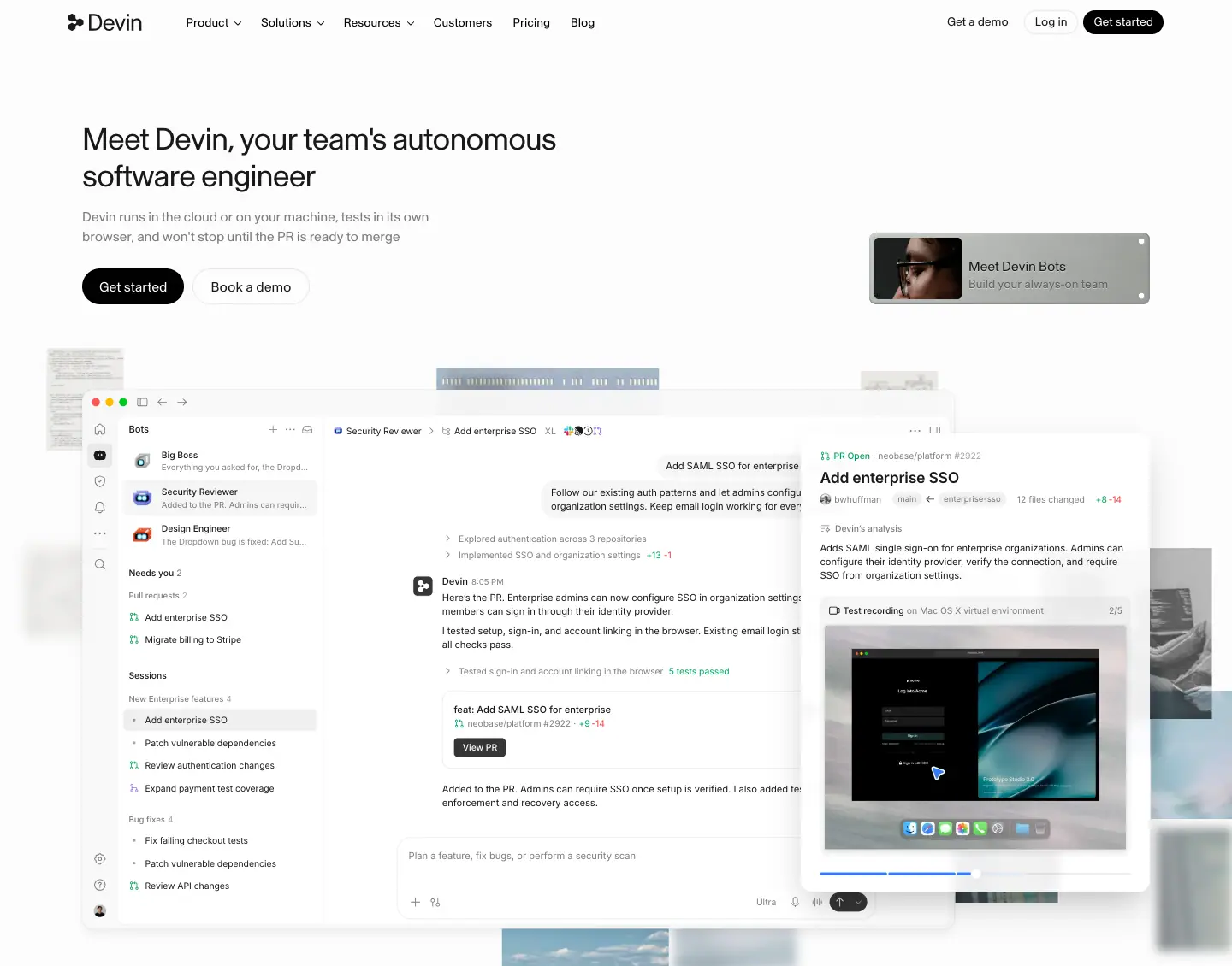
| Element |
Measured |
| H1 |
36 / 43.2px, 400, −1.08px, ink, 2 lines, w 568px, x 96, y 140 |
| Sub |
16 / 22.4px ink 56 %, w 425px, y 242 |
| CTAs |
"Get started" black pill 119 × 42 (x 96) + "Book a demo" outline pill 136 × 42 (x 225), 10px apart, y 314 |
| Promo card (top right) |
"Meet Devin Bots / Build your always-on team", 328 × 84px at x 1016, rounded 8px, with a <canvas> animated border and a 66px video thumb |
| Product window |
Full Devin app re-built in HTML: sidebar (Bots, Needs you, Sessions, Bug fixes), chat thread, composer, a floating PR panel with test-recording video. ≈ 1150 × 360px at y ≈ 470 |
| Background |
Photo collage of 32 tiles (hero-collage-box) behind the window, mix-blend-mode: multiply, panning on 8 loops of 55–242 s |
| Logo marquee |
Below the window, 21 SVG logos, 213 × 88 each, animation new-home-logo-scroll 60–114 s linear infinite |
Why. The H1 is left-aligned and modest because the window is the real headline. The visitor sees Devin working (a PR with "5 tests passed") within the first viewport. The drifting collage behind the window adds depth and a sense of "always running".
Type B · Centered title + toggle (Pricing)
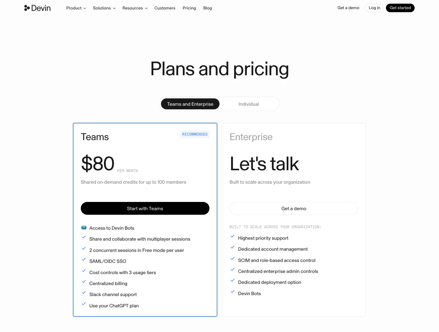
H1 "Plans and pricing" 64 / 70.4px centered at y 188. A 384px segmented toggle ("Teams and Enterprise" | "Individual"), active segment #191919 fill, sits 64px below. The plan cards follow directly; there is no sub-copy. Why. Pricing visitors already know the product. The fastest path to a number wins.
Type C · Split statement + video (Customers)
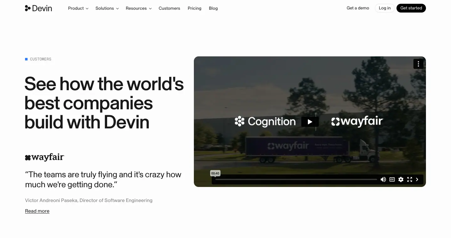
Left: mono eyebrow "■ CUSTOMERS" (12px Geist Mono, blue square bullet), H2 60.96px weight 500 (the only heavy display on the site), wayfair logo, 26.67px weight 300 blockquote, attribution 16px ink 56 %, "Read more" link. Right: 740 × 416px video card (Cognition × Wayfair). Why. A customer page leads with a real customer voice and a face. The heavier weight gives the claim "world's best companies" more authority.
Type D · Full-bleed video, dark (Bots)
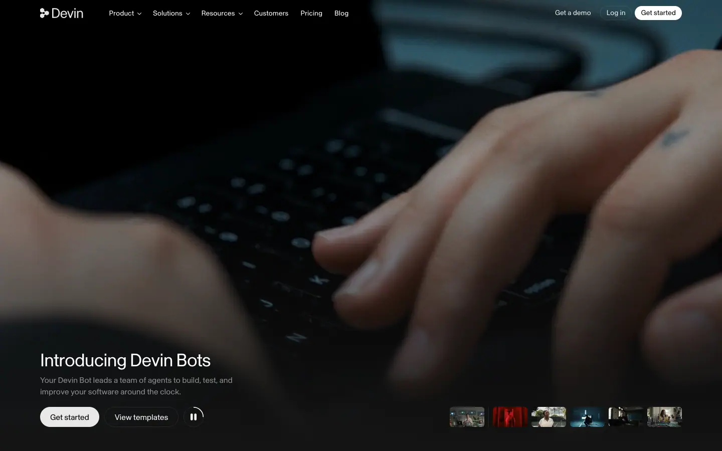
880px tall full-bleed video (DevinBots-landingpage-v2.mp4, muted, loop) of hands typing. Bottom-left: H1 36px white, sub 16px white 52 %, "Get started" (#e7e7e7 pill) + "View templates" (outline) + a circular pause button. Bottom-right: 6 video chapter thumbnails. The nav turns transparent with white text. Why. Launch energy. The human hands say "your team", and the dark page differentiates the new product line.
Type E · Title + big product stage (Cloud)
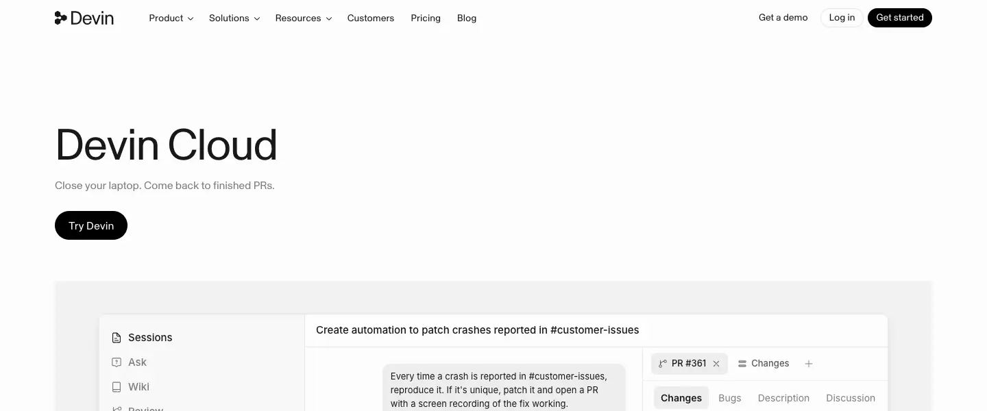
H1 "Devin Cloud" 64px left at x 80, one-line sub "Close your laptop. Come back to finished PRs." (16px ink 56 %), one black "Try Devin" pill. Below: a 1280px #f8f8f8 stage holding a 1150px app window (sessions sidebar, live step log with ticks, diff panel). Why. A product page names the product, states the benefit in 8 words, and shows it.
Type F · Split with object photo (Security)
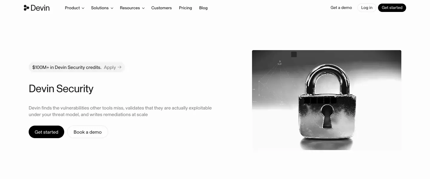
Left: credits pill "$100M+ in Devin Security credits. Apply →" (rgba(0,0,0,.04) fill, 12px, full radius), H1 36px, sub 16px ink 56 %, two CTAs. Right: 500 × 340px black-and-white macro photo of a padlock. Below: an announcement banner (embossed "Security 2.0" plate, NEW label, title, sub, "Read the post →"). Why. The padlock is a literal, instantly-read symbol. The credits pill puts the strongest offer above the H1.
Type G · Plain title (Blog)
H1 "Blog" 36 / 46.8px at x 80; right-aligned 16px sub "Read about our latest announcements." on the same baseline. Then a featured post (628px image + text). Why. An index page is a tool; the content is the hero.
Comparison
| Page |
H1 size |
Align |
Visual |
CTAs |
| Home |
36 |
left |
HTML product window + photo collage |
2 |
| Pricing |
64 |
center |
toggle + plan cards |
in cards |
| Customers |
61 (500) |
left split |
video |
link |
| Bots |
36 white |
bottom-left |
full-bleed video |
2 + pause |
| Cloud |
64 |
left |
app stage |
1 |
| Security |
36 |
left split |
photo |
2 + pill |
| Blog |
36 |
left |
featured post |
0 |
06 · Section types
Every section pattern found on the 7 pages, with measurements and the reason it exists. Close-up crops are in images/patterns/.
1. Logo marquee
Single row, 21 grey SVG logos at 213 × 88px, endless horizontal scroll (new-home-logo-scroll, 60 s / 67.5 s / 114 s linear infinite; track width 9177px). Logos are monochrome grey so no brand color competes. Why: social proof without a heading, and motion shows "the list is long".
2. Logo wall (static grid)
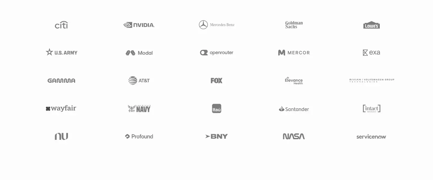
Cloud: 5 × 5 grid of grey logos (Citi, NVIDIA, U.S. Army, NASA, …), no borders, ≈ 256px columns. Why: on a product page, a dense static grid reads as "everyone", and government logos answer security doubts.
3. Bot template grid (staggered)
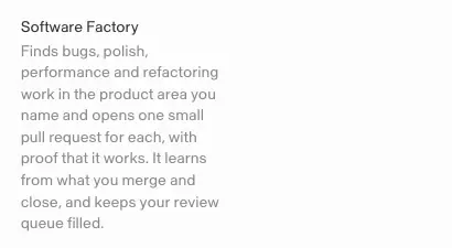
Header row: two-tone H2 left, "Learn more" + "View templates" right. Six tiles: 190px square art (3D mascot icon on #efefef-ish tile, radius 3.67px) + 188px text column (14px title ink, 14 / 19.6 description ink 56 %). Tiles alternate columns per row (x 309 / 944, then 520 / 1155), making a checkerboard. Why: a checkerboard breaks the grid monotony and gives each bot room to breathe.
4. Feature card bento (2-up + 3-up)
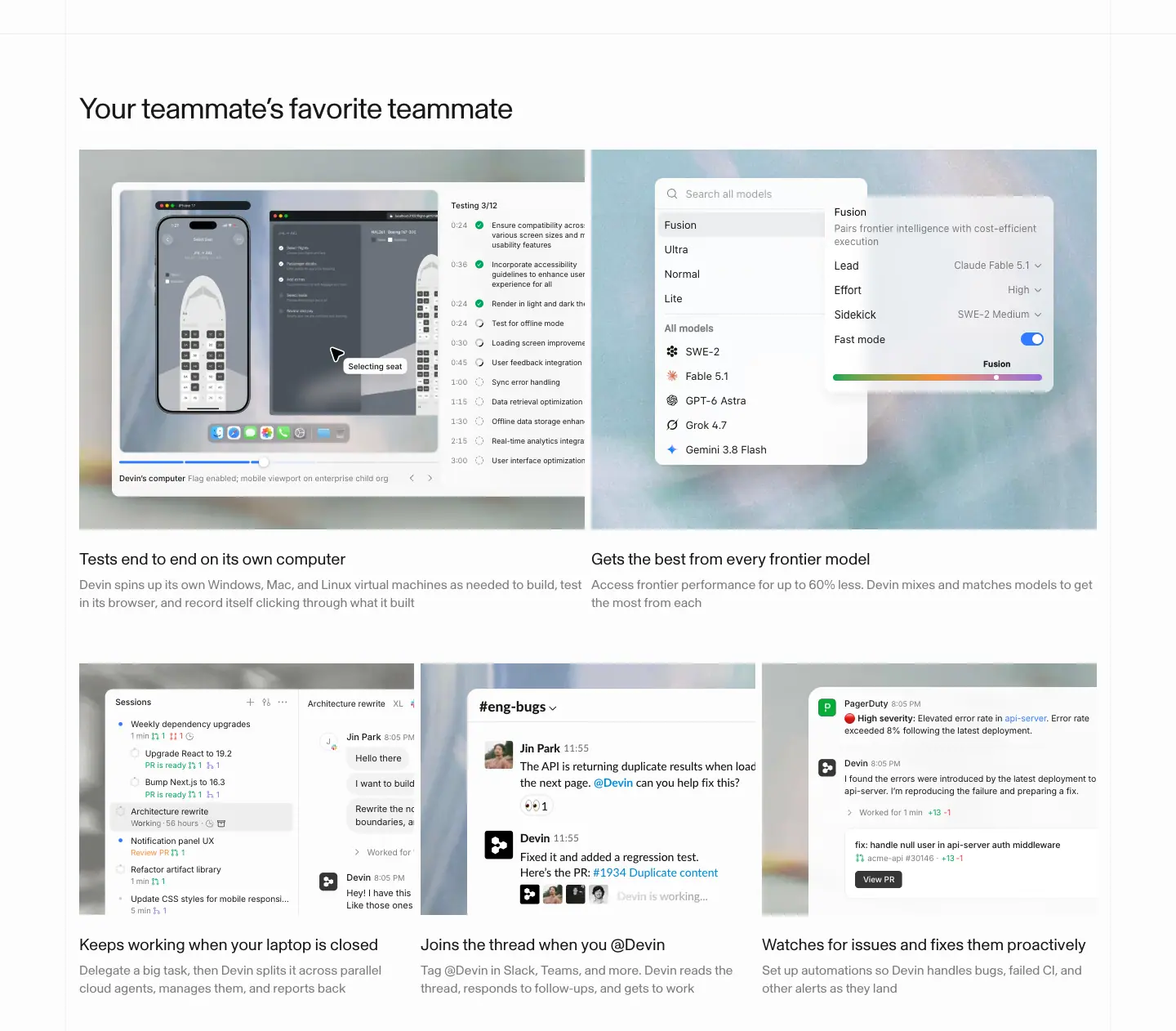
Home "Your teammate's favorite teammate": row 1 = 2 cards × 619px, row 2 = 3 cards × 410px, 8px gaps. Each card = a photo backdrop (≈ 528px tall on 2-up, 308px on 3-up) with a floating HTML mockup, then H3 20px + 16px grey copy below the image (not inside a box). Why: two widths create a bento rhythm without card chrome. Copy sits outside the visual so it stays readable.
5. Zig-zag numbered steps
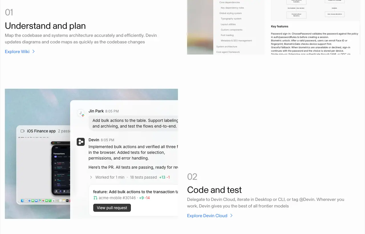
"From problem to merged PR": 4 rows, each 607px visual + 563px text, sides alternate (text left, right, left, right). Text block sits bottom-aligned to the visual: "01" (32px ink 40 %), H3 32px, 16px grey copy, blue link "Explore Wiki >". Row pitch ≈ 575px. Why: numbers turn features into a workflow (plan → code → review → automate). Alternation keeps the eye moving down.
6. Integration grid

4 × 2 cells, each ≈ 311px wide with a 1px left hairline: grey tool icon (Slack, GitHub, PagerDuty, Sentry, Teams, Linear, Jira, Notion) and a 16px ink-40 % caption describing the job, not the tool ("Fix CI when it fails"). Why: captions sell outcomes. Grey icons keep it calm.
7. Changelog list ("Recently shipped")
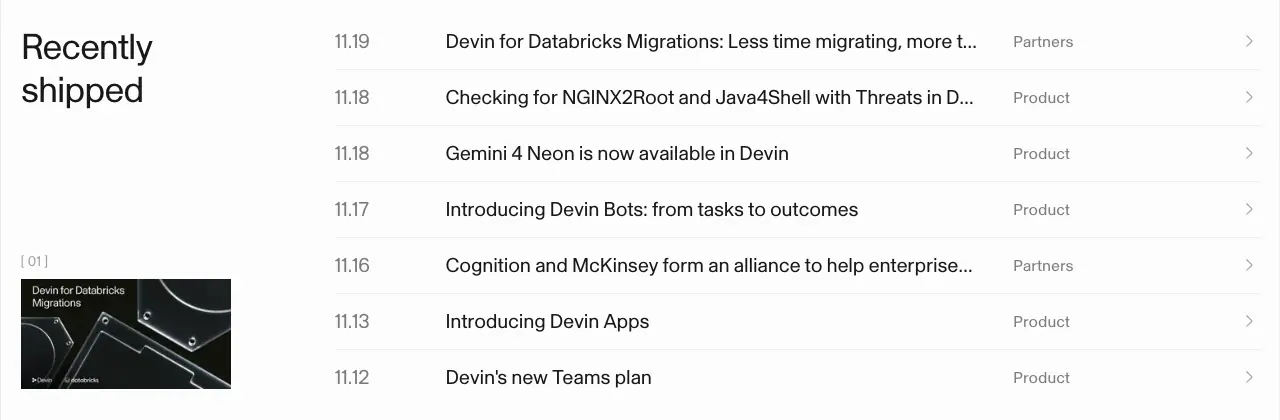
Left column: H2 "Recently / shipped" + a 210 × 110 cover image of the first post with a "[ 01 ]" caption (14px ink 40 %), which indexes the list row it illustrates. Right: 7 rows, grid 75px | 1fr | 106px | chevron: date "11.19" (20px ink 56 %), title (20px ink), category (16px ink 56 %). Rows 56px apart, 1px rgba(0,0,0,.06) dividers, hover turns text #317cff. Why: shipping velocity is proof. A dense list shows 7 launches in one week.
8. Trust block (badges + bullet list)
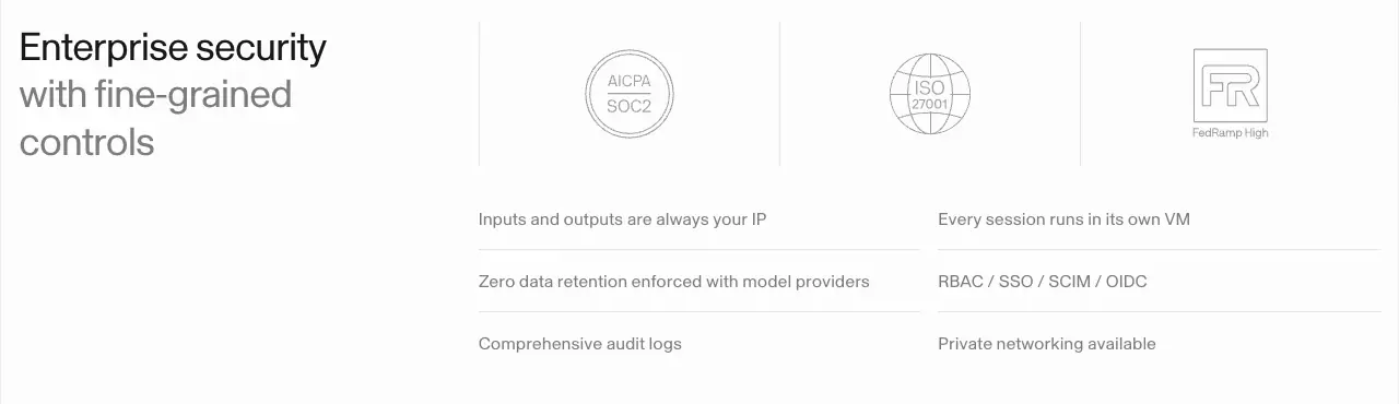
Left: two-tone H2 (ink + ink 56 %) in a 361px column. Right: three 140px badge cells (SOC 2, ISO 27001, FedRAMP High, drawn as grey line art) separated by hairlines, then a 2-column list of 6 items, 16 / 24px ink 56 %, hairline between rows. Why: enterprise checklist in one glance; no marketing copy needed.
9. Two-tone closing CTA
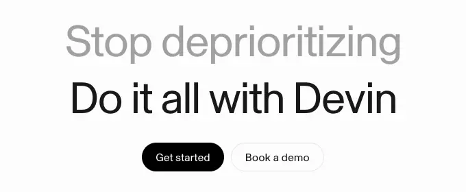
Centered, 64 / 70.4px: line 1 grey (ink 40 %) "Stop deprioritizing", line 2 ink "Do it all with Devin", 31px to the pill pair. Security inverts the colors ("Every second counts" ink / "Do it all with Devin" grey). Customers turns line 1 electric blue #2200ff at weight 500. Why: the problem/answer pair ends every page with the brand promise.
10. Plan cards
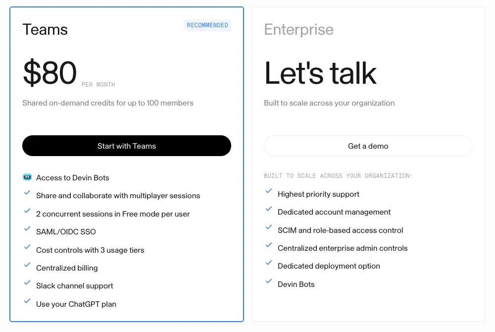
Two white cards, 1px border; recommended card gets a #317cff border and a mono "RECOMMENDED" badge (rgba(49,124,255,.08) fill). Name 32px, price 64px + "PER MONTH" mono, 16px grey sub, full-width 42px CTA, check list 16px with 36px row pitch. Enterprise name is ink 40 % and price is "Let's talk". Why: two choices only (team vs enterprise); individuals are behind the toggle.
11. Comparison table
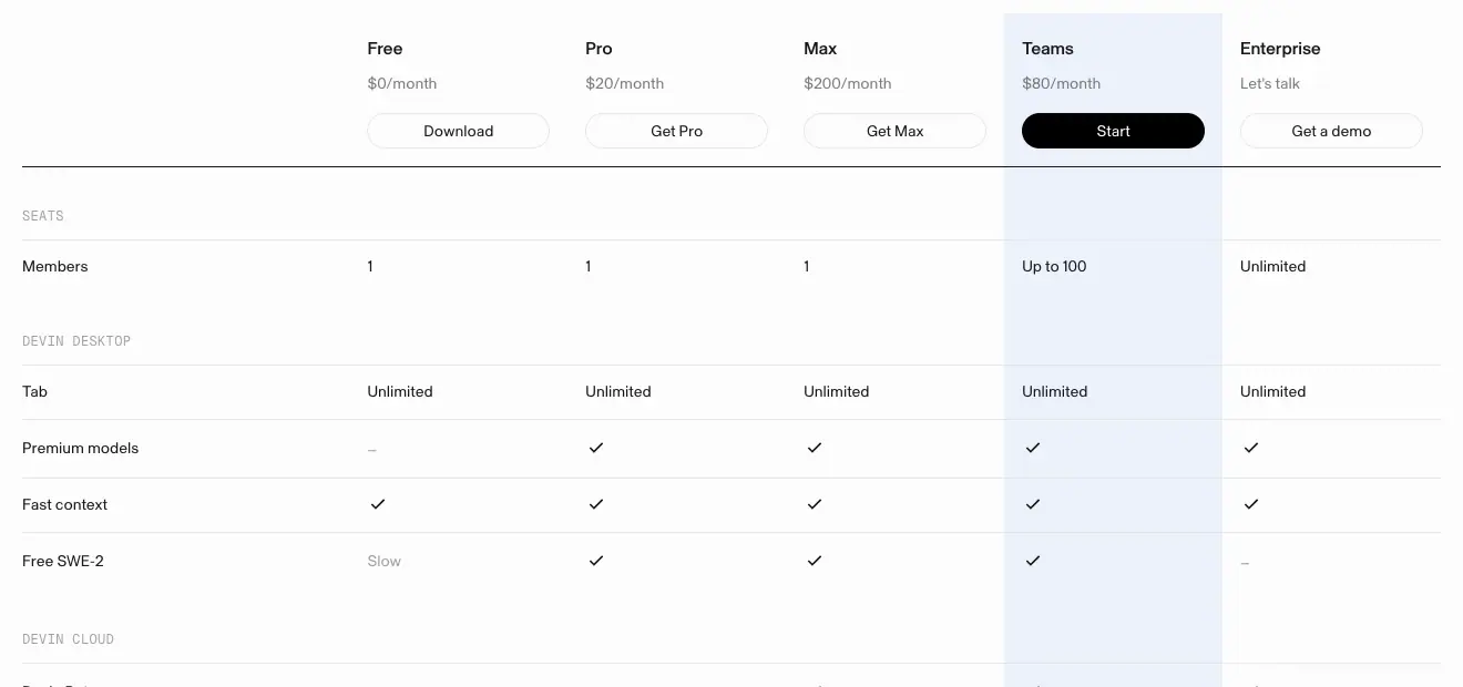
5 plan columns × 197px. Header: name 16px 500, price 14px grey, 32px pill CTA (only Teams is black). The Teams column has a continuous rgba(49,124,255,.08) tint from header to last row. Group labels in mono 12px ink 40 % ("SEATS", "DEVIN DESKTOP", "INTEGRATIONS"). Rows 14px, ≈ 51px pitch, hairlines; "–" for no, a check for yes. Why: the tinted column guides the eye to the plan Devin wants you to buy.
12. FAQ accordion
Two forms:
- Dark panel (Pricing,
images/patterns/faq-dark-accordion.png): black 1280px panel, 64px title in #e7e7e7, rows 20px white with "+" / "−" icons, answer 14px grey. Accordion animates grid-template-rows in 0.2s cubic-bezier(0,0,.2,1).
- Light split (Security): "FAQ" H2 left in a 591px column, questions 18 / 23.4px right with "+" and hairlines.
Why: the black panel on Pricing is a deliberate weight change before the footer; it marks "questions answered, you can decide now".
13. Customer story card grid
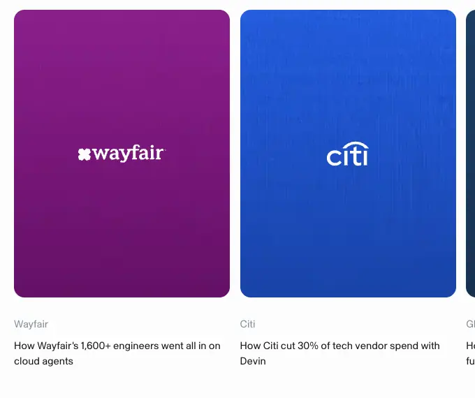
4 columns × 309px; card = 309 × 413px portrait tile filled with a noisy vertical gradient in the customer's brand color and a centered white logo, then mono-ish company name 14.76px #818f9a and a 14.76 / 22.1px title. Filter chips above (pill, 37px tall, 15px, rgba(0,0,0,.15) border). Why: 40+ logos in color make the scale of adoption physical. Same layout per card keeps it a catalog.
14. Stats wall (staggered tiles)
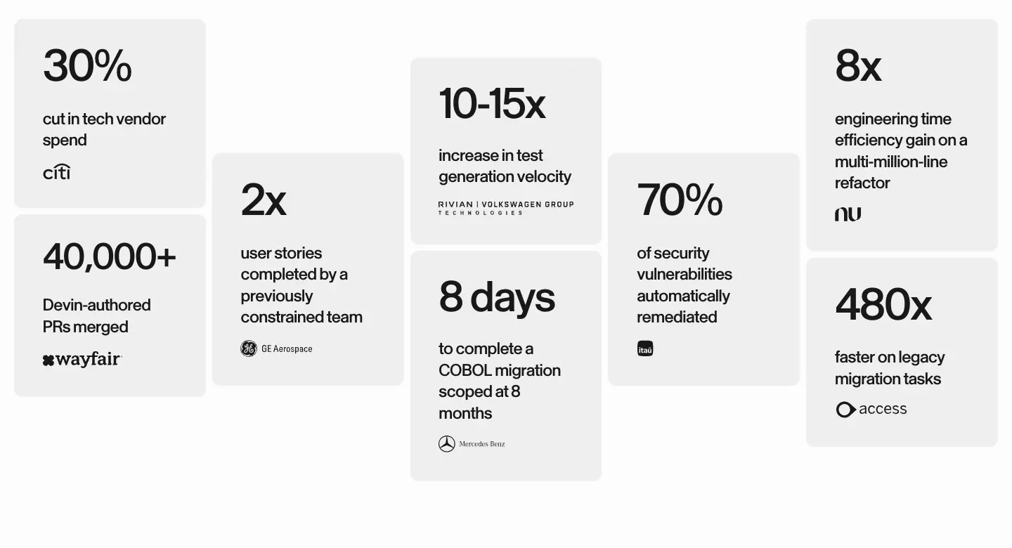
10 grey tiles (≈ 270px wide, #efefef fill, 8px radius) in 5 columns with vertical offsets: numeral 64 / 74.4px weight 500, −2.56px; label 24 / 30.6px 500; a small customer logo. Why: the staggered "skyline" turns numbers into a visual and each claim is attributed.
15. Sticky use-case tabs with stat cards (Cloud)
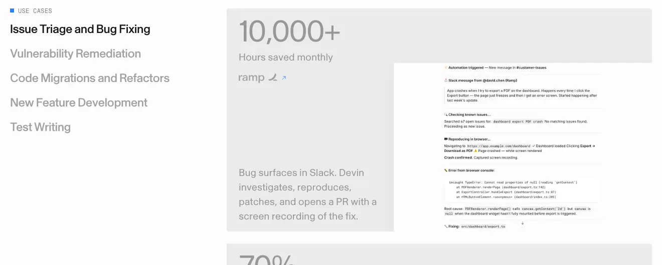
Left: mono "■ USE CASES" + 5 tab labels 24 / 28.8px weight 500 (active ink, others ink 40 %). Right: stacked 848px grey cards, each with a 60px stat ("10,000+"), 20 / 30px label, customer logo with ↗, a 20 / 29px description, and a product screenshot cropped at the bottom-right. Scrolling activates the matching tab. Why: one section covers five use cases without five sections.
16. Feature bento with eyebrow (Cloud)
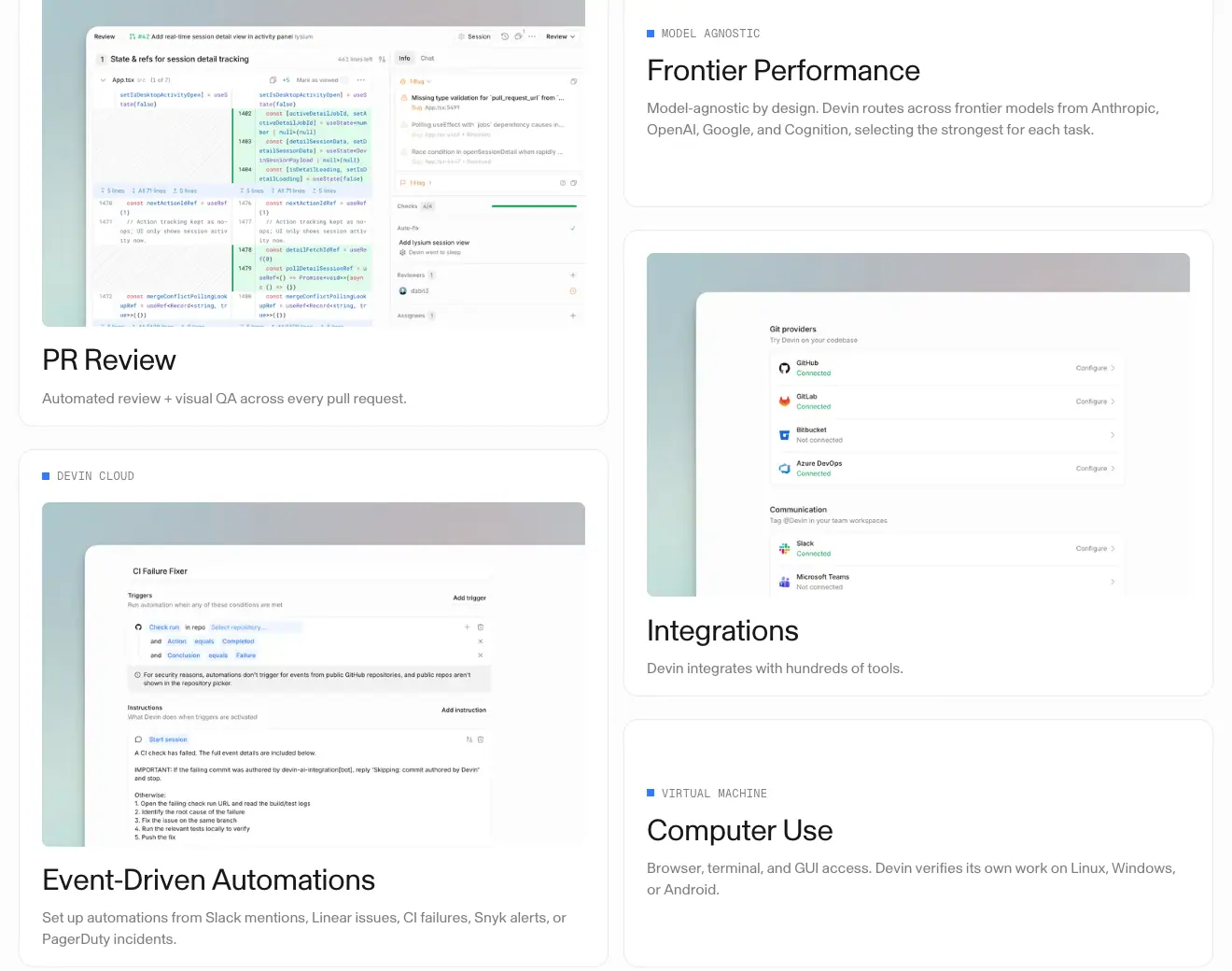
2 columns × 640px, white cards with 1px border: some with a top screenshot (PR Review, Event-Driven Automations, Integrations), some text-only with a mono eyebrow ("■ MODEL AGNOSTIC", "■ VIRTUAL MACHINE"). H3 32px + 16px grey. Uneven heights create a masonry bento. Why: mixes heavy and light cards so the grid does not feel uniform.
17. Tabbed product showcase (Cloud)
"Cover every mode of development work": centered 36px H2 + grey sub, a 3-tab underline switcher (Devin Cloud / Desktop / CLI; active tab has a 2px #317cff top bar), then a 1280px grey stage with the app window and a 14px caption.
18. Dark feature cards (Bots)
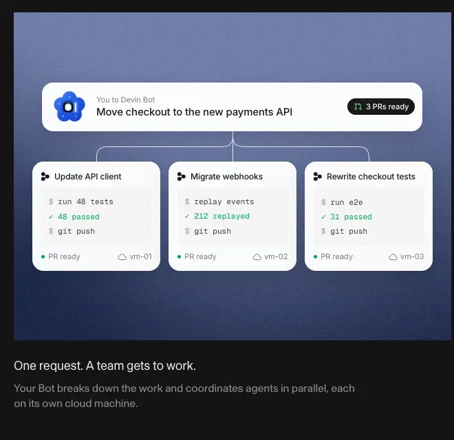
2 × 640px cards with saturated, grainy gradient backgrounds (slate blue, sage green, wine, olive, grey, violet) and a white floating mockup; caption below in 18px white 90 % + 16px white 52 %. Why: on dark, color backdrops replace the photo vellum.
19. Testimonial carousel (Bots)
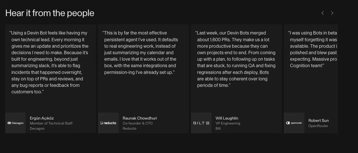
Cards 350px wide, #1d1f20, 18 / 25.2px quote, logo tile + name + title at the bottom, horizontal scroll with ‹ › arrows, last card cut off at the right edge to signal "more".
20. Gradient CTA banner (Bots)
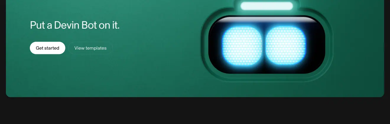
≈ 1280 × 410px rounded panel (pixel-measured), deep green gradient, H2 36px #f7f7f5 "Put a Devin Bot on it.", two buttons, and a huge glowing bot face on the right.
21. Announcement banner (Security)

1280 × 140px light-grey panel: embossed metal "Security 2.0" image, mono "NEW", 20px title, 16px grey sub, "Read the post →" right. Why: a news slot under the hero that can be swapped weekly.
22. Quote card (Security)
Itaú: 1280px white card, company name + logo left, 24px ink statement right ("When SonarQube or Fortify or Veracode flags an issue, Devin automatically analyzes and fixes it…"), "Read the Itaú story ↗" link.
23. Blog featured post + filter + card grid
See Blog: 628px image + 32px title, mono tag filter (rgba(0,0,0,.06) chips, 4px radius, 12px Geist Mono uppercase; active = #317cff on rgba(49,124,255,.08)), 3-column cards with 416 × 234px cover, mono tag, 20px title, 16px grey excerpt, mono date + read time.
07 · Copywriting and voice
All copy quoted verbatim from the captured DOM (data/*.json → heads, texts).
Voice in four words
Plain, concrete, outcome-first, calm. Devin is described as a colleague ("your team's autonomous software engineer", "Your teammate's favorite teammate"), never as "AI-powered magic". There are no exclamation marks in marketing copy and almost no adjectives.
Headline formulas
| Formula |
Examples |
Why it works |
| Problem, / outcome. (two-tone) |
"From problem to merged PR, / Devin gets hard engineering work done." · "Most findings don't matter / Find and fix the ones that do" · "Connect once, deliver repeatedly / with your favorite tools" |
Grey half sets context, ink half promises a result |
| Imperative closer |
"Stop deprioritizing / Do it all with Devin" · "Every second counts / Do it all with Devin" · "Put a Devin Bot on it." |
Ends every page on an action |
| Meet + role |
"Meet Devin, your team's autonomous software engineer" · "Meet Devin Bots. Build, test, and ship while you sleep." |
Personifies the product as a hire |
| Verb phrase card titles |
"Tests end to end on its own computer" · "Keeps working when your laptop is closed" · "Joins the thread when you @Devin" · "Watches for issues and fixes them proactively" |
Every feature is something Devin does, third person, present tense |
| Job-to-be-done captions |
"Triage bugs as they land" · "Fix CI when it fails" · "Assign a ticket, get a PR" · "Build from a spec page" |
Integration grid sells outcomes, tools are implied by icon |
| Short pairs |
"You set the direction. Your Bots own the outcome." · "One request. A team gets to work." · "Text a change. Call for an update." |
Two short sentences = rhythm, used on Bots |
| Promise in 8 words |
"Close your laptop. Come back to finished PRs." |
Cloud sub-head, entire value prop |
Sub-copy rules
- One sentence, ≤ 25 words, ends without a period on Home cards ("Devin spins up its own Windows, Mac, and Linux virtual machines as needed to build, test in its browser, and record itself clicking through what it built").
- Names the mechanism: "splits it across parallel cloud agents, manages them, and reports back".
- Numbers where possible: "up to 60% less", "$100M+ in Devin Security credits", "~70% of vulnerabilities are resolved automatically".
Proof copy
- Stats always carry an owner: "30% cut in tech vendor spend — Citi", "40,000+ Devin-authored PRs merged — wayfair", "8 days to complete a COBOL migration scoped at 8 months — Mercedes-Benz".
- Story titles follow "How {Company} {did measurable thing} with Devin": "How Citi cut 30% of tech vendor spend with Devin".
- Quotes are conversational: "The teams are truly flying and it's crazy how much we're getting done."
Mockup copy is real copy
Mockups contain believable engineering content: "feat: Add SAML SSO for enterprise · neobase/platform #2922 · +9 −14", "fix: handle null user in api-server auth middleware", "JWT signature check is skipped when the key is cached". Why: engineers read mockups closely; fake lorem ipsum would break trust.
CTA vocabulary
| CTA |
Where |
Audience |
| Get started |
Nav, Home, Security, Bots |
self-serve |
| Book a demo / Get a demo |
Home, Security, Pricing, nav |
enterprise |
| Try Devin |
Cloud |
product-page variant |
| Start with Teams / Start |
Pricing |
plan-specific |
| Learn more / View templates |
Bots blocks |
exploration |
| Explore Wiki / Explore Devin Cloud / Explore Devin Review / Explore Security Swarm |
Step links |
deeper product pages |
| Contact sales |
Cloud org block |
enterprise |
| Read the post → / Read more / Read the Itaú story ↗ |
content |
|
Labels
Mono uppercase labels are nouns, 1–3 words: "CUSTOMERS", "USE CASES", "MODEL AGNOSTIC", "VIRTUAL MACHINE", "RECOMMENDED", "PER MONTH", "DEVIN ON YOUR TEAM", "ENTERPRISE". They label; they never sell.
08 · Components
Measured from computed styles (data/*.json → btns) and from the Tailwind class lists read off the live elements.
Navigation bar


| Property |
Value |
| Height |
52px desktop, 60px mobile |
| Position |
fixed, z-index: 1000, stays put on scroll (transform none after scrolling 1500px) |
| Background |
#fcfcfc on light pages; transparent over the Bots video |
| Border / blur |
none / none |
| Left |
Devin logo (mark + wordmark) at x 80, then Product ▾, Solutions ▾, Resources ▾, Customers, Pricing, Blog — 14px / 1.4, weight 400, items are 28px-tall pills with 12px side padding |
| Right |
"Get a demo" (text button), "Log in" (outline pill, rgba(0,0,0,.08) border), "Get started" (black pill) — all 28px tall, 14px |
| Nav item hover |
hover:bg-tint-secondary = rgba(0,0,0,.06) pill, transition: none |
Why: a 52px solid bar is the lightest possible chrome that still guarantees contrast over photo-heavy sections.
Buttons

| Variant |
Size |
Fill |
Text |
Border |
Hover |
| Primary (large) |
h 42px, px 20px |
#000 (--text-primary-strong) |
#fff 16px / 400 |
none |
opacity: .8, instant (transition: none) |
| Secondary (large) |
h 42px, px 20px |
transparent |
#191919 16px |
1px rgba(0,0,0,.08) |
fill rgba(0,0,0,.06) |
| Primary (nav) |
h 28px, px 12px, pb 1px |
#000 |
#fff 14px |
— |
opacity .8 |
| Table CTA |
h 32px |
outline or black |
14px |
1px rgba(0,0,0,.08) |
|
| Plan CTA |
h 42px, full card width (422px) |
|
|
|
|
| Dark page primary |
h 40–42px |
#e7e7e7 / #fff |
#000 |
|
|
| Dark page secondary |
|
transparent |
white |
1px white 8 % |
|
| Focus |
focus-visible:outline-2 outline-offset-2 (4 on secondary), outline-current |
|
|
|
|
All buttons: border-radius: 9999px, Skandia 400, white-space: nowrap, [text-box: normal].
Why instant hover: a button is a control. Devin's site behaves like the app — no easing on feedback.
Text link with chevron
16 / 22.4px, #317cff, no underline, gap: 4px to a chevron icon. Used for "Explore …" step links and "Access the Trust Center".
Pills, chips, tags
| Component |
Measured |
Image |
| Credits pill (Security) |
h 34px, pad 6px 10px, fill rgba(0,0,0,.04), 12px text + grey "Apply →" |
images/patterns/announcement-pill.png |
| Use-case chip (Customers) |
h 37px, pad 10px 20px, 15px, fill #fcfcfc, border rgba(0,0,0,.15), full radius |
images/patterns/use-case-chips.png |
| Blog tag filter |
h 24px, pad 0 6px, radius 4px, Geist Mono 12px uppercase +0.36px; idle rgba(0,0,0,.06) / ink, active rgba(49,124,255,.08) / #317cff |
images/patterns/blog-filter-tags.png |
| Recommended badge |
Geist Mono 12px #317cff on rgba(49,124,255,.08), radius 4px |
|
| Segmented toggle |
384px pill, 2 segments × 192px, h 36px; active #191919 fill + white text, idle text ink 56 % |
images/patterns/segmented-toggle.png |
| Eyebrow |
6px blue square + Geist Mono 12px uppercase ink 56 % |
|
Cards
| Card |
Measured |
| Promo card (Home hero) |
328 × 84px, 8px radius, <canvas> animated edge, thumbnail video, 16px title + 14px grey sub |
| Feature card |
no chrome: image block + text below |
| Bot template tile |
190px square art on light tile (3.67px radius) + text column, opacity: .9 |
| Plan card |
white, 1px border, ≈ 470px wide, 32px padding |
| Customer story card |
309 × 413px gradient tile + 2 text lines |
| Stat tile |
#efefef, ≈ 270px wide, ≈ 8px radius, 20px padding |
| Blog card |
416px cover (≈ 234px tall), mono tag, 20 / 26 title, 16 / 24 excerpt, mono date |
| Bento card (Cloud) |
white, 1px rgba(0,0,0,.08) border, ≈ 12px radius, screenshot top |
| Testimonial (Bots) |
350px, #1d1f20, quote 18px |
Lists and tables
- Changelog row: grid
75px 1fr 106px max-content, gap-x: 36px, padding: 15px 0 16px, top border rgba(0,0,0,.06), hover text → #317cff.
- Check list (plans): 16px ink rows, 36px pitch, a small blue check icon.
- Comparison table: see 06 §11.
Accordion
Rows separated by hairlines, question 18–20px, "+" icon at right that becomes "−". Body opens by animating grid-template-rows (0fr → 1fr) in 0.2s cubic-bezier(0, 0, .2, 1).
Product mockup kit (Inter)
The mockups share a mini design system:
| Element |
Style |
| Window |
white, 12px radius, --shadow-L2, macOS traffic lights |
| Sidebar row |
13 / 18px Inter 400, −0.065px; section labels 12 / 16 weight 500 ink 56 % |
| Message author |
14 / 20 Inter 500; timestamp 12px ink 56 % |
| Message body |
14 / 20 Inter 400 |
| PR card |
title 14px 500, repo neobase/platform #2922 ink 56 %, +9 green, −14 red, dark "View PR" mini button 13px |
| Status |
"PR Open" / "Open" green 13px 500; "Review PR" orange |
| Big PR title |
22 / 28 Inter 600 −0.33px |
| Code |
SFMono 12 / 18, GitHub light syntax colors (#d73a49 keywords, #005cc5, #6f42c1, #032f62 strings, #6a737d comments) |
| Working dot |
animation session-working-dot 1s linear infinite (48 instances on Home) |
Footer
See Shared header and footer.
09 · Art direction and imagery
Image sources read from img.currentSrc (data/*.json → media). Style descriptions come from the screenshots in images/.
The overall look
"Engineering document on good paper, with photographs pinned behind it." Calm off-white surfaces and thin rules carry the information. Warmth and depth come from three image families placed behind or beside the content, never on top of it.
1. Vellum photo backdrops
Files: graphic-backgrounds/vellum-blur-2.webp, bg-1.jpg … bg-6.jpg, frontier-models/background-1/2/3, automate/background.jpg.
- Soft, out-of-focus photographs (sky, water, frosted glass) in cool blue-grey and pale teal.
- Low contrast and desaturated, so white mockups stay the brightest object.
- Every feature card on Home uses one (e.g. 619 × 528px behind the VM mockup, 410 × 308px behind the 3-up cards).
Why. Pure white mockups on a pure white page lose their edges. A blurred photo adds separation without shadows or borders, and the "frosted" feel matches the cloud/automation story.
2. Hero photo collage
32 tiles (hero/collage/horizontal-*.webp, square-*.webp) placed around the product window, mix-blend-mode: multiply, each panning slowly (see 10). Subjects: landscapes, architecture, people at desks, desaturated.
Why. It suggests a living world around the product (the "team") while multiply blending pushes the photos back into the paper.
3. Rebuilt product UI
All app imagery is live HTML/CSS: sidebars, threads, PR panels, code review, schedulers, model pickers, Slack and PagerDuty messages. Only video recordings inside them (review/recording.webp, code-test/recording-*.png) are raster.
Why. Sharp at any DPI, editable copy, can animate step by step, and every mockup matches the real app because it uses the app's font (Inter) and status colors.
4. 3D bot mascots
Eight glossy, toy-like 3D robots (cyan, red-orange, green, lavender hexagon, silver capsule, pink, cobalt flower, yellow) with glowing white-blue "eyes". Also as flat 2.5D icon tiles (Software Factory, Android Engineer, Chief of Staff, Latency Optimizer, Product Engineer, QA Engineer) with a white pictogram on a black screen inside a colored bezel.
Why. Bots are a team of agents; giving each one a body makes "a team" tangible and memorable. The soft plastic style keeps AI agents friendly rather than threatening. Color codes each role.
5. The otter
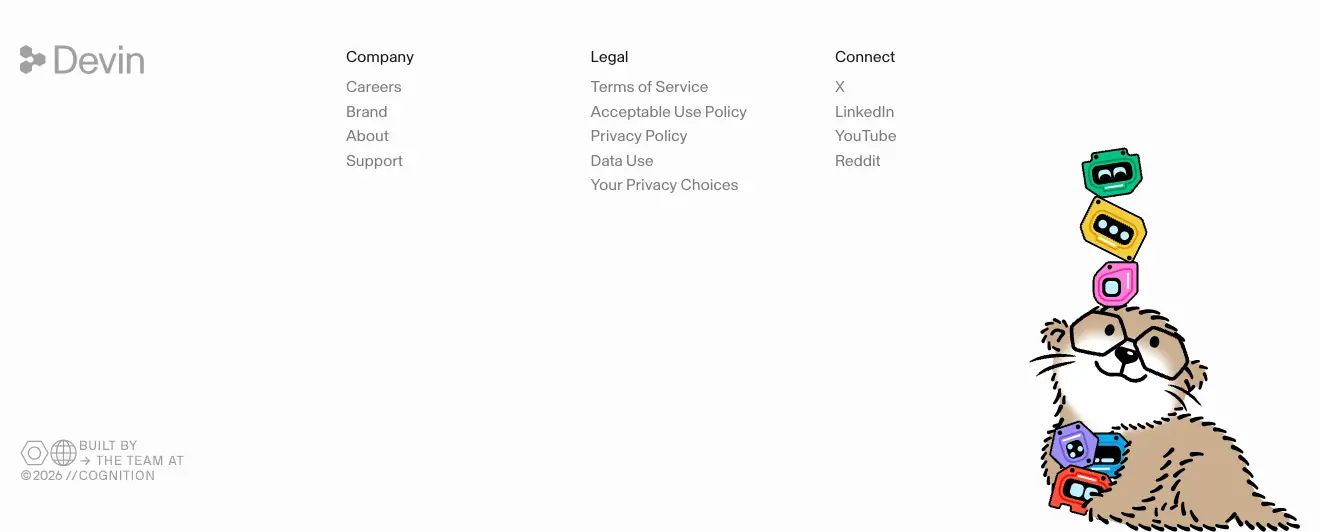
An illustrated otter (brown fur, round glasses, line-art whiskers) holding and balancing stacked bot heads in the bottom-right of every footer (footer/otter/body.svg, pupils.svg, paw.svg, layered). Keyframes otter-hop, bubble-pop, wiggle, bounce, shimmy, jelly, flip exist for it.
Why. A mascot that rewards people who scroll to the end. The pupils are a separate SVG layer, which lets them move independently of the body. It is the most playful element on the site and it is placed where it cannot distract from conversion.
6. Customer brand cards
Each story card is a full-bleed portrait tile with a noisy vertical gradient in the customer's own brand color (Wayfair purple, Citi blue, Itaú orange, Nubank violet, Linktree green) and a centered white logo.
Why. Turns a logo list into a color field that feels like an art wall; each customer is recognisable from color alone. Grain keeps flat gradients from looking cheap.
7. Object photography and embossed graphics
- Security: black-and-white macro photo of a padlock; "Security 2.0" embossed metal plate.
- Blog covers: frosted-glass hexagons ("Security / Threats"), translucent acrylic shapes (Databricks), embossed bot face on white (Teams plan), grainy blue-grey title cards for model launches ("Gemini 4 Neon").
Why. Physical, tactile objects in monochrome give abstract topics (security, migration) a concrete feel and match the grey palette.
8. Bots page: grainy color fields
Feature cards on Bots use saturated grainy gradients (slate blue, sage, wine, olive, grey vignette, violet) instead of photos. The closing banner is a deep green field with a giant glowing bot face.
9. Logo and wordmark usage (from devin.ai/brand)
Captured 2026-11-21 (data/brand.json, full page images/full/brand.png).
| Asset |
What the page offers |
Crop |
| Devin wordmark + symbol |
Light and Dark toggles; downloads in SVG, PNG, EPS per lockup |
 |
| Cognition wordmark + symbol |
Same layout: the parent company gets equal billing |
 |
| Logo reveal |
"The Devin wordmark in motion. Select to play." Video preview 485×113 (DEVIN_WORDMARK_IN_LIGHT-preview.mp4); downloads MP4, MOV, AEP (the After Effects source) |
 |
| Brand kit |
One black pill "Download brand kit" (178×42, radius 9999px, 16px) · "All formats & source files · ZIP, 44 MB" |
— |
Observed rules (from the page and from usage across the site):
- Monochrome only. Every mark is pure black on white or white on black; no brand colour version exists.
- The symbol is three hexagonal "cells" joined (Devin) or a cluster of rounded cells (Cognition). Both read at favicon size because the cells are solid, not outlined.
- Wordmark and site type are related: the "Devin" wordmark is set in a grotesk close to Skandia, so the logo and headlines feel like one voice.
- Motion is part of the identity. Shipping the AEP source means partners can reuse the exact reveal timing instead of inventing their own.
- The page states no clear-space or minimum-size rule. Only the downloads and the light/dark pairing are specified.
Why: a short, download-first brand page tells press and partners "take the originals". Offering After Effects source files is unusual and signals that motion is a first-class brand asset.
10. Enterprise photography
/enterprise opens with a carousel of 512×288 photo cards (12 IMG nodes, looping horizontally) of executives and engineers, each with a big light-weight stat on top ("5x", "70%", "8 months → 8 days" at 40px / 44px, weight 300, #ffffff) and a gradient scrim linear-gradient(to top, oklab(0 0 0 / .52) 0%, …) (12 nodes).
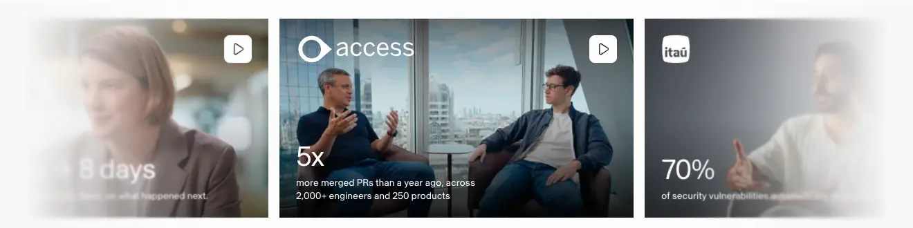
Why: enterprise buyers trust peers. Real people plus one number per photo turns case studies into a billboard. The 300 weight keeps the numbers elegant rather than shouty.
Iconography
- Integration icons: monochrome grey brand glyphs ≈ 24px.
- UI icons: thin-stroke (≈ 1.5px) line icons in mockups.
- Compliance badges: grey line drawings (circle seals for SOC 2 / ISO, square "FR" for FedRAMP).
Rules to copy
- Keep imagery behind or beside content, never under text.
- Desaturate photos so the UI stays the brightest thing.
- One playful asset per page, placed at the edges.
- Use the customer's color, not yours, when showcasing customers.
10 · Motion and interaction
Measured with getComputedStyle on every element (transition-*, animation-*) and by reading every @keyframes rule (data/home.probe.json, data/bots.probe.json, data/pricing.probe.json). Hover values come from the elements' Tailwind classes and computed styles.
Global timing tokens
| Token |
Value |
--default-transition-duration |
150ms |
--default-transition-timing-function |
cubic-bezier(.4, 0, .2, 1) (ease-in-out, Tailwind default) |
--ease-out |
cubic-bezier(0, 0, .2, 1) |
Transition inventory (Home, count of elements)
| Property |
Duration |
Easing |
Count |
Used for |
| color, background-color, border-color… |
150ms |
(.4,0,.2,1) |
12 |
links, list rows |
| opacity |
150ms |
(.4,0,.2,1) |
6 |
fades in mockups |
| transform |
100ms / 150ms |
ease-out (0,0,.2,1) |
5 |
press / small moves |
| scale, opacity |
150ms |
ease-out |
2 |
popovers |
| opacity |
300ms |
(.4,0,.2,1) |
1 |
|
| opacity |
1.8s, each with its own delay 0.02–2.9s |
ease-out |
≈ 32 |
hero collage tiles fading in one by one at load |
| buttons |
transition: none (duration 200ms declared but property none) |
— |
all CTAs |
instant hover |
Bots page adds: box-shadow 300ms (60 elements), colors 100ms ease-out (44), opacity, translate, scale 500ms ease-out (30, mockup entrances), all 200ms (12).
Pricing adds: grid-template-rows 200ms ease-out (accordion), translate 150ms ease-out (toggle thumb).
Keyframe animations
| Name |
Duration |
Timing |
What it does |
hero-collage-pan |
55s, 73s, 92s, 110s, 121s, 161s, 202s, 242s |
linear, infinite |
8 layers × 4 tiles drift horizontally at different speeds = parallax |
new-home-logo-scroll / legacy-marquee |
60s, 67.5s, 114s |
linear, infinite |
Logo marquee, translate(0) → translate(-50%) on a duplicated track |
session-working-dot |
1s |
linear, infinite |
"Working" indicators in mockups (48 elements) |
home-bento-button-pulse |
— |
— |
opacity .1 → 0, scale 1 → 1.75: ripple on a play/hotspot button |
shine |
— |
— |
background-position 100% → -100%: text shimmer for "Devin is working..." |
bots-gravity-drift / lift / scale / hang |
22s, 26s |
custom linear(…) curves with 24 stops |
Floating bot mascots drift and sway as if weightless |
bots-wave |
0.9s |
ease-in-out, infinite |
Bot waving hand |
otter-hop, bubble-pop, wiggle, bounce, shimmy, jelly, flip, spin |
— |
— |
Footer otter reactions |
mine-explode, mine-particle, mine-trail-fade, mine-tired |
— |
— |
Declared mine-* keyframes (explosion, particles, trail). The trigger was not found during capture; it reads as an Easter-egg game |
triage-stream, remediate-sequence, finding-path |
— |
— |
Security mockups: animate CSS custom properties (--security-triage-progress 0 → 1) to drive step-by-step UI |
review-highlight |
— |
— |
background-size 0 → 100%: highlight sweeps across a code-review sentence |
pulse, spin |
— |
— |
Loaders |
Notable technique. The Security mockups animate registered custom properties (@property) instead of transforms. One number drives many child styles, so a multi-step product demo is pure CSS.
Notable technique 2. Bots uses CSS linear() easing with 24 stops to approximate physics curves (drift slows near the top, like gravity) without JavaScript.
Scroll behaviour
- No scroll-triggered reveal on headings or copy. Measured: below-the-fold H2/H3/images have
opacity: 1 and identity transform before scrolling.
- Mockups animate in place (bots page entrances use 500ms opacity/translate/scale with ease-out).
- Nav is fixed and never hides.
- Cloud use-case tabs are sticky and switch as their card scrolls into view. Measured: at scroll 1650 the tab list sits at top 153px with "Issue Triage" in ink; at scroll 3300 it is still at 153px and "Test Writing" is ink while the others are ink 40 %.
Why no reveals. Static text loads fast, stays readable for scanners and screenshotters, and looks confident. Motion budget goes to the product demos.
Hover and press
| Element |
Hover |
| Primary pill |
opacity: .8, instant |
| Outline pill / nav item |
background rgba(0,0,0,.06), instant |
| Changelog row |
text color → #317cff (150ms) |
| Bot template tile |
base opacity: .9 |
| Focus (all) |
2px outline: currentColor, offset 2–4px |
Media
- Bots hero video:
muted, loop, not autoplay attribute (started by script), with a visible pause button. Chapter thumbnails jump within the video.
- Customers hero: click-to-play video with controls.
@media (prefers-reduced-motion: reduce) rules exist in the stylesheet.
Motion principles to copy
- UI feedback is instant (0ms on buttons, ≤ 150ms elsewhere).
- Ambient motion is very slow (22–242s loops) and linear, so it is noticed only peripherally.
- Product demos are the only "storytelling" motion, and they are driven by CSS keyframes, not scroll.
- Fun motion is opt-in (otter, mini-game) and lives in the footer.
11 · Glossary
The terms you need to brief, design or build a page like devin.ai. Each entry says where it appears on Devin's site.
Layout and structure
| Term |
Meaning |
On devin.ai |
| Container / max-width |
The widest a content column may get |
1400px grid, 1280px of content |
| Gutter |
Gap between grid columns |
10px token; 8–16px in practice |
| Side margin / page padding |
Space between viewport edge and content |
80px at 1440px, 20px on mobile |
| Framed layout |
Page drawn inside visible vertical rules |
Home, Security (lines at x 80 / 1359) |
| Hairline / rule |
1px divider |
rgba(0,0,0,.06–.08) between sections and list rows |
| Section padding / vertical rhythm |
Space between sections |
≈ 60px above + 60px below a hairline |
| Bento grid |
Grid of cards with mixed sizes |
Home 2-up + 3-up feature cards, Cloud masonry bento |
| Zig-zag / alternating rows |
Text and image swap sides each row |
Home steps 01–04 |
| Split hero |
Hero with text on one side, visual on the other |
Customers, Security |
| Full-bleed |
Element touches both viewport edges |
Bots hero video |
| Stage |
Tinted area that holds a product screenshot |
Cloud #f8f8f8 app stage |
| Checkerboard / staggered grid |
Items offset per row |
Bot template grid, stats wall |
| Sticky tabs / scrollspy |
Tab list that stays fixed and follows scroll |
Cloud use cases |
| Marquee |
Endless scrolling row |
Logo strip |
| Logo wall |
Static grid of customer logos |
Cloud |
Typography
| Term |
Meaning |
On devin.ai |
| Grotesk / neo-grotesk |
Sans-serif family style with plain shapes |
Skandia |
| Type scale |
The fixed set of sizes |
12 / 14 / 16 / 20 / 32 / 36 / 64 |
| Tracking / letter-spacing |
Space between all letters |
−0.03em on 36–64px, +0.03em on mono labels |
| Leading / line-height |
Space between lines |
1.1 display, 1.2 headings, 1.4 body |
| Two-tone headline |
One heading, two colors |
Grey clause + ink clause |
| Eyebrow / kicker |
Small label above a heading |
"■ CUSTOMERS" in Geist Mono |
| Lead / sub-head |
Paragraph right under a heading |
16 / 22.4 ink 56 % |
| Measure |
Line length |
Hero sub limited to 425px (≈ 60 characters) |
| Optical weight |
How heavy text looks |
All 400; emphasis by color |
| Monospace label |
Fixed-width uppercase tag |
Prices, tags, dates |
Color
| Term |
Meaning |
On devin.ai |
| Ink |
Main text color |
#191919 |
| Paper |
Page background |
#fcfcfc |
| Alpha tint / opacity scale |
Greys made from ink at lower alpha |
56 %, 40 %, 8 %, 6 %, 4 % |
| Semantic token |
Color named by role, not hue |
--text-secondary, --border-primary |
| Accent |
The one brand action/link color |
#317cff |
| Status colors |
Colors that carry state |
green +, red −, orange review |
| Contrast ratio |
WCAG luminance ratio |
17.1 : 1 for ink on paper |
| Theme flip |
Same tokens, dark values |
Bots page |
Components
| Term |
Meaning |
On devin.ai |
| Pill button |
Fully rounded button |
All CTAs |
| Primary / secondary CTA |
Filled vs outlined action |
Get started / Book a demo |
| Ghost button |
Transparent button, text only |
Nav "Get a demo" |
| Segmented control |
Pill switch with 2+ segments |
Pricing Teams / Individual |
| Chip / tag |
Small labeled pill |
Use-case chips, blog tags |
| Badge |
Status label on a card |
RECOMMENDED |
| Accordion |
Expand/collapse list |
FAQ |
| Comparison table |
Plans × features grid |
Pricing |
| Highlighted column |
Tinted plan column |
Teams rgba(49,124,255,.08) |
| Carousel |
Horizontally scrolled cards |
Bots testimonials |
| Changelog list |
Date + title + category rows |
Recently shipped |
| Stat tile |
Big number + label + logo |
Customers stats wall |
| Announcement bar / banner |
News slot near the top |
Security 2.0 |
Imagery and art direction
| Term |
Meaning |
On devin.ai |
| Product mockup / faux UI |
Product UI rebuilt for marketing |
Every feature card |
| Backdrop / vellum |
Blurred photo behind a mockup |
vellum-blur-2.webp |
| Blend mode (multiply) |
Pixel mixing that darkens |
Hero collage |
| Mascot |
Brand character |
3D bots, otter |
| Grain / noise |
Fine texture on gradients |
Customer cards, Bots cards |
| Duotone / monochrome photo |
Photo reduced to grey tones |
Padlock |
| Easter egg |
Hidden playful feature |
Otter reactions, mine game |
Motion
| Term |
Meaning |
On devin.ai |
| Easing curve |
Speed profile of a motion |
cubic-bezier(.4,0,.2,1), (0,0,.2,1) |
| Duration token |
Standard time |
150ms default |
| Ambient motion |
Slow background loop |
Collage pan 55–242s |
| Parallax |
Layers moving at different speeds |
8 collage speeds |
| Stagger |
Items start one after another |
Collage tiles 1.8s with varied delays |
linear() easing |
Multi-stop CSS easing |
Bots gravity drift |
@property animation |
Animating a registered custom property |
Security progress demos |
| Reduced motion |
Respecting prefers-reduced-motion |
Rules present |
| Instant hover |
Hover with no transition |
All CTA pills |
12 · Build recipe
A starting point to build a page with Devin's system. Values are the measured ones from docs 02–10. Swap the font if you do not license Skandia (closest free options: Inter Display at 400, Geist 400, or Instrument Sans 400; keep the tracking values).
1. Tokens
:root {
  /* color: RGB triplets so any use can add alpha */
  --bg-page: 252 252 252;        /* #fcfcfc */
  --bg-elevated: 255 255 255;
  --bg-wash: 248 248 248;
  --ink: 25 25 25;               /* #191919 */
  --ink-strong: 0 0 0;
  --accent: 49 124 255;          /* #317cff */
  --green: 0 165 88;  --red: 245 59 58;  --orange: 245 142 58;  --purple: 149 108 222;

  --text-primary:   rgb(var(--ink));
  --text-secondary: rgb(var(--ink) / .56);
  --text-tertiary:  rgb(var(--ink) / .40);
  --tint-2: rgb(0 0 0 / .06);  --tint-3: rgb(0 0 0 / .04);  --tint-4: rgb(0 0 0 / .02);
  --border-1: rgb(0 0 0 / .08); --border-2: rgb(0 0 0 / .06);

  --shadow-1: 0 1px 2px rgb(0 0 0 / .05);
  --shadow-2: 0 1px 3px rgb(0 0 0 / .06), 0 1px 2px rgb(0 0 0 / .06);
  --shadow-3: 0 10px 15px -3px rgb(0 0 0 / .06);

  /* type */
  --font-sans: "Skandia", "Inter Display", system-ui, sans-serif;
  --font-ui: "Inter", system-ui, sans-serif;      /* product mockups only */
  --font-mono: "Geist Mono", ui-monospace, monospace;

  /* layout */
  --grid-max: 1400px; --page-pad: 60px; --gutter: 10px; --section-pad: 60px;

  /* motion */
  --dur: 150ms; --ease: cubic-bezier(.4, 0, .2, 1); --ease-out: cubic-bezier(0, 0, .2, 1);
}
.theme-dark {                      /* Bots page */
  --bg-page: 20 20 20; --bg-elevated: 31 31 31; --bg-wash: 40 40 40;
  --ink: 255 255 255; --accent: 120 191 255; --green: 127 240 176; --red: 255 138 138;
  --text-primary: rgb(255 255 255 / .9); --text-secondary: rgb(255 255 255 / .52);
  --border-1: rgb(255 255 255 / .08);
}
body { background: rgb(var(--bg-page)); color: var(--text-primary);
  font: 400 16px/1.4 var(--font-sans); letter-spacing: -0.01em; -webkit-font-smoothing: antialiased; }
2. Type classes
.t-display { font-size: 64px; line-height: 1.1; letter-spacing: -0.03em; font-weight: 400; }
.t-h2      { font-size: 36px; line-height: 1.2; letter-spacing: -0.03em; font-weight: 400; }
.t-h3-lg   { font-size: 32px; line-height: 1.2; letter-spacing: -0.02em; }
.t-h3      { font-size: 20px; line-height: 1.2; letter-spacing: -0.01em; }
.t-body    { font-size: 16px; line-height: 1.4; letter-spacing: -0.01em; color: var(--text-secondary); }
.t-small   { font-size: 14px; line-height: 1.4; }
.t-label   { font: 400 12px/1.4 var(--font-mono); letter-spacing: 0.03em; text-transform: uppercase; color: var(--text-secondary); }
.t-stat    { font-size: 64px; line-height: 1.16; letter-spacing: -0.04em; font-weight: 500; }
.muted     { color: var(--text-secondary); }   /* grey half of a two-tone headline */
.faint     { color: var(--text-tertiary); }
@media (max-width: 939px) {
  .t-display { font-size: 40px; line-height: 44px; letter-spacing: -1.2px; }
  .t-h2 { font-size: 32px; letter-spacing: -0.03em; }
}
Two-tone heading:
<h2 class="t-h2"><span class="muted">From problem to merged PR,</span><br>Devin gets hard engineering work done.</h2>
3. Layout primitives
.container { max-width: var(--grid-max); margin-inline: auto; padding-inline: var(--page-pad); }
.frame { border-inline: 1px solid var(--border-2); }               /* framed pages */
.section { padding-block: var(--section-pad); border-top: 1px solid var(--border-2); }
.frame > .section > * { padding-inline: 16px; }
.grid-2 { display: grid; grid-template-columns: 1fr 1fr; gap: 8px; }
.grid-3 { display: grid; grid-template-columns: repeat(3, 1fr); gap: 8px; }
.zigzag { display: grid; grid-template-columns: 607fr 563fr; gap: 64px; align-items: end; }
.zigzag.flip { grid-template-columns: 563fr 607fr; }
.zigzag.flip > :first-child { order: 2; }
@media (max-width: 939px) {
  .container { padding-inline: 20px; }
  .grid-2, .grid-3, .zigzag { grid-template-columns: 1fr; }
}
4. Buttons and links
.btn { display: inline-flex; align-items: center; height: 42px; padding: 0 20px;
  border-radius: 9999px; font: 400 16px/24px var(--font-sans); white-space: nowrap;
  transition: none; cursor: pointer; }
.btn-primary { background: rgb(var(--ink-strong)); color: #fff; }
.btn-primary:hover { opacity: .8; }
.btn-secondary { background: transparent; color: var(--text-primary); border: 1px solid var(--border-1); }
.btn-secondary:hover { background: var(--tint-2); }
.btn-sm { height: 28px; padding: 0 12px 1px; font-size: 14px; }
.btn:focus-visible { outline: 2px solid currentColor; outline-offset: 2px; }
.link { color: rgb(var(--accent)); text-decoration: none; display: inline-flex; gap: 4px; }
.tag { font: 12px/24px var(--font-mono); letter-spacing: .03em; text-transform: uppercase;
  padding: 0 6px; border-radius: 4px; background: var(--tint-2); }
.tag[aria-current] { color: rgb(var(--accent)); background: rgb(var(--accent) / .08); }
5. Nav
.nav { position: fixed; inset: 0 0 auto; height: 52px; z-index: 1000; background: rgb(var(--bg-page)); }
.nav a { height: 28px; padding: 0 12px; border-radius: 9999px; font-size: 14px; }
.nav a:hover { background: var(--tint-2); }
6. Feature card with vellum backdrop
<article class="feature">
  <div class="feature-art" style="background-image:url(vellum.jpg)">
    <div class="mock window">…HTML product UI in Inter…</div>
  </div>
  <h3 class="t-h3">Keeps working when your laptop is closed</h3>
  <p class="t-body">Delegate a big task, then Devin splits it across parallel cloud agents</p>
</article>
.feature-art { aspect-ratio: 4 / 3; background-size: cover; display: grid; place-items: center; overflow: hidden; }
.feature h3 { margin-top: 20px; } .feature p { margin-top: 8px; }
.window { background: #fff; border-radius: 12px; box-shadow: var(--shadow-2); font: 13px/18px var(--font-ui); }
7. Motion snippets
@keyframes marquee { to { transform: translateX(-50%); } }
.marquee-track { display: flex; width: max-content; animation: marquee 60s linear infinite; }
@keyframes pan { to { transform: translateX(-50%); } }
.collage-layer { mix-blend-mode: multiply; animation: pan var(--pan, 120s) linear infinite; }
.accordion-body { display: grid; grid-template-rows: 0fr; transition: grid-template-rows .2s var(--ease-out); }
.accordion[open] .accordion-body { grid-template-rows: 1fr; }
@media (prefers-reduced-motion: reduce) { .marquee-track, .collage-layer { animation: none; } }
8. Build order for a Devin-style landing page
- Nav: 52px fixed, logo + 6 links left, ghost / outline / black pills right.
- Hero: 36px two-line H1 left, 16px grey sub, two pills; under it a full-width HTML product window on a blended photo collage.
- Logo marquee: grey logos, 60s loop.
- Product line teaser: two-tone H2 + buttons right, checkerboard of 6 mascot tiles.
- Bento: 2-up then 3-up feature cards, each a mockup on a vellum photo, 20px H3 + grey line below.
- Workflow: two-tone H2 + 4 zig-zag steps with "01–04", 32px H3, blue "Explore …" link.
- Integrations: 4 × 2 icon grid with job captions.
- Changelog: "Recently shipped" + 7 dated rows.
- Trust: badges + 6 security bullets.
- Closing CTA: 64px two-tone line + the same two pills.
- Footer: logo, 3 link columns, "built by" mark, one playful illustration.
Separate each step with a 1px hairline and 60px padding on both sides.
13 · Brand assets and graphics inventory
Every distinct graphic type found on the 13 captured devin.ai pages: what it is, where it appears, how it is made, and how to rebuild it. Crops are PNG cuts from the full-page screenshots; no asset files were downloaded.
Official downloads: devin.ai/brand → "Download brand kit" (ZIP, 44 MB, all formats and source files). See 09 · Art direction §9 for usage rules.
A. Identity
| Asset |
Crop |
Spec (measured) |
Rebuild / use |
| Devin wordmark + symbol |
|
two cards per row (wordmark 440×160 image, symbol card), Light/Dark toggle, SVG/PNG/EPS downloads |
Use originals. Monochrome only. |
| Cognition wordmark + symbol |
|
same layout as Devin |
Parent brand shown with equal weight. |
| Logo reveal |
|
VIDEO 485×113, MP4 / MOV / AEP downloads |
Reuse the AEP; do not re-animate. |
| Otter mascot |
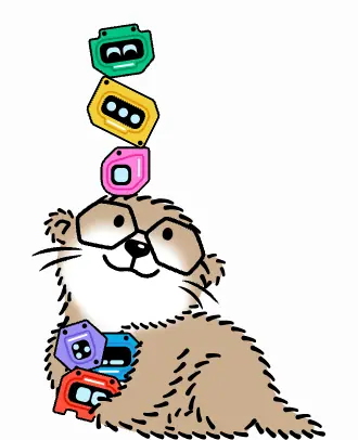 |
271×385, three layered SVGs (body, pupils, paw) in every footer; keyframes otter-hop, wiggle, bounce, jelly… |
Line-art character with flat fills; separate the eyes as their own layer so they can track or blink. |
B. Product imagery
| Asset |
Crop |
Spec |
Rebuild |
| CLI / product panel on vellum |
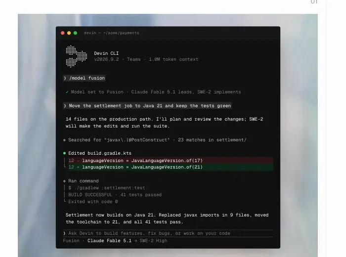 |
dark terminal window (macOS traffic lights) on a blurred pale-blue photo backdrop; text in Geist Mono 11px and IBM Plex Mono 12px |
Rebuild the UI in HTML with real copy; place it on a heavily blurred photo (≈40px blur ≈) tinted to the page grey. |
| Blog data chart |
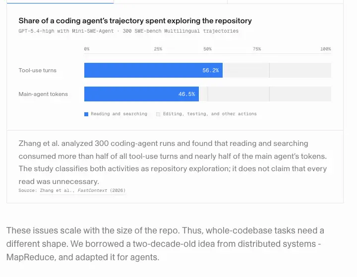 |
white card, title 16/20.8 500, mono subtitle, blue #337df4 bars, grey track, source line in mono |
Simple horizontal bar chart: one accent colour, mono axis labels. |
C. Photography
| Asset |
Crop |
Spec |
Rebuild |
| Enterprise photo stat cards |
|
512×288 carousel, bottom scrim oklab(0 0 0 / .52), stat 40/44 weight 300 white, caption 14/19.6 |
Documentary photo + one number + one sentence. Keep the scrim under the text only. |
| Photo stat band |
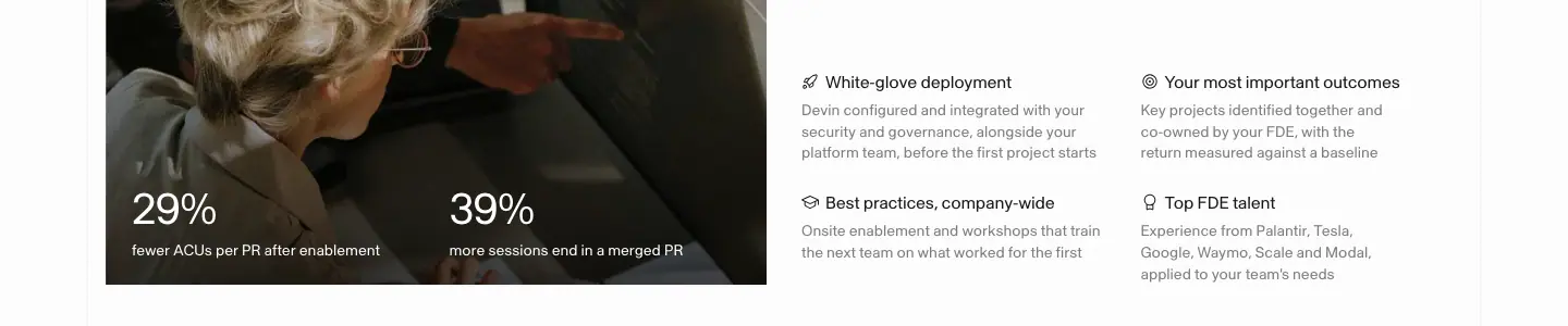 |
two photo tiles with "29%" / "39%" overlaid, beside feature bullets |
Same recipe, smaller. |
D. Customer graphics
| Asset |
Crop |
Spec |
Rebuild |
| Customer cover tile |
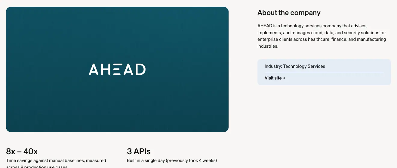 |
740×416 cover in the customer colour (AHEAD teal) with a centred white wordmark; side card "About the company" on #e4ecf4/#f7f6f5 |
Flat customer colour + white logo; add grain for depth. |
| Stat row |
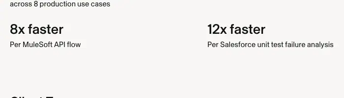 |
28/30.8 500 numbers ("8x faster", "12x faster"), 15/22.5 captions, 2-column |
Two big numbers per row; captions say exactly what was measured. |
| Pull quote |
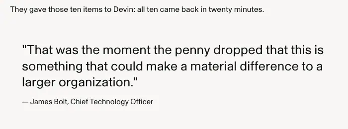 |
26/32.6 400 #111111, straight quotes, attribution "— Name, Title" 14px |
Large quote in body font, not italic. |
| Enterprise logo wall |
 |
grey monochrome logos (Citi, Mercedes-Benz, Hertz, Fox, Palantir…), 213×88 cells |
Convert every logo to one grey; equal optical size. |
E. Video and embeds
| Asset |
Crop |
Spec |
| YouTube embed in blog |
 |
/blog/our-brand embeds a Windsurf brand film with a pink-blue wave cover; this is the Windsurf identity, kept inside a Devin article |
F. What Devin's art kit is made of (summary)
- Paper:
#fcfcfc with grey hairlines.
- Ink:
#191919 at 100/56/40%.
- Vellum photos: blurred, pale photographs as backdrops for UI.
- Rebuilt UI: HTML mockups in Inter/Plex/Geist Mono.
- Characters: 3D plastic bots and the line-art otter.
- Customer colour fields with grain.
- Documentary photography for enterprise proof.
G. Production checklist
- Export UI mockups as live HTML where possible (crisp at every zoom).
- Keep one playful asset per page and put it at the edge (footer otter).
- Customer art = their colour + their logo, never yours.
- Ship the motion source (AEP) with the logo kit.
Home · devin.ai
- URL: https://devin.ai/
<title>: Devin: the autonomous software engineer- Meta description: "Devin is an AI coding agent and software engineer that helps developers build better software faster. Parallel cloud agents for serious engineering teams."
- Page height: 8,332px at 1440px width (10,743px at 390px).
- Template: framed light page. Vertical hairlines at x = 80 and x = 1359, content at x = 96–97, horizontal hairlines between sections with 60px padding on each side.
- Background
#fcfcfc, text #191919, one font (Skandia 400) outside mockups.
Narrative arc. Who Devin is (hero) → the new product line (Bots) → what Devin can do on its own (5 capability cards) → how it fits your workflow end to end (4 numbered steps) → where it plugs in (integrations) → that it ships fast (changelog) → that it is safe (security) → do it now (closing CTA). The page moves from identity to capability to process to proof to action.
1. Hero
| Element |
Measured |
| H1 |
"Meet Devin, your team's autonomous software engineer". 36 / 43.2px, 400, −1.08px, #191919, x 96, y 140, w 568 (2 lines) |
| Sub |
"Devin runs in the cloud or on your machine, tests in its own browser, and won't stop until the PR is ready to merge". 16 / 22.4px, ink 56 %, w 425, y 242 |
| CTAs |
"Get started" 119 × 42 black pill (x 96, y 314); "Book a demo" 136 × 42 outline pill (x 225) |
| Promo card |
x 1016, y 272, 328 × 84, radius 8px, canvas edge animation, 16px "Meet Devin Bots" + 14px grey "Build your always-on team" |
| Product window |
Re-built Devin app: left rail ("Bots", "Big Boss", "Security Reviewer", "Design Engineer", "Needs you · Pull requests", "Sessions", "Bug fixes"), center chat thread with a PR card ("feat: Add SAML SSO for enterprise · neobase/platform #2922 · +9 −14 · View PR") and a composer ("Plan a feature, fix bugs, or perform a security scan", model "Ultra"), right a floating PR panel ("PR Open", 22px Inter 600 "Add enterprise SSO", "Devin's analysis", "Test recording on Mac OS X virtual environment 2/5" with a video still) |
| Mockup type |
Inter: 13 / 18 rows, 14 / 20 messages, 12 / 16 meta; status green #00a558, red #f53b3a |
| Backdrop |
32 photo tiles in 8 panning layers (hero-collage-pan 55–242s), mix-blend-mode: multiply, fading in over 1.8s with staggered delays |
| Logo marquee |
21 grey logos (OpenRouter, Modal, Gamma, Citi, Decagon, Mercor, Mercedes-Benz, AngelList, Fox, NVIDIA, Rivian-VW, AT&T, Profound, Rohlik, Cloudflare, Lowe's, Exa, Wayfair, Elevance…) 213 × 88 each |
Why it works.
- The H1 is small on purpose: the real headline is the PR card that says "5 tests passed". The first screen proves the claim "won't stop until the PR is ready to merge".
- The promo card in the top-right corner is a newsroom slot. It promotes the newest launch (Bots) without displacing the evergreen hero.
- The drifting collage gives a sense of an always-on agent while the window stays perfectly still and readable.
2. Meet Devin Bots
- H2 two-tone: "Meet Devin Bots." (ink) / "Build, test, and ship while you sleep." (ink 56 %), 36px, x 97, w 531.
- Right: "Learn more" (black) + "View templates" (outline), y 1318.
- Six tiles in a checkerboard: Software Factory, Android Engineer, Chief of Staff, Latency Optimizer, Product Engineer, QA Engineer. Each = colored 3D bezel icon on a light tile + 14px title + 14 / 19.6px grey description (≈ 30–40 words).
Why. Bots are a team; the checkerboard makes six roles feel like individual people at desks rather than a feature table. Descriptions are job descriptions ("Tests each pull request in a real browser and posts the video").
3. Your teammate's favorite teammate (bento)
| Card |
Size |
Mockup |
Copy |
| Tests end to end on its own computer |
619 × 528 |
Phone app in a VM, "Testing 3/12" timeline with timestamps, "Selecting seat" cursor label |
"Devin spins up its own Windows, Mac, and Linux virtual machines…" |
| Gets the best from every frontier model |
619 × 528 |
Model picker (SF Pro): Fusion / Ultra / Normal / Lite, "All models" list, Lead/Effort/Sidekick settings, Fast mode toggle, a color gradient "Fusion" slider |
"Access frontier performance for up to 60% less…" |
| Keeps working when your laptop is closed |
410 × 308 |
Sessions list with "PR is ready" green, "Working · 56 hours", "Review PR" orange |
|
| Joins the thread when you @Devin |
410 × 308 |
Slack thread in Lato, #eng-bugs, @Devin mention #088bd7, PR link, "Devin is working..." shimmer |
|
| Watches for issues and fixes them proactively |
410 × 308 |
PagerDuty alert "🔴 High severity", Devin reply, PR card |
|
H3 20 / 24px; body 16 / 22.4px ink 56 %; text sits below each visual.
Why. Each card is one autonomous behaviour, each shown in the tool where it happens (VM, model menu, Slack, PagerDuty). Copying each tool's real font sells the integrations without saying "integrates with".
4. From problem to merged PR (4 steps)
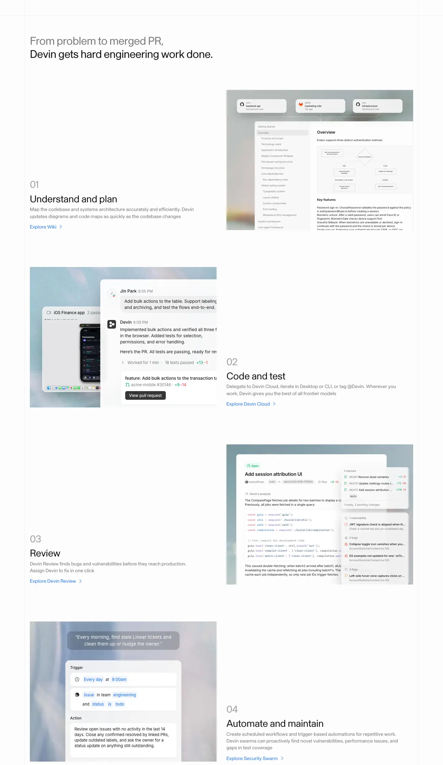
- H2 two-tone: "From problem to merged PR," (ink 56 %) / "Devin gets hard engineering work done." (ink).
- Four rows, ≈ 575px apart, alternating: 01 Understand and plan (wiki/DeepWiki mockup with a flowchart and repo sync cards) → 02 Code and test (phone recording + chat + PR) → 03 Review (Devin Review: PR analysis, GitHub-colored code, stacked PRs, "1 vulnerability · 2 bugs · 3 flags") → 04 Automate and maintain (scheduler: "Every day at 9:00am", "Issue in team engineering and status is todo", action text).
- Text block: number 32px ink 40 %, H3 32px, body 16px grey, link 16px
#317cff "Explore Wiki / Devin Cloud / Devin Review / Security Swarm >". Text is bottom-aligned to the 607 × 455 visual.
Why. The numbers turn the product suite into one workflow, and each step links to the dedicated product page. The zig-zag keeps a long section scannable.
5. Connect once, deliver repeatedly (integrations)

- H2 two-tone with the grey first: "Connect once, deliver repeatedly" (ink 40 %) / "with your favorite tools".
- 4 × 2 grid, cells ≈ 311px, left hairlines; grey icons (Slack, GitHub, PagerDuty-style, Sentry, Teams, Linear, Jira-like, Notion); captions 16px ink 40 %: "Triage bugs as they land", "Fix CI when it fails", "Investigate alerts as they fire", "Turn errors into fixes", "Triage issues when they get posted", "Pick up issues as they're assigned", "Assign a ticket, get a PR", "Build from a spec page".
Why. It answers "does it fit my stack?" and phrases each tool as a trigger → outcome.
6. Recently shipped
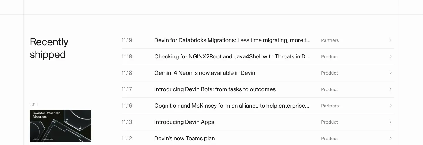
- Left: H2 "Recently / shipped", cover image 210 × 110 ("Devin for Databricks Migrations"), caption "[ 01 ]".
- Right: 7 rows dated 11.19 → 11.12 (Databricks migrations, NGINX2Root checks, Gemini 4 Neon, Devin Bots, McKinsey alliance, Devin Apps, Teams plan). Date 20px ink 56 %, title 20px, category 16px ink 56 % ("Partners", "Product"), chevron. Hover →
#317cff.
Why. Seven launches in eight days is the strongest velocity signal a buyer can see. It also keeps the homepage fresh without redesigns.
7. Enterprise security
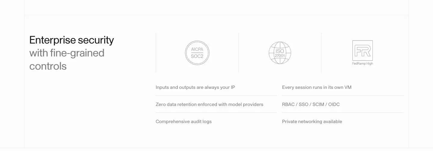
- H2 "Enterprise security" (ink) / "with fine-grained controls" (ink 56 %), 361px column.
- Three badge cells (AICPA SOC 2, ISO 27001, FedRAMP High).
- Six bullets in 2 columns, 16 / 24px ink 56 %: "Inputs and outputs are always your IP", "Zero data retention enforced with model providers", "Comprehensive audit logs", "Every session runs in its own VM", "RBAC / SSO / SCIM / OIDC", "Private networking available".
8. Closing CTA

"Stop deprioritizing" (64px ink 40 %) / "Do it all with Devin" (64px ink), centered at y 7393, w 492, then the pill pair at y 7578.
Why. "Deprioritizing" names the pain every engineering manager has (the backlog). The grey line fades the pain, the ink line delivers the brand.
9. Footer
See Shared header and footer.
Mobile (390px)
H1 32 / 38.4px. Nav 60px with a hamburger. The product window is shown cropped and shifted to the right edge (bleeds off-screen), which keeps UI legible. Bot tiles become 2 columns, cards stack, integrations 2 columns, changelog rows keep date + title only.
Pricing · devin.ai/pricing
- URL: https://devin.ai/pricing
<title>: Plans and Pricing | Devin- Meta description: "Choose the perfect plan for your Devin journey. Free, Pro, Max, Teams, and Enterprise plans available."
- Page height: 5,323px at 1440px (6,507px at 390px).
- Template: unframed light page, content x 80 → 1360.
Narrative arc. Pick your audience (toggle) → two team plans → reassurance (model providers) → full comparison → self-serve close → FAQ on a black panel → footer.
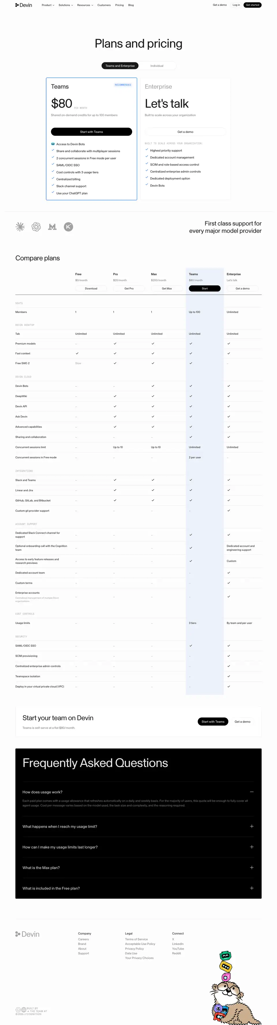
1. Hero: title, toggle, plan cards
| Element |
Measured |
| H1 |
"Plans and pricing", 64 / 70.4px, 400, −1.92px, centered, y 188 |
| Toggle |
2 segments × 192 × 36px; active "Teams and Enterprise" #191919 fill + white 16px; idle "Individual" ink 56 % |
| Teams card |
name 32px; badge "RECOMMENDED" Geist Mono 12px #317cff on rgba(49,124,255,.08); price "$80" 64px + "PER MONTH" mono 12px ink 40 %; sub "Shared on-demand credits for up to 100 members" 16px grey; CTA "Start with Teams" 422 × 42 black; 8 check rows 16px, 36px pitch ("Access to Devin Bots", "SAML/OIDC SSO", "Use your ChatGPT plan"…); border 1px #317cff |
| Enterprise card |
name 32px ink 40 %, price "Let's talk" 64px, CTA "Get a demo" outline, mono heading "BUILT TO SCALE ACROSS YOUR ORGANIZATION:", 6 rows |
Why.
- The toggle defaults to the team buyer, the segment with the most revenue. Individuals are one click away.
- The Teams card is the only one with color (blue border + badge), so the recommendation is visual, not written.
- "Let's talk" in the same 64px slot as "$80" keeps the cards aligned and honest: no fake price.
- The grey Enterprise name lowers its visual weight so Teams wins the first glance.
2. Model providers strip

Four grey provider marks left (Anthropic-style asterisk, OpenAI knot, two others), right-aligned 32px statement "First class support for every major model provider". Why: removes the "am I locked to one model?" objection before the table.
3. Compare plans
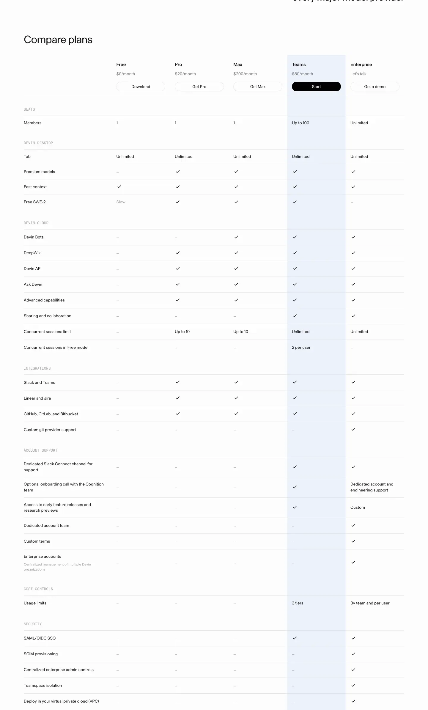
- H2 "Compare plans" 36px.
- Header row: Free ($0/month, "Download"), Pro ($20, "Get Pro"), Max ($200, "Get Max"), Teams ($80, black "Start"), Enterprise ("Let's talk", "Get a demo"). Plan name 16px 500, price 14px ink 56 %, 165 × 32px pill buttons.
- Teams column tinted
rgba(49,124,255,.08) from header to the last row (39 tinted cells counted).
- Groups in Geist Mono 12px ink 40 % uppercase: SEATS, DEVIN DESKTOP, DEVIN CLOUD, INTEGRATIONS, ACCOUNT SUPPORT, COST CONTROLS, SECURITY.
- Rows 14 / 19.6px, ≈ 51px pitch, hairlines
rgba(0,0,0,.08); values are checkmarks, "–", or short text ("Up to 10", "Unlimited", "3 tiers", "By team and per user").
Why. A long table is unavoidable for a 5-tier product. Mono group labels make it scannable; the tinted column keeps the recommendation visible at every row.
4. Start your team on Devin

A white 1280px card with a 1px border: H2 36px "Start your team on Devin", 16px grey "Teams is self-serve at a flat $80/month.", buttons right ("Start with Teams" 158 × 42, "Get a demo" 124 × 42). Why: catches readers who finished the table and are ready.
5. Frequently Asked Questions (black panel)
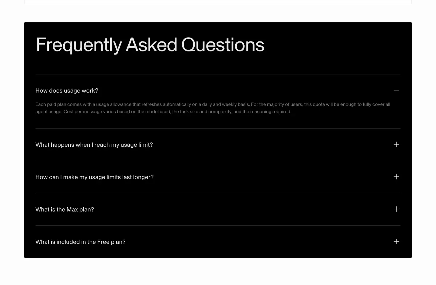
- 1280px black panel, title 64px
#e7e7e7 (32 / 35.2px on mobile).
- Five rows: "How does usage work?" (open), "What happens when I reach my usage limit?", "How can I make my usage limits last longer?", "What is the Max plan?", "What is included in the Free plan?". Question 20px white, answer 14px grey, "+"/"−" at right, hairlines white 12 %.
- Open/close animates
grid-template-rows 200ms cubic-bezier(0,0,.2,1).
Why. The only dark block on a light page signals "fine print, answered". Usage questions are the top objection for a credit-based product.
6. Footer
See Shared header and footer.
Mobile

H1 40 / 44px; plan cards stack; the model-provider statement moves above the logos and centers. The comparison table does not scroll sideways: a row of plan pills (Free, Pro, Max, Teams active in black, Enterprise) replaces the 5 columns, and the table shows one plan column at a time next to the feature labels (still tinted blue for Teams). FAQ panel keeps full width with a 32 / 35.2px title.
Why. Five columns cannot fit 390px. A plan switcher keeps each row readable and defaults to the plan Devin recommends.
Customers · devin.ai/customers
- URL: https://devin.ai/customers
<title>: Customers | Devin- Meta description: "See how leading companies use Devin to accelerate software development. Customer success stories and case studies from top engineering teams."
- Page height: 9,727px at 1440px.
- Template: unframed light page, x 80.
Narrative arc. A headline claim with one big customer on video → filterable catalog of 47 stories → the brand closer in blue → a wall of numbers with attribution.

1. Hero: claim + video testimonial
| Element |
Measured |
| Eyebrow |
"CUSTOMERS", Geist Mono 12 / 18px, +0.36px, ink 56 %, blue square bullet, y 180 |
| H2 |
"See how the world's best companies build with Devin", 60.96px / 1.0, weight 500, −1.83px, w 528, 3 lines |
| Logo |
wayfair wordmark |
| Quote |
"The teams are truly flying and it's crazy how much we're getting done." 26.67 / 32px, weight 300, −0.53px |
| Attribution |
"Victor Andreoni Paseka, Director of Software Engineering", 16px ink 56 % |
| Link |
"Read more", 16px ink |
| Video |
740 × 416px card at right (Cognition ▶ wayfair), player controls visible |
Why. This page uses heavier (500) and lighter (300) weights than the rest of the site. The contrast between a dense, confident headline and an airy quote reads like a magazine cover story. One named director quote is more persuasive than a generic claim.
2. Use-case filter + story grid
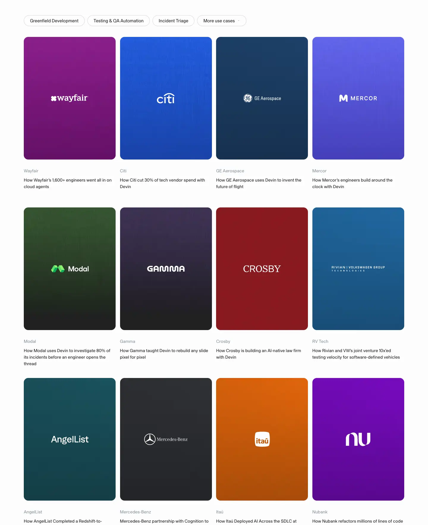
- Filter chips: "Greenfield Development", "Testing & QA Automation", "Incident Triage", "More use cases ▾". 37px tall, 15px,
#fcfcfc fill, 1px rgba(0,0,0,.15) border, full radius.
- Grid: 4 columns × 309px, 15px gap. Tile 309 × ≈ 413px: noisy vertical gradient in the customer's brand color with a centered white logo. Below: company name 14.76px
#818f9a, title 14.76 / 22.1px ink ("How Wayfair's 1,600+ engineers went all in on cloud agents").
- 47 story cards (counted from the company-name
H5 elements), including: Wayfair, Citi, GE Aerospace, Mercor, Modal, Gamma, Crosby, RV Tech, AngelList, Mercedes-Benz, Itaú, Nubank, Ripple, Access Group, Odyssey, Eon, Comarch, Tavrn, Rohlik, Común, Evinova, Compiled Health, Basis, Reducto, Latent, Airbyte, Endava, WPP, EBANX, Exa, Melius, Finch, Eight Sleep, Hippo, AHEAD, Cognizant, FE fundinfo, Infosys, Citation Group, Litera, Hamming, Bilt, Gumroad, Linktree, Crossmint, Ramp.
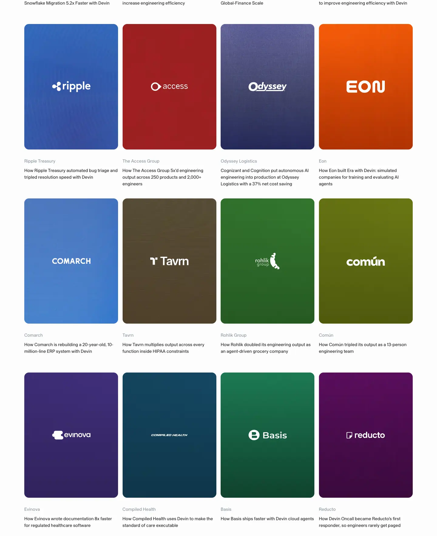
Why.
- Brand colors make the wall instantly scannable ("there's Citi") and make it look like a gallery rather than a list.
- Every title starts with "How {Company}…" and contains a number, so the grid doubles as a list of outcomes.
- Portrait tiles fit 4 per row and keep the logo at a large size.
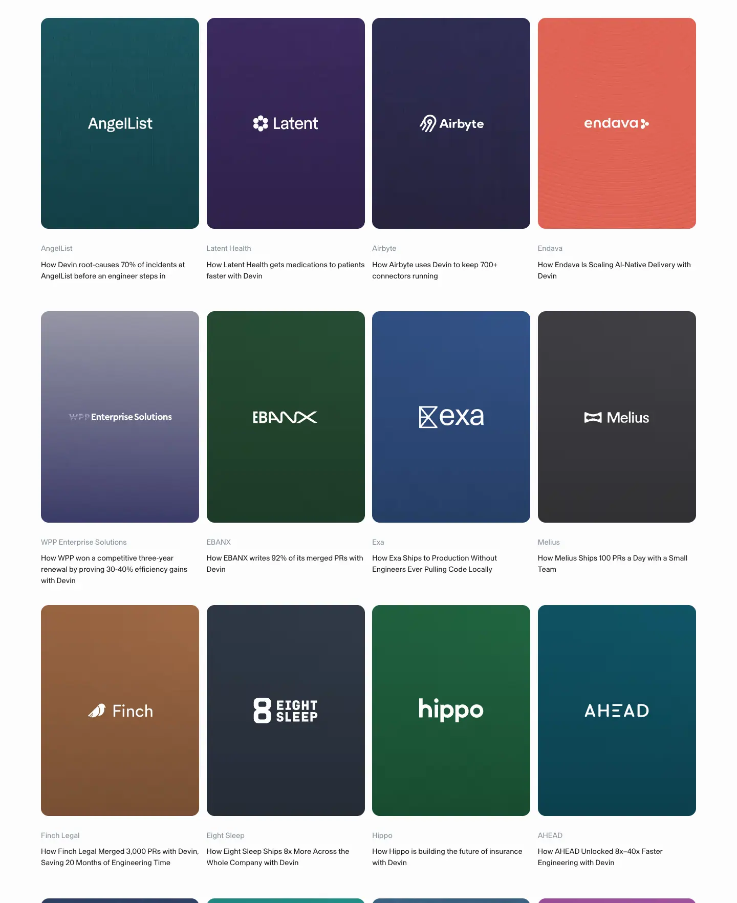
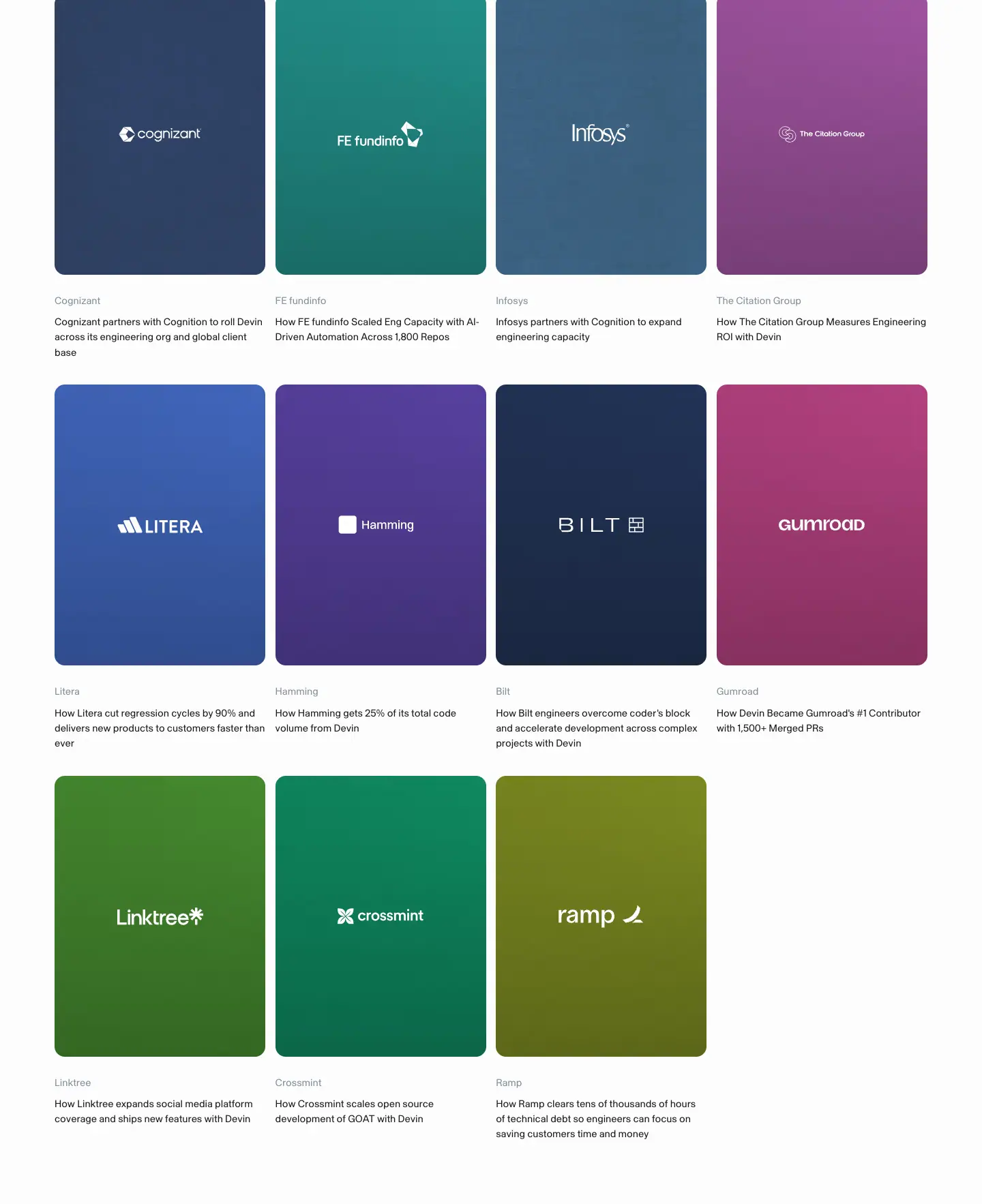
3. Closer + stats wall
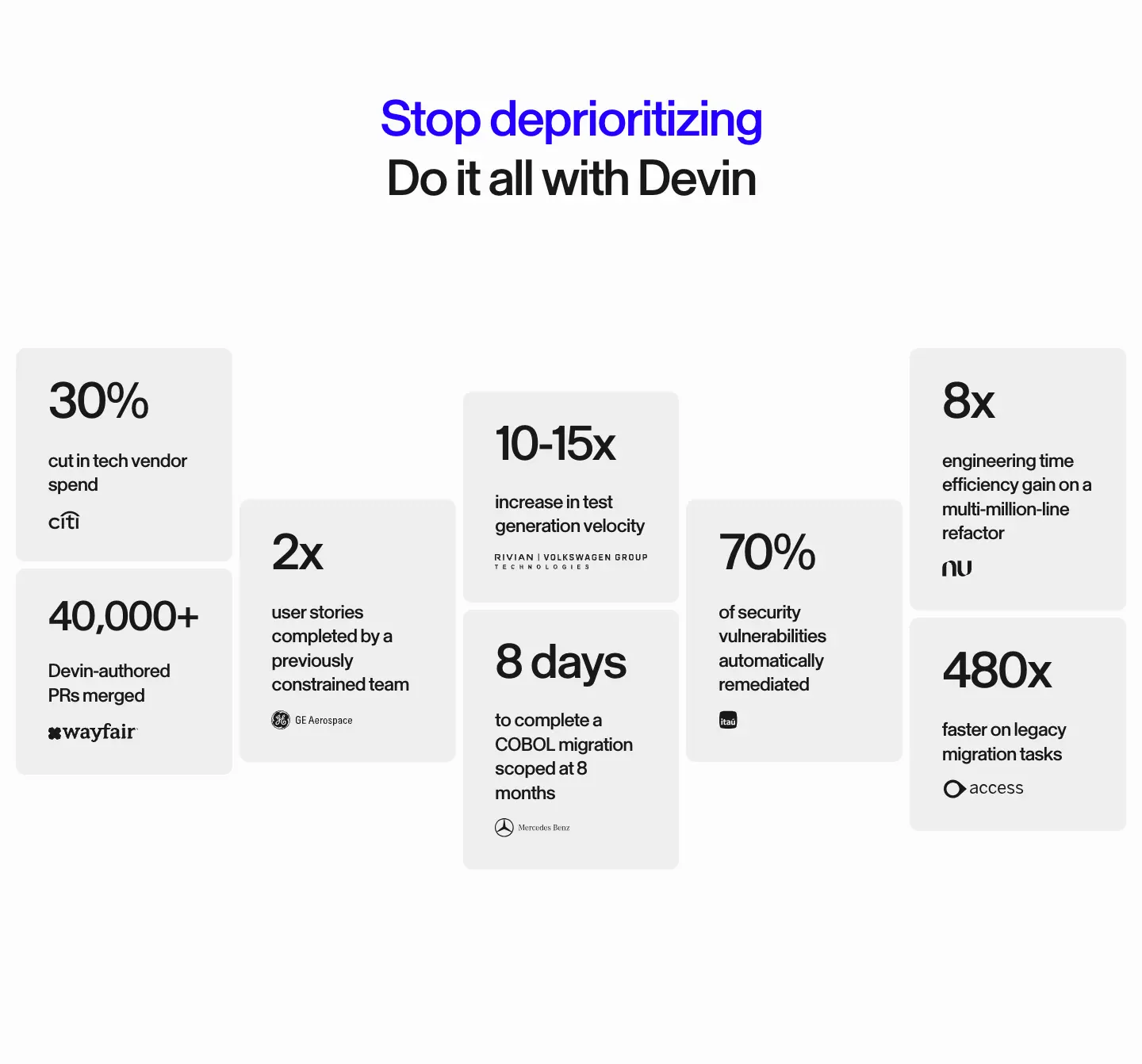
- H2 64 / 74.4px weight 500, −2.56px, centered: "Stop deprioritizing" in
#2200ff (electric blue) / "Do it all with Devin" ink.
- Stats wall (
images/patterns/stats-wall.png): 10 tiles #efefef, 5 columns with staggered vertical offsets, numeral 64 / 74.4 weight 500 −2.56px (52.7px for "40,000+", 61.5px for "10-15x" and "8 days"), label 24.16 / 30.6 weight 500, then customer logo:
- 30% cut in tech vendor spend (Citi) · 40,000+ Devin-authored PRs merged (wayfair) · 2x user stories (GE Aerospace) · 10-15x test generation velocity (Rivian | VW) · 8 days COBOL migration scoped at 8 months (Mercedes-Benz) · 70% vulnerabilities remediated (Itaú) · 8x engineering time efficiency (Nubank) · 480x faster legacy migration (Access).
Why. Numeral size is adjusted per stat so all fit the same tile width. The staggered skyline turns a data table into a shape. The one saturated headline on the site gives this page its own energy.
4. Footer
See Shared header and footer.
Bots · devin.ai/bots
- URL: https://devin.ai/bots
<title>: Devin Bots | Devin- Meta description: "Always-on Devins with their own identity, memory, and permissions. Give a Bot a job and it keeps doing it."
- Page height: 7,841px at 1440px.
- Template: dark page. Page
#141414, elevated #1f1f1f, headings white 90 %, copy white 52 %. Same components and tokens as the light pages, dark values.
Narrative arc. Cinematic launch video → meet the bot (mascot reveal) → what Bots do (6 feature cards) → the cast (8 mascots) → pick a template → people's quotes → security → green CTA banner.

1. Video hero
| Element |
Measured |
| Video |
DevinBots-landingpage-v2.mp4, 1440px wide, muted, loop, ≈ 880px tall, hands typing on a dark keyboard |
| H1 |
"Introducing Devin Bots", 36 / 43.2px white, x 80, y 696 (bottom-left) |
| Sub |
16 / 22.4px white 52 % "Your Devin Bot leads a team of agents to build, test, and improve your software around the clock." |
| CTAs |
"Get started" 118 × 40 #e7e7e7 / black text; "View templates" 149 × 40 outline (white 8 % border); a circular pause button |
| Chapters |
6 small video thumbnails bottom-right |
| Nav |
transparent, white text, white "Get started" pill |
| Gradient |
linear-gradient(to top, #141414 0%, rgba(20,20,20,.6) 35%, transparent) under the text |
Why. A product launch earns a cinematic moment. Human hands show the person in charge. The bottom-left layout leaves the video subject visible. The pause button respects users who dislike motion.
2. Bot reveal
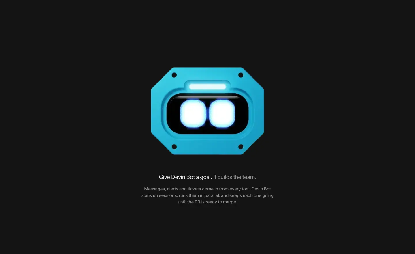
A single large cyan 3D bot centered on dark, glowing eyes. Below: 20px two-tone line "Give Devin Bot a goal. It builds the team." (white 90 % / white 52 %) and a 16px paragraph. The bot floats with the bots-gravity-* loops (22–26s, linear() curves).
Why. The mascot becomes the product's face before any feature is listed.
3. You set the direction (feature cards)
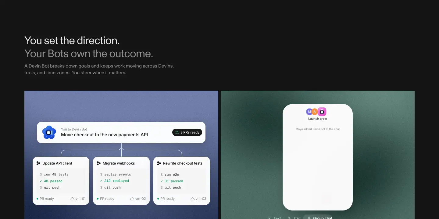
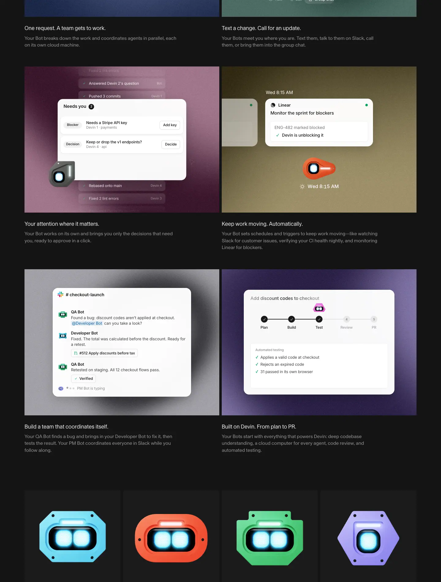
- H2 two-tone 36px: "You set the direction." / "Your Bots own the outcome." + 16px grey paragraph.
- Six cards in 2 columns (≈ 640 × 480 visual each) on grainy color fields:
1. One request. A team gets to work. (slate blue; bot fans out to 3 VMs with terminal output
$ run 48 tests ✓ 48 passed)
2. Text a change. Call for an update. (sage; phone UI "Launch crew", Text / Call / Group chat)
3. Your attention where it matters. (wine; "Needs you 2" with "Add key" / "Decide")
4. Keep work moving. Automatically. (olive; Linear card "Monitor the sprint for blockers")
5. Build a team that coordinates itself. (grey vignette; Slack #checkout-launch with QA Bot / Developer Bot)
6. Built on Devin. From plan to PR. (violet; Plan → Build → Test → Review → PR stepper)
- Caption 18 / 25.2 white 90 % + 16px white 52 %.
Why. Each title is two short sentences: action, then result. The colored fields give each feature its own mood on a dark page.
4. Bot gallery
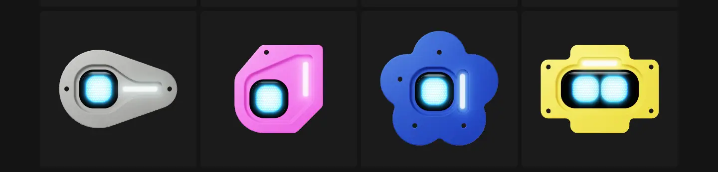
8 tiles (#1d1f20), each a different 3D bot shape and color. Pure character design, no copy. Why: personality and collectability; it builds the idea of "a team of different specialists".
5. A Devin Bot for every job
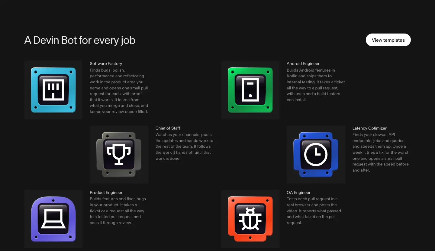
Same checkerboard template grid as Home, on dark, 193px tiles, white "View templates" button right. Text white 90 % / white 52 %.
6. Hear it from the people
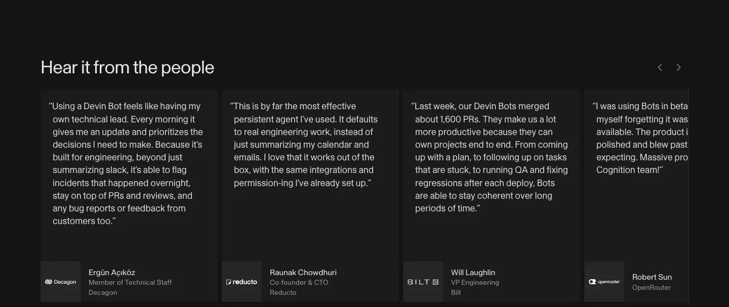
Carousel of 350px cards, quotes 18 / 25.2 white 90 %, logo tile + name/title (Decagon, Reducto, Bilt, OpenRouter…), ‹ › arrows top-right, last card clipped at the viewport edge.
7. Enterprise security
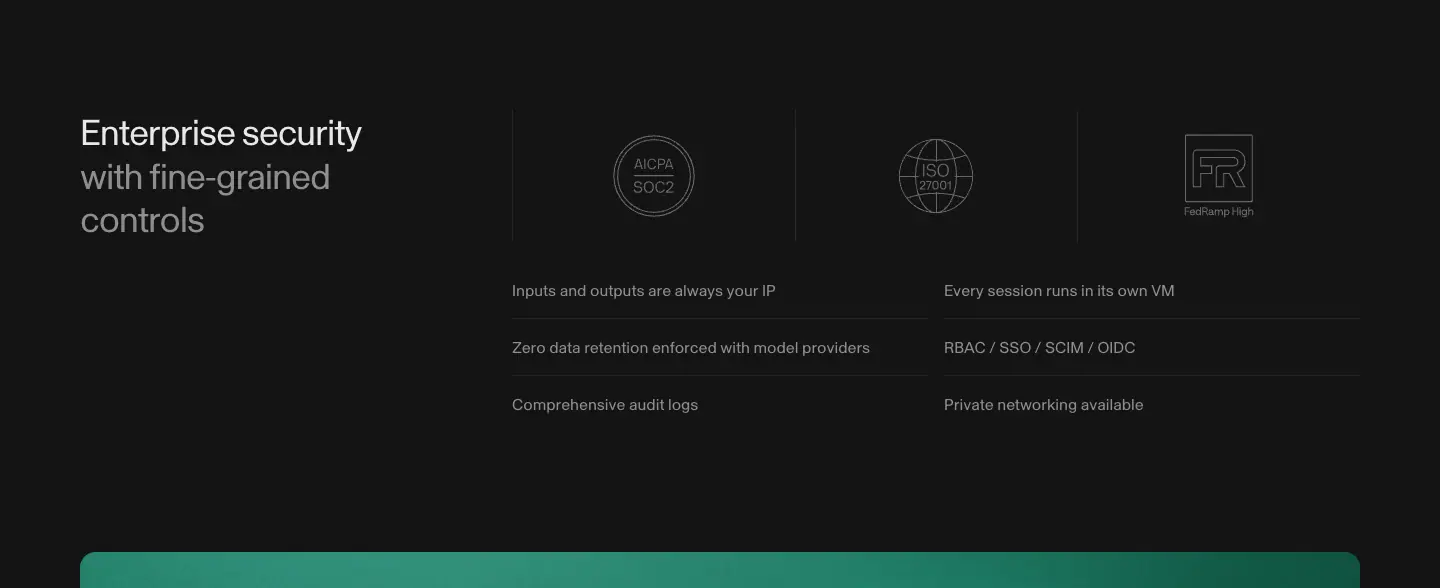
Same block as Home in dark tokens.
8. Put a Devin Bot on it
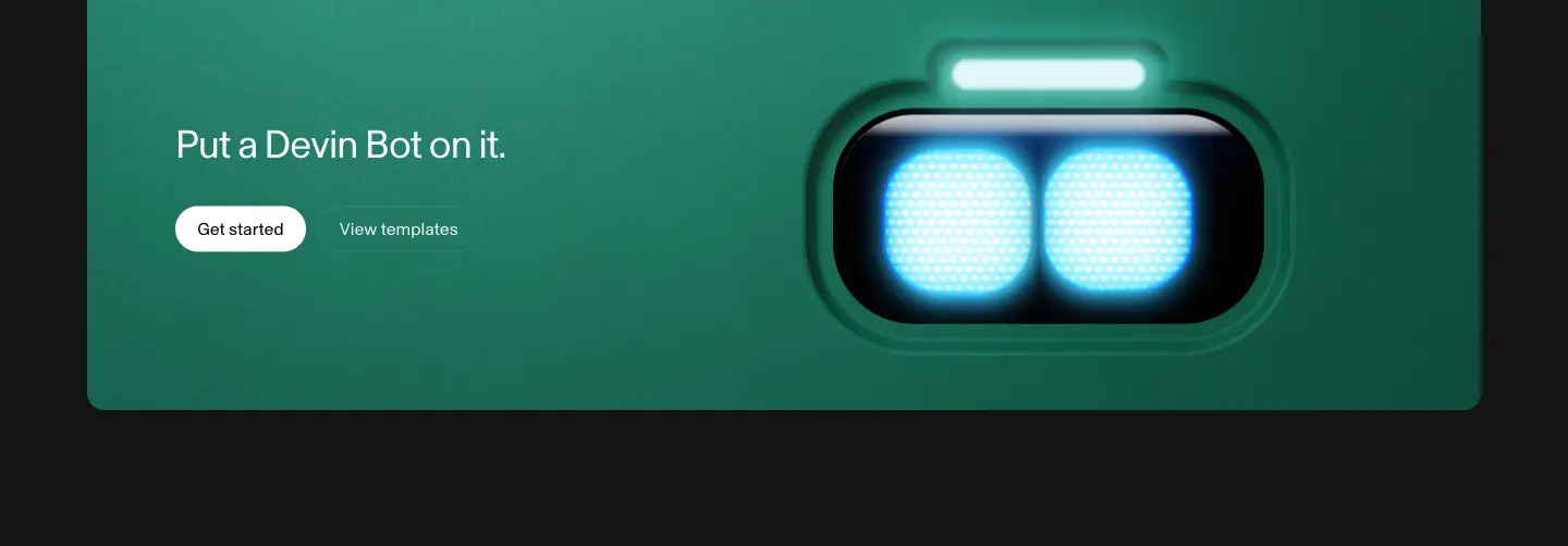
Rounded deep-green gradient banner, H2 36px #f7f7f5, "Get started" white pill + "View templates" outline, giant glowing bot face right.
Why. The page ends on color instead of the standard two-tone closer, so the launch page feels like a campaign.
9. Footer
Dark version of the shared footer; links white 52 %.
Cloud · devin.ai/cloud
- URL: https://devin.ai/cloud
<title>: Devin Cloud | Devin- Meta description: "Close your laptop. Come back to finished PRs."
- Page height: 7,482px at 1440px.
- Template: unframed product page, x 80.
Narrative arc. Name + promise + one CTA → the product working → who uses it → five use cases with numbers → feature bento → the three surfaces (Cloud / Desktop / CLI) → enterprise close.

1. Hero
H1 "Devin Cloud" 64 / 70.4px left at x 80, y 188. Sub "Close your laptop. Come back to finished PRs." 16px ink 56 %. One black "Try Devin" pill 106 × 42.
Why. One CTA (not two): this page targets people already exploring the product.
2. Product window
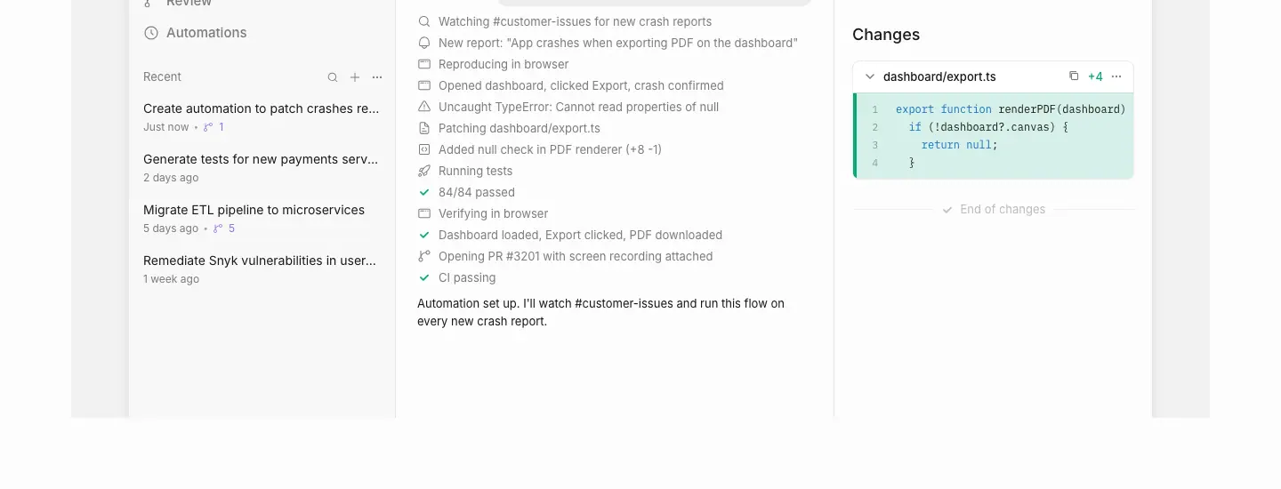
1280px #f8f8f8 stage holding the app: sidebar (Sessions, Ask, Wiki, Review, Automations; Recent sessions), a task "Create automation to patch crashes reported in #customer-issues", a step log with icons and green ticks ("Reproducing in browser", "84/84 passed", "Opening PR #3201 with screen recording attached", "CI passing"), and a Changes panel with a green diff of dashboard/export.ts.
Why. The step log reads like a story of autonomous work, line by line, so the reader sees what "come back to finished PRs" means.
3. Logo wall
5 × 5 grey logos: Citi, NVIDIA, Mercedes-Benz, Goldman Sachs, Lowe's, U.S. Army, Modal, OpenRouter, Mercor, Exa, Gamma, AT&T, FOX, Elevance Health, Rivian | VW, wayfair, U.S. Navy, Itaú, Santander, Intact, Nubank, Profound, BNY, NASA, ServiceNow.
Why. Military and government logos (Army, Navy, NASA) next to banks answer the security question for a cloud product.
4. Use cases (sticky tabs + stat cards)
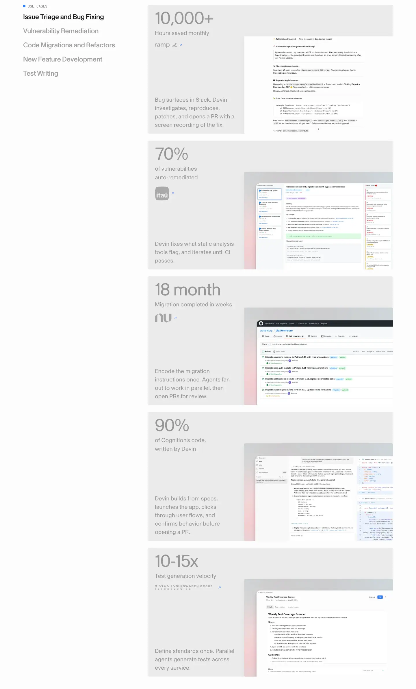
- Left (sticky at top 153px): mono "■ USE CASES", then tabs 24 / 28.8px weight 500: Issue Triage and Bug Fixing, Vulnerability Remediation, Code Migrations and Refactors, New Feature Development, Test Writing. Active ink, others ink 40 %.
- Right: 5 stacked grey cards (848px wide), each: stat 60px ink 40 % ("10,000+", "70%", "18 month", "90%", "10-15x"), 20 / 30 label, customer logo + ↗ (ramp, Itaú, Nubank, Cognition, Rivian | VW), 20 / 29 description, and a cropped product screenshot bottom-right.
- Measured: at scroll 1650 "Issue Triage" is active; at 3300 "Test Writing" is active; tab list stays at 153px.
Why. A scrollspy combines five use cases into one section and keeps the menu visible, so the reader knows where they are.
5. Get started with Devin + feature bento

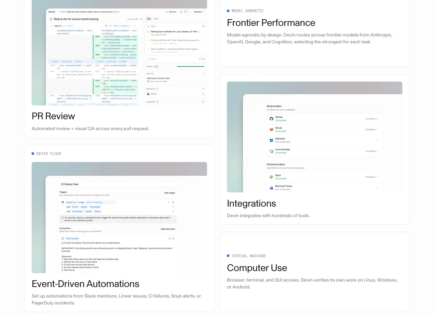
- Mono eyebrow "DEVIN ON YOUR TEAM", H2 64px centered "Get started with Devin", "Try Devin" + "Get a demo".
- Bento in 2 × 640px columns: PR Review (screenshot), Frontier Performance ("■ MODEL AGNOSTIC", text only), Integrations (screenshot of Git provider and Slack/Teams connections), Event-Driven Automations ("■ DEVIN CLOUD", CI Failure Fixer screenshot), Computer Use ("■ VIRTUAL MACHINE", text only). H3 32px, body 16px grey.
Why. Text-only cards next to screenshot cards create a masonry rhythm and let abstract features (model routing) stay short.
6. Cover every mode of development work
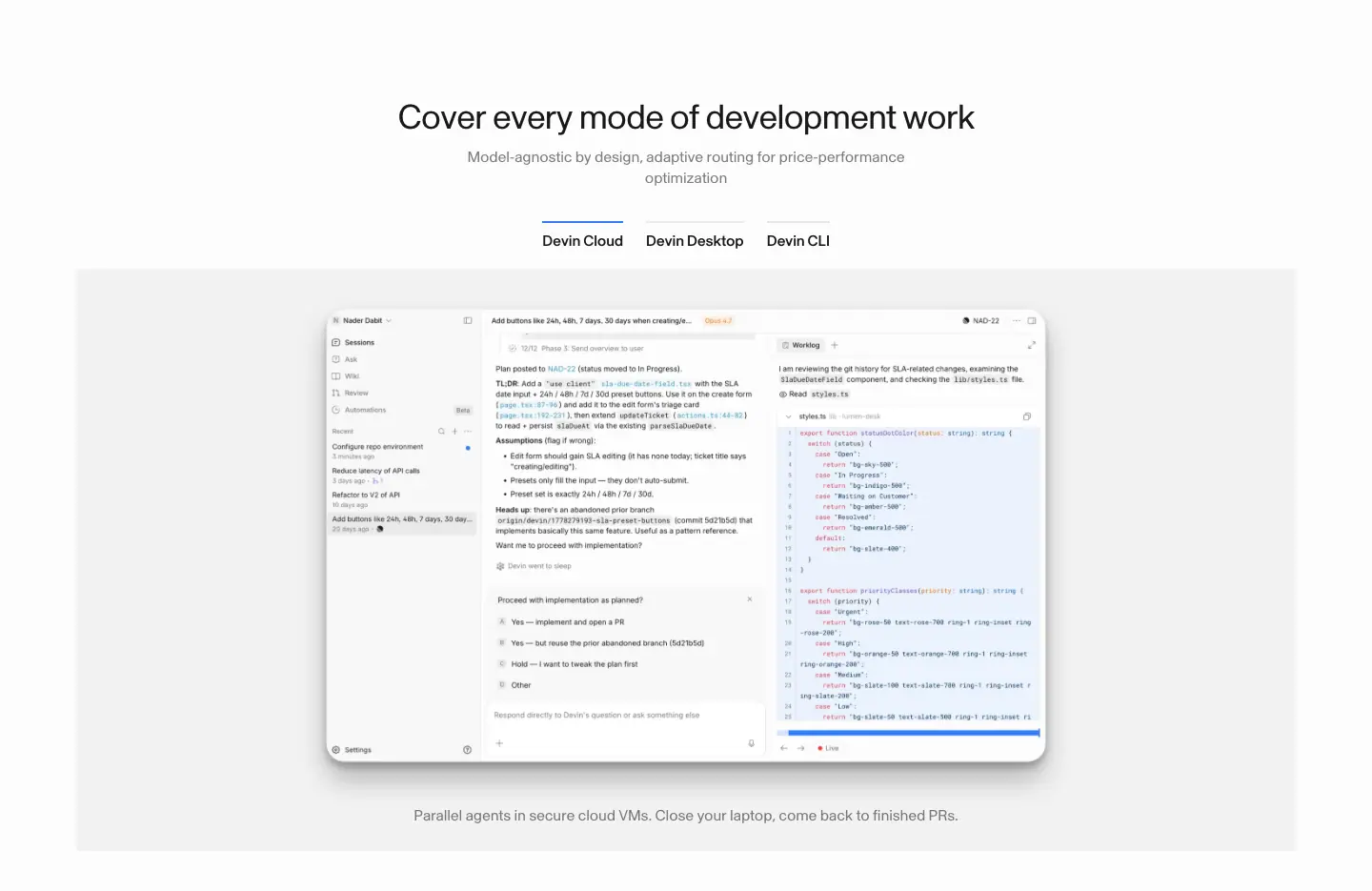
H2 36px centered, sub 16px grey "Model-agnostic by design, adaptive routing for price-performance optimization". Tab switcher Devin Cloud / Devin Desktop / Devin CLI (16px, active has a 2px #317cff top bar). Grey stage with the app; caption "Parallel agents in secure cloud VMs. Close your laptop, come back to finished PRs."
7. Devin for your organization

Mono "ENTERPRISE" in blue, H2 64px "Devin for your organization", black "Contact sales".
8. Footer
See Shared header and footer.
Security · devin.ai/security
- URL: https://devin.ai/security
<title>: Devin Security | Devin- Meta description: "Devin finds the vulnerabilities other tools miss, validates that they are actually exploitable under your threat model, and writes remediations at scale."
- Page height: 6,541px at 1440px.
- Template: framed light page (same frame as Home, content x 96–97).
Narrative arc. Offer + promise → news (2.0) → customer logos → the method (find, validate, remediate) → a bank's proof → lifecycle steps → works with your scanners → governance → FAQ → closer.
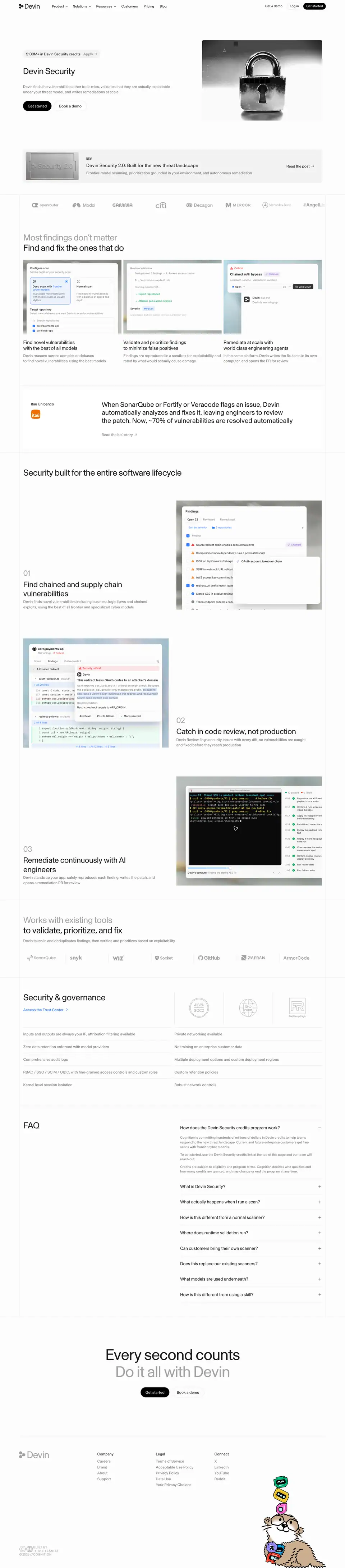
1. Hero
| Element |
Measured |
| Credits pill |
"$100M+ in Devin Security credits. Apply →", 322 × 34px, rgba(0,0,0,.04) fill, 12 / 16px, pad 6px 10px, full radius, y 208 |
| H1 |
"Devin Security", 36 / 43.2px, x 96, y 274 |
| Sub |
"Devin finds the vulnerabilities other tools miss, validates that they are actually exploitable under your threat model, and writes remediations at scale", 16px ink 56 % |
| CTAs |
Get started / Book a demo at y 421 |
| Visual |
black-and-white macro photo of a padlock, ≈ 500 × 340px, right |
Why. The offer pill sits above the H1 because a $100M credit program is the strongest hook. The padlock is the most universal security symbol; monochrome keeps it on brand.
2. Announcement banner

1280 × ≈ 140px rgba(0,0,0,.04) panel: embossed "Security 2.0" metal plate, "NEW" mono label, title "Devin Security 2.0: Built for the new threat landscape" (20px), sub "Frontier-model scanning, prioritization grounded in your environment, and autonomous remediation" (16px grey), "Read the post →".
3. Most findings don't matter (3-up method)
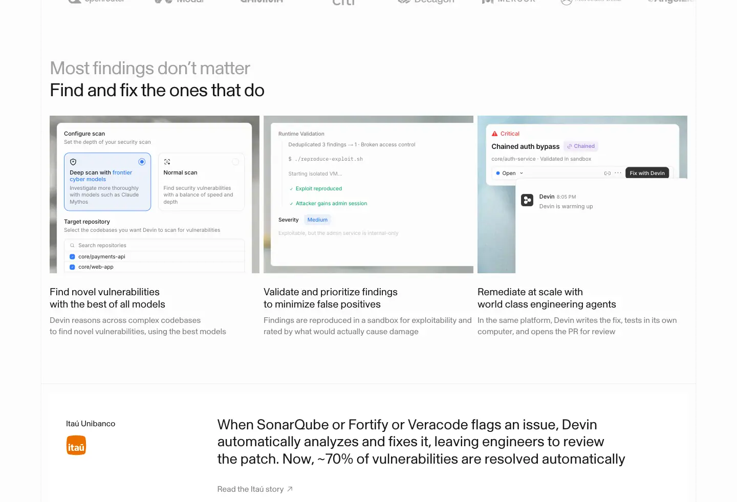
- Logo marquee row at top (same as Home).
- H2 two-tone: "Most findings don't matter" (ink 56 %) / "Find and fix the ones that do".
- 3 cards × 410px: Configure scan ("Deep scan with frontier cyber models"), Runtime Validation ("Exploit reproduced ✓, Attacker gains admin session ✓"), Critical "Chained auth bypass" with "Fix with Devin". H3 20 / 24px (2 lines), body 16px grey.
- Quote card: Itaú Unibanco, 24px statement, "Read the Itaú story ↗".
Why. Security teams drown in false positives. The headline names that pain and the three cards show the funnel: find → prove → fix.
4. Security built for the entire software lifecycle
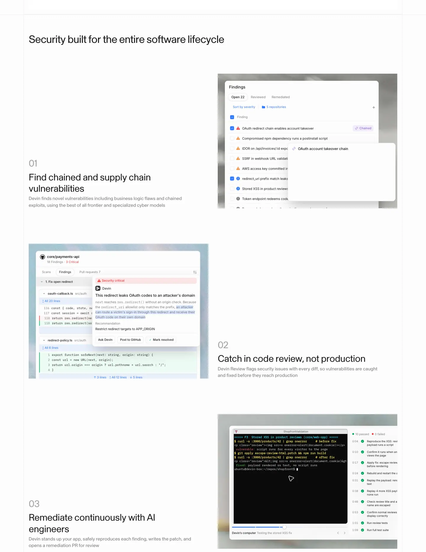
Zig-zag steps 01–03 (same template as Home steps): Find chained and supply chain vulnerabilities (findings list with "Chained" purple tag) → Catch in code review, not production (code review with "Security critical" red label and a highlighted sentence animated by review-highlight) → Remediate continuously with AI engineers (terminal + test checklist, green dots).
5. Works with existing tools
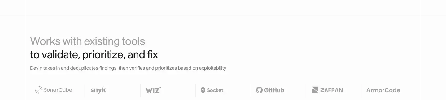
Two-tone H2 + 16px grey sub, a row of 7 grey scanner logos: SonarQube, snyk, wiz, Socket, GitHub, Zafran, ArmorCode. Why: positions Devin as an add-on to the scanners buyers already own, not a replacement.
6. Security & governance
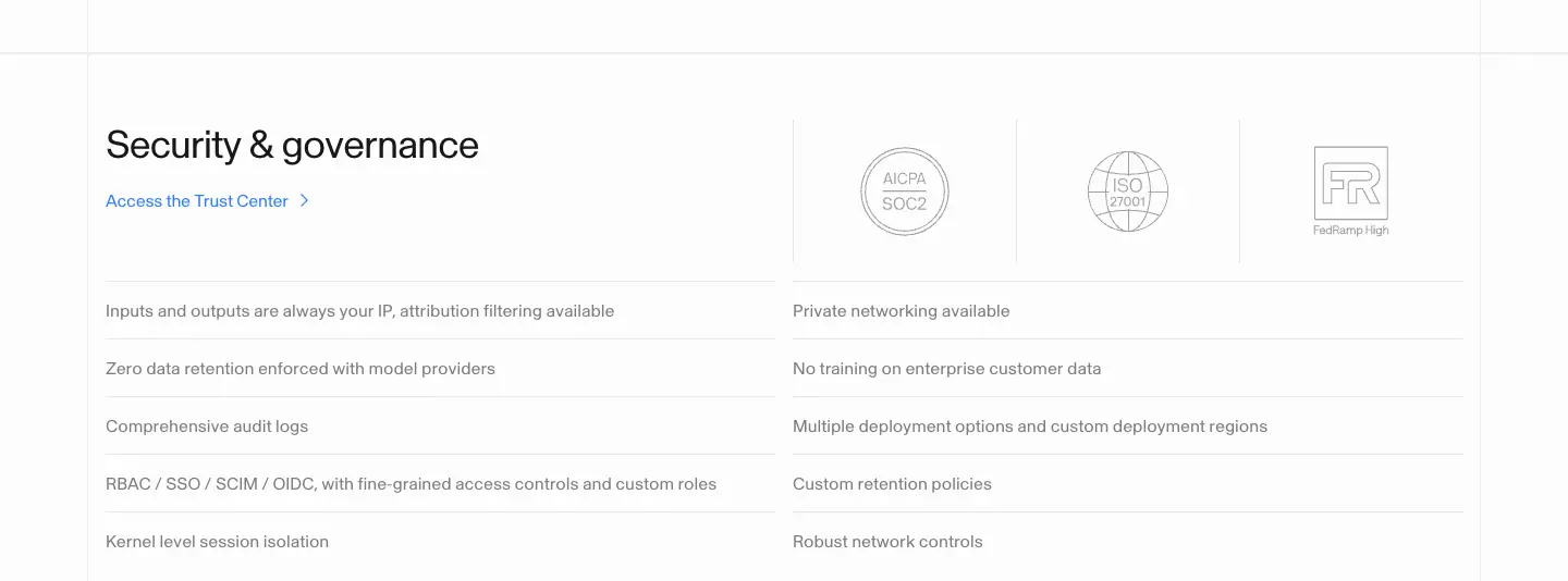
H2 36px + blue "Access the Trust Center >", three badges, 10 bullets in 2 columns ("Kernel level session isolation", "No training on enterprise customer data", "Custom retention policies"…).
7. FAQ
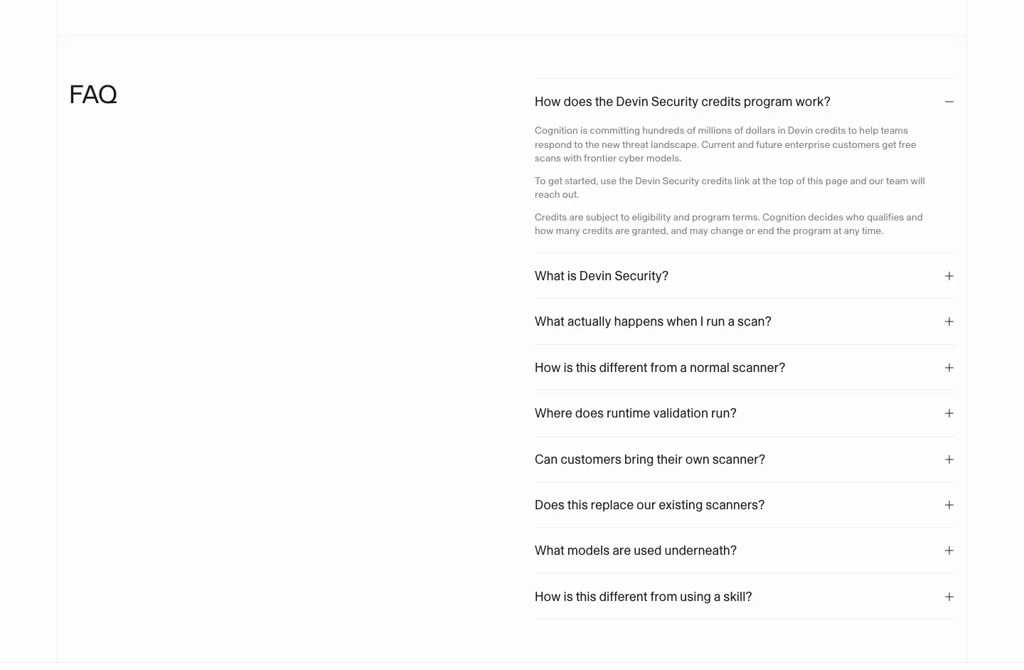
"FAQ" H2 left; right column of 9 questions 18 / 23.4px with "+", first one open ("How does the Devin Security credits program work?").
8. Closer

"Every second counts" (64px ink) / "Do it all with Devin" (64px ink 40 %) — the reverse of the Home tones, because here the urgency is the message.
9. Footer
See Shared header and footer.
Blog · devin.ai/blog
- URL: https://devin.ai/blog
<title>: Blog: Product Updates, News & Research | Devin- Meta description: "Read about the latest Devin announcements, product updates, and research from Cognition."
- Page height: 3,378px at 1440px.
- Template: unframed light index, x 80.
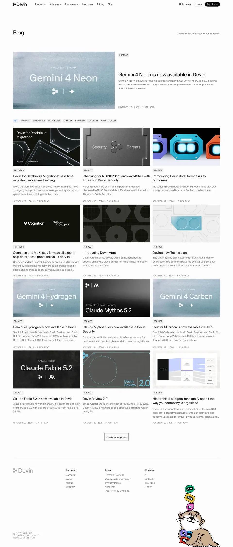
1. Header
H1 "Blog" 36 / 46.8px at x 80, y 188; right-aligned sub "Read about our latest announcements." 16px ink 56 %, letter-spacing −0.2px.
2. Featured post
1280 × 353px row: cover image left (≈ 628 × 353, grainy blue-grey title card "AVAILABLE IN DEVIN / Gemini 4 Neon" with logos), right column at x 732: mono tag "PRODUCT" (12px, rgba(0,0,0,.06) chip), H2 32 / 41.6px, excerpt 16 / 24px ink 56 %, mono date "NOVEMBER 18, 2026 · 1 MIN READ" at the bottom.
3. Filters and grid
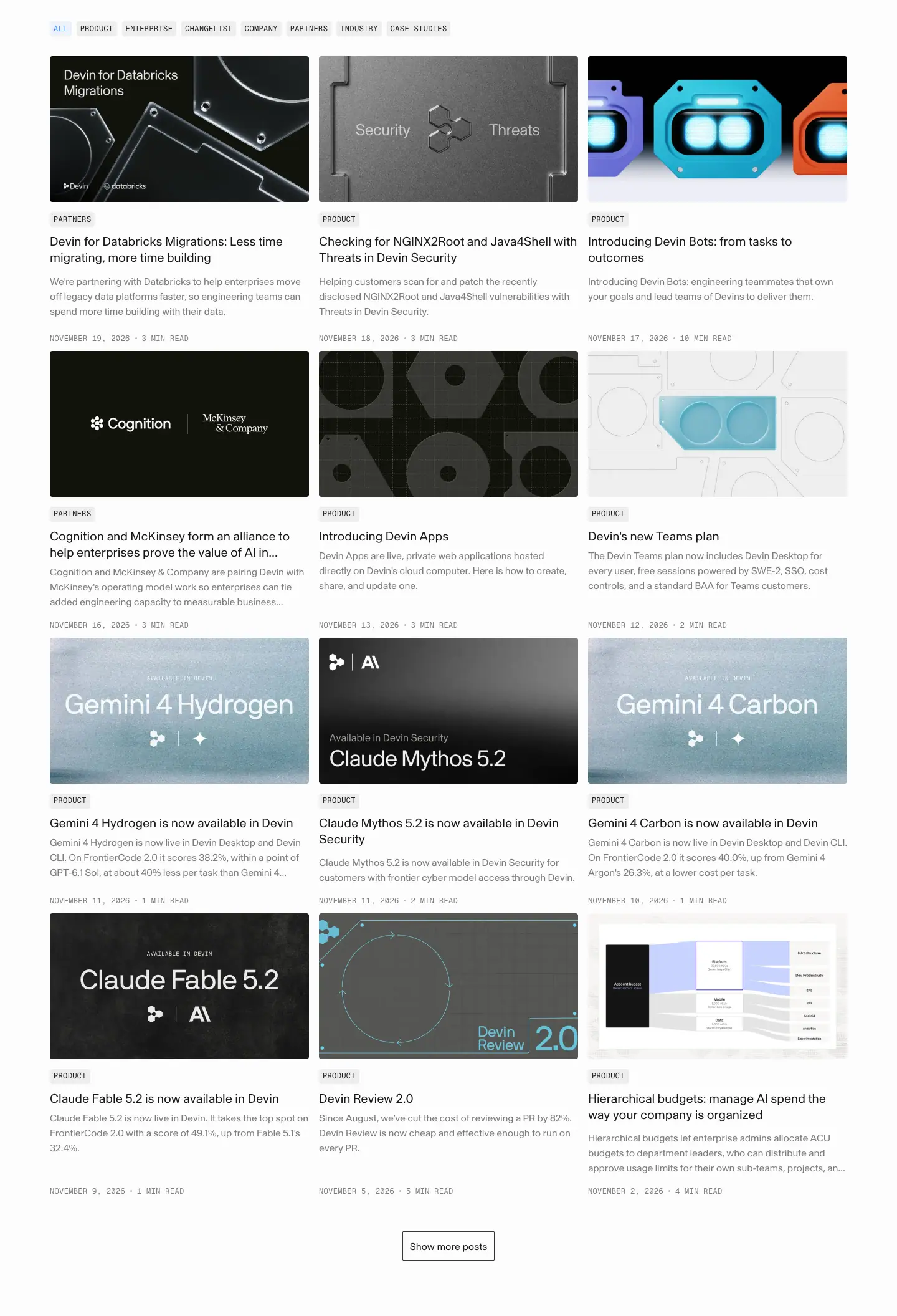
- Tag filter: ALL (active,
#317cff on rgba(49,124,255,.08)), PRODUCT, ENTERPRISE, CHANGELIST, COMPANY, PARTNERS, INDUSTRY, CASE STUDIES. Geist Mono 12 / 16.8px, +0.36px, 24px tall, 4px radius.
- 3 columns × 416px, 16px gap. Card: cover 416 × ≈ 234px, mono tag, title 20 / 26px, excerpt 16px grey (3 lines), mono date + read time. Row pitch ≈ 450–470px.
- Covers share an art direction: monochrome object renders (glass, acrylic, embossed bots), grainy model-launch title cards, and partner lockups on black.
Why. Monospace metadata (tags, dates) makes the blog feel like a changelog, consistent with the engineering audience. Uniform covers keep the grid calm even with 15+ different topics.
4. Footer
See Shared header and footer.
Blog post template · devin.ai/blog/<slug>
The sitemap lists 291 blog posts (public pages). The blog index is reviewed in blog.md. Two posts were captured on 2026-11-21:
| Post |
Height |
Type |
Full page |
/blog/agentic-map-reduce |
7,928px |
research / engineering |
 |
/blog/our-brand |
4,193px |
company / brand essay |
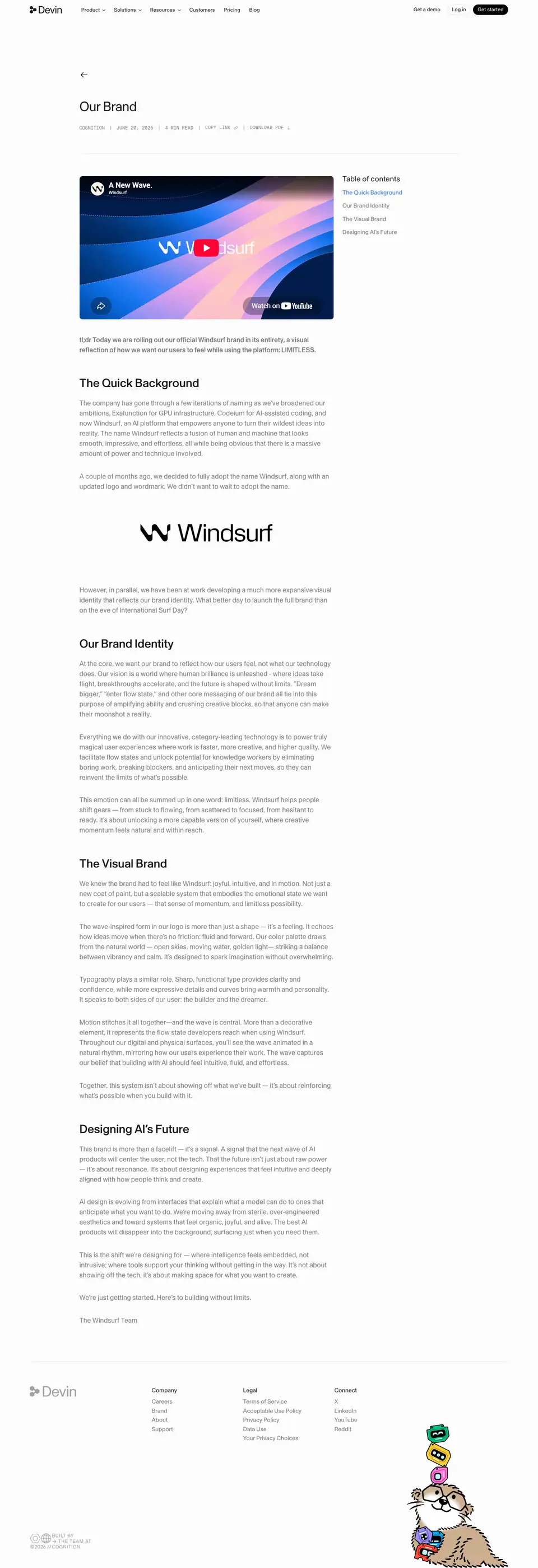 |
1 · Title block
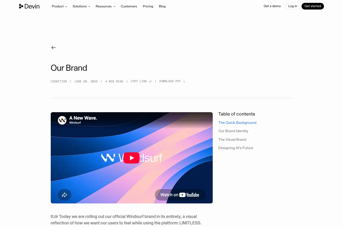
- Back arrow
← above the title.
- H1 36px / 46.8px, weight 400,
-1.08px (−0.03em), #191919, at x=213, max 1,015px. The same 36px as page H1s on marketing pages: a post is not louder than a product page.
- Meta row in Geist Mono 12px / 16.8px, uppercase,
+0.36px, ink at 56%: COGNITION · JULY 1, 2026 · 9 MIN READ, then actions COPY LINK and DOWNLOAD PDF.
Why: mono uppercase meta reads as "document metadata", like a paper header. "Download PDF" signals that research posts are meant to be cited.
2 · Body column + table of contents
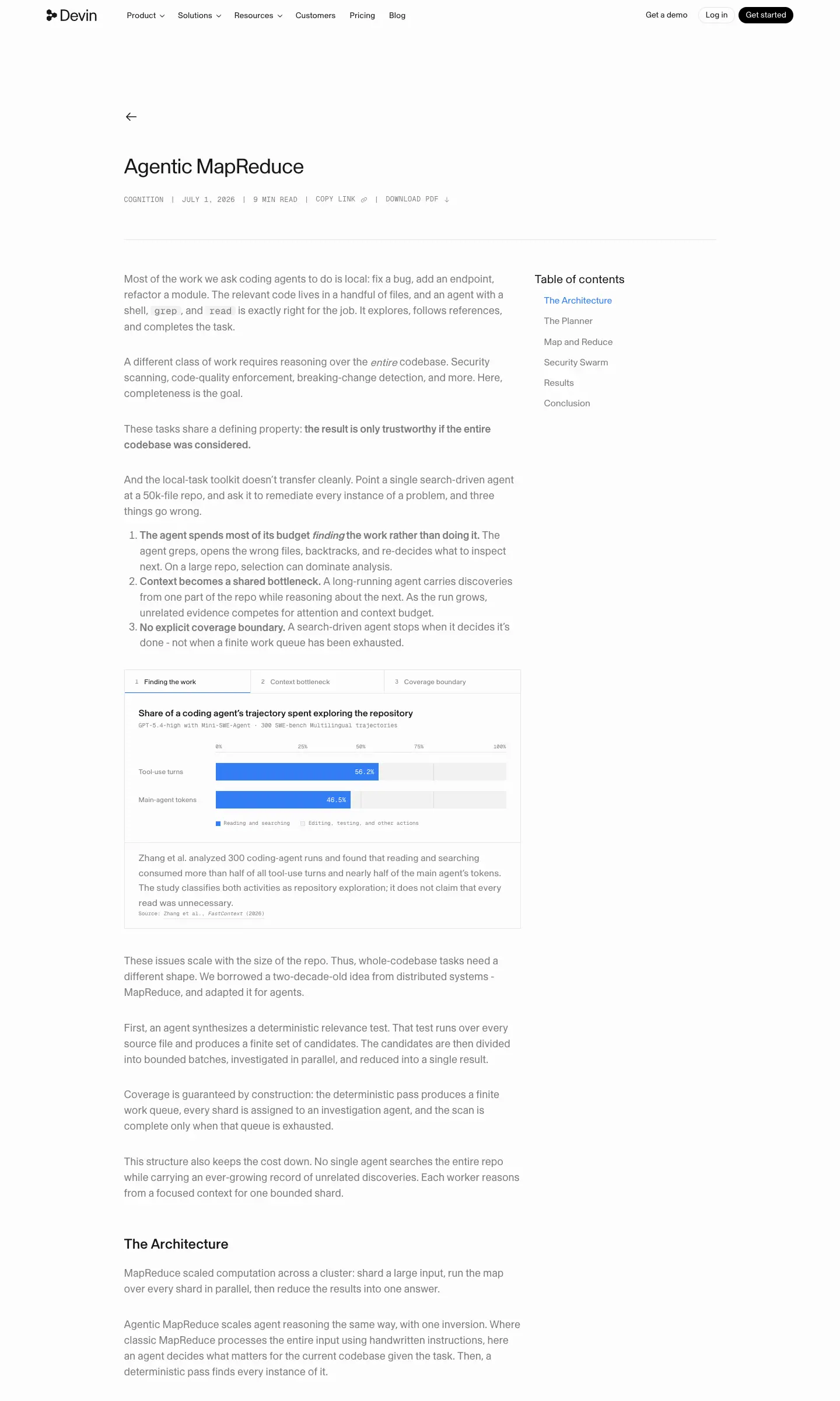
- Body: 680px column at x=213. 18px / 27px, weight 400, ink at 56% (
#191919 / 0.56). Bold runs use 700 at the same 56% ink.
- Inline code (
grep, read) in Geist Mono 16.2px.
- Sticky table of contents at x=917, 311px wide: title "Table of contents" 20/24, entries 16/22.4 −0.16px, active entry
#337df4 (the only blue on the page), others 56% ink.
- Section headings differ by post: the research post uses H3 24/26.4 500; the brand post uses H2 32/32 500 −0.32px. The template allows either.
Why 56% ink for body: the page is near-white #fcfcfc; full-black text at 18px would feel heavy over 7,000px. 56% ink keeps contrast comfortable while headings at 100% stand out. Check: #191919 at 56% on #fcfcfc renders ≈ #7d7d7d, contrast ≈ 4.0:1. That passes WCAG AA only for large text. It is a deliberate softness trade-off; for accessibility, use ≥ 60% ink (≈ 4.6:1).
3 · Figures and tables
- Charts are HTML/SVG cards inside the column: title 16/20.8 500, mono subtitle, bars in
#337df4, grey tracks, mono source line "Source: Zhang et al., FastContext (2026)".
- Tables (stage / what happens / agents?) use 14px rows with hairline dividers.
- Results table: blue bar for Devin, grey bars for others, with costs in mono.
Why: research posts persuade engineers with data; one blue colour for "us", grey for everyone else, is a comparison you read in one glance.
4 · Brand-essay variant (/blog/our-brand)
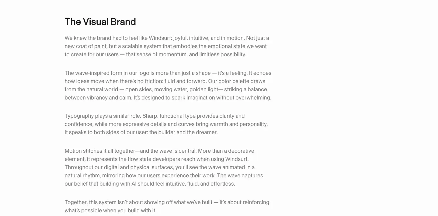
- Embedded YouTube film (Windsurf brand film) and a black Windsurf wordmark image (448×142).
- Section H2s: "The Quick Background", "Our Brand Identity", "The Visual Brand", "Designing AI's Future".
- Body text describes the brand as a "wave" and positions it against "corporate" AI branding.
Why it matters for design research: this is the company explaining its own identity in its own words. Use it as the primary source for tone when copying the brand.
5 · End of post
Footer with the otter mascot (271×385) in the bottom-right, same on every page.
Reuse recipe
- 36px weight-400 title, mono uppercase meta with "Copy link / Download PDF".
- 680px body at 18/27, 56–62% ink.
- Sticky right TOC with one blue active state.
- Charts as HTML cards: one brand colour vs grey.
Customer story template · devin.ai/customers/<slug>
The sitemap lists 42 customer stories (public pages); the index is reviewed in customers.md. Two stories were captured on 2026-11-21:
| Story |
Height |
Full page |
/customers/ahead |
5,795px |
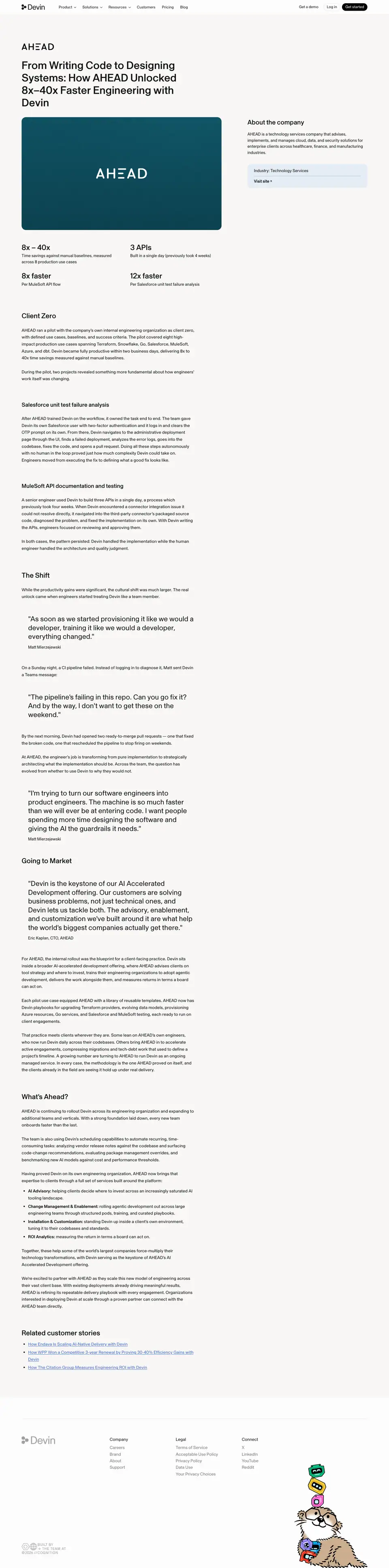 |
/customers/access-group |
10,413px |
 |
1 · Hero: title + cover + company card
- Customer logo (small) above the title.
- H1 40px / 46px, weight 500,
#111111, 640px column at x=80. Formula: "From X to Y: How {Customer} {verb} {number} {outcome}" ("How The Access Group 5x'd engineering output across 250 products and 2,000+ engineers").
- Cover: 740×416 tile in the customer colour (AHEAD teal) with a centred white wordmark, or a video still with Cognition × customer marks (Access Group).
- Company card on the right (x=916, 444px): H2 "About the company" 24/36 500, description 15/22.5, "Industry: Technology Services", bold "Visit site" link, on a pale fill (
#e4ecf4 / #f7f6f5).
Why: the right card answers "who is this?" without interrupting the story; the cover puts the customer's brand, not Devin's, front and centre.
2 · Stat grid
- 2×2 grid at x=80 / 482: numbers 28px / 30.8px 500 ("8x – 40x", "3 APIs", "8x faster", "12x faster"), captions 15/22.5 that define the measurement ("Per MuleSoft API flow", "Built in a single day (previously took 4 weeks)").
Why: every number carries its unit of measure. Engineers distrust unqualified multipliers.
3 · Narrative sections
- H2 26/31.2 500, H3 21/25.2 500, body 16px / 25.6px
#111111 at full strength (marketing pages use 56% ink).
- Access Group story: 12 H2 sections, each headline is a finding ("5x more merged pull requests than a year ago", "Automating bug fixing at scale").
- Pull quotes: 26px / 32.6px weight 400, straight quotes, attribution line "— James Bolt, Chief Technology Officer".
Why: long-form proof for enterprise buyers who forward the link internally. Headline-as-finding means skimming the H2s gives the whole case.
4 · Related stories + footer
"Related customer stories" H2 26/31.2, three text links, then the shared footer with the otter.
Reuse recipe
- Outcome headline with a number.
- Customer-colour cover + company card.
- 2×2 stat grid with defined units.
- Findings as H2s, quotes at 26px, full-ink body.
Brand assets page + Enterprise page
Two pages captured on 2026-11-21: /brand (2,686px) and /enterprise (8,372px).
Part 1 · /brand
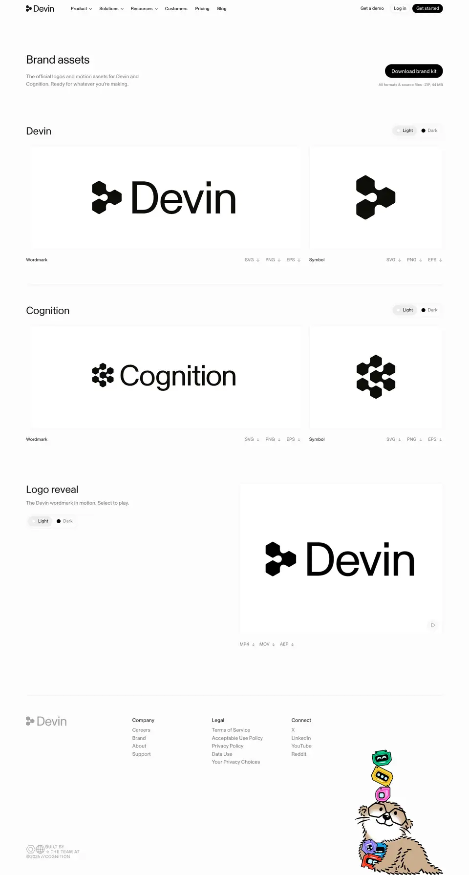
| # |
Section |
Crop |
| 0 |
Header: "Brand assets" H1 36/43.2 400 −1.08px; sub 16/22.4 56% ink "The official logos and motion assets for Devin and Cognition. Ready for whatever you're making."; black pill "Download brand kit" 178×42; note "All formats & source files · ZIP, 44 MB" (12px) |
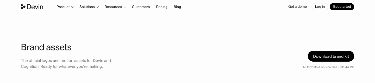 |
| 1 |
Devin: H2 32/38.4 400 −0.64px; Light/Dark toggle; wordmark card + symbol card; per-card downloads SVG · PNG · EPS |
 |
| 2 |
Cognition: identical layout |
 |
| 3 |
Logo reveal: "The Devin wordmark in motion. Select to play." Video + downloads MP4 · MOV · AEP |
 |
Why: the page has 4 sections and no rules text. It trusts the files to carry the rules and keeps the decision "light or dark" as the only choice. Usage analysis: 09 · Art direction §9.
Part 2 · /enterprise

| # |
Section |
y |
Crop |
| 0 |
Hero + photo stat carousel + pillars + logo wall |
0 |
00 |
| 1 |
"Let the models compete. Devin gets the best from all of them" |
1,308 |
01 |
| 2 |
"Tasks over tokens. Value over spend" |
1,984 |
02 |
| 3 |
"Up to $10M in guaranteed engineering value" (dark band) |
2,660 |
03 |
| 4 |
"Forward Deployed Engineers from the greatest companies in the world" |
3,662 |
04 |
| 5 |
"Know what you got, and what it cost" |
4,338 |
05 |
| 6 |
"Budgets that hold. Per organization, per tier, per person" |
5,013 |
06 |
| 7 |
"Built to pass your security review" |
5,689 |
07 |
| 8 |
FAQ + contact form |
6,340 |
08 |
0 · Hero
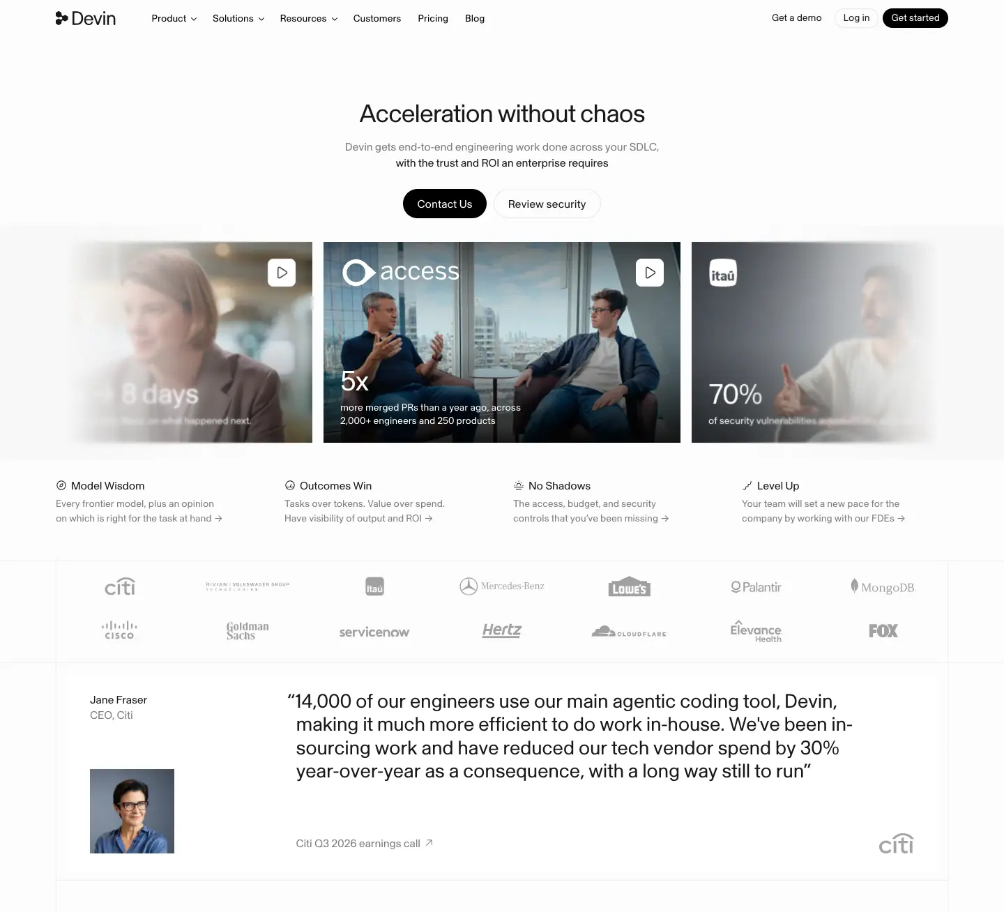
- Centred H1 "Acceleration without chaos" 36/43.2 400 −1.08px (409px wide), sub 16/22.4, two buttons: black pill "Contact Us" (119×42) + text "Review security".
- Photo stat carousel: 12 cards of 512×288 sliding horizontally; stats 40/44 weight 300 white ("5x", "70%", "8 months → 8 days").
- Four pillars in a row (16/22.4): Model Wisdom · Outcomes Win · No Shadows · Level Up, each with a 14px grey line and
→.
- Grey logo wall + a Citi testimonial.
Why: "Acceleration without chaos" names the enterprise fear (chaos) and answers it in four words. Peer photos plus numbers do the persuading above the fold.
1–2, 4–7 · Zig-zag feature modules
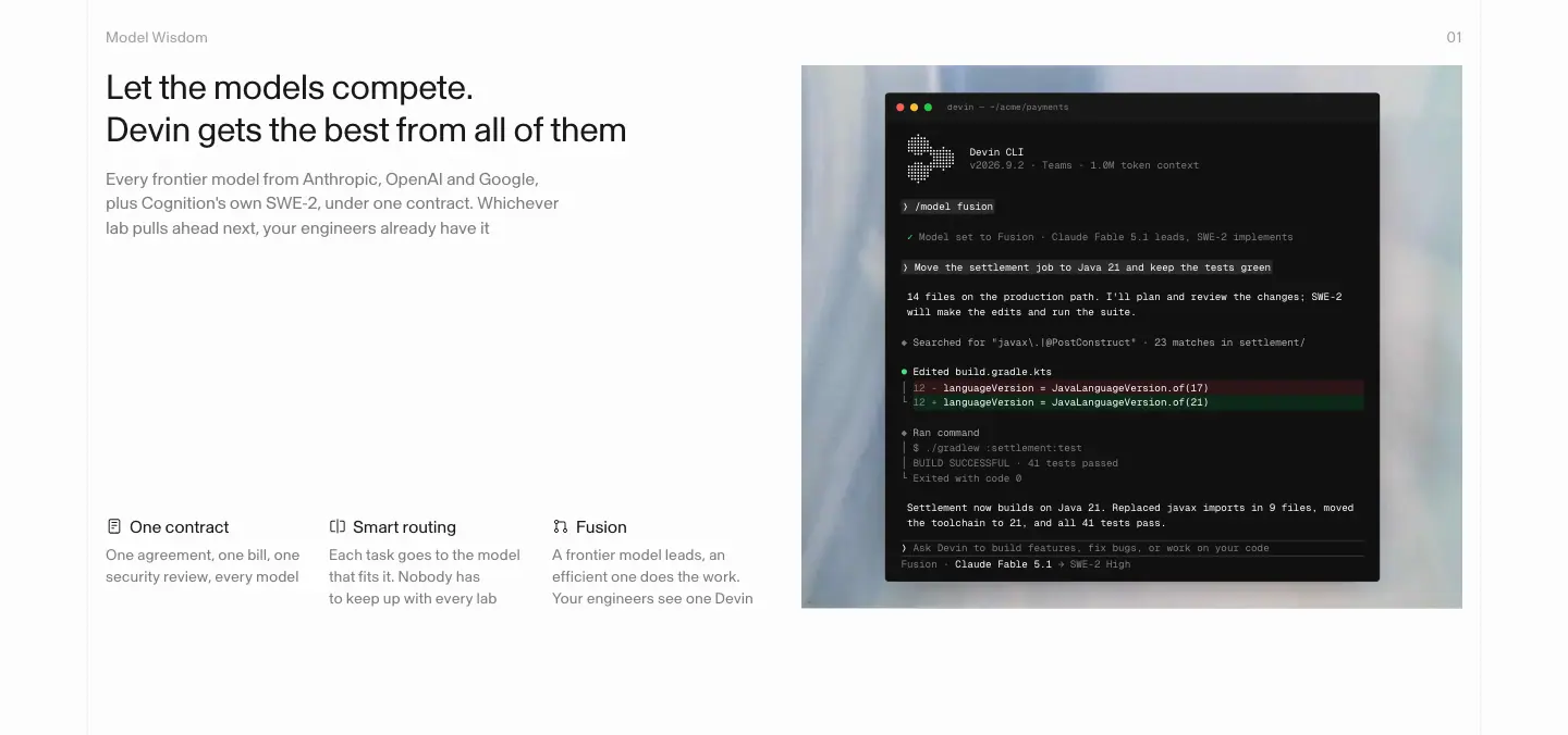
- Alternating text-left / visual-right (x=97 then x=736), each 676px tall (measured: 676, 676, 676, 675, 676px).
- H2 32/38.4 400 −0.64px written as two short sentences ("Tasks over tokens. Value over spend").
- Three sub-points per module as H3 16/22.4 ("One contract", "Smart routing", "Fusion").
- Visuals: product UI on pale-blue vellum photos, or photography.
Why: identical module heights give the long page a steady rhythm. Parallel two-sentence headlines are scannable promises.
3 · Dark guarantee band
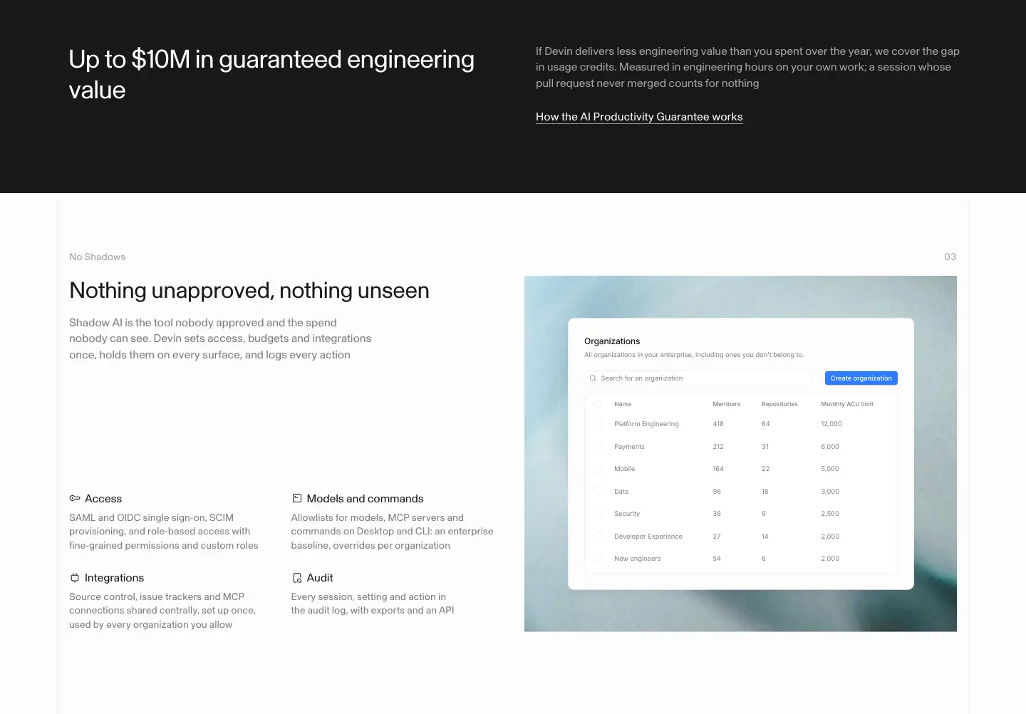
Full-width #191919 band: "Up to $10M in guaranteed engineering value" in white, with a link to the guarantee. The only dark section on the page.
Why: a money-back guarantee is the strongest claim on the page; inverting the colour makes it impossible to scroll past.
7 · Security stats
"6 of 8", "3 of 6", "3" large numerals with captions, plus compliance badges. Numbers framed as "x of y" read as audited facts.
8 · FAQ + form
Accordion FAQ ("Our engineers already use Cursor and Claude Code. Why add Devin?" and others) then "See how Devin can work for your team" with a short form (First name, Last name…).
Why: FAQ answers the objections a procurement team raises; the form sits right after the last objection.
Reuse recipe (enterprise)
Fear-naming H1 → peer photo stats → four pillars → identical zig-zag modules with two-sentence H2s → one inverted guarantee band → "x of y" security numbers → objection FAQ → form.